Conversion Copy & Messaging
Conversion copy: clear value propositions, outcome-led headlines, messaging congruence, calls to action, offers, and objection handling.
38%
Best tweets about Conversion Rate Optimization
Explore the best tweets about conversion rate optimization, featuring research, experiments, landing pages, copy, funnels, analytics, and test results.
CRO research, hypotheses, experiments, copy, design, funnels, analytics, statistical rigor, and measurable conversion results.
Original Xholic analysis
CRO discussion centers on intent-matched pages, clearer copy, proof, and friction diagnosis—but it also disputes how tests should be run and whether conversion alone defines a winner. [2071533443381350689, 2044319910902264262, 2066521110535954457]
62% of posts
All-time engagement
46% of posts
Published in 90 days
Conversation map
Conversion copy: clear value propositions, outcome-led headlines, messaging congruence, calls to action, offers, and objection handling.
38%
Experiment design and testing practice: hypotheses, A/B tests, test scope, velocity, significance, and interpreting results.
34%
Reducing cognitive load and interaction friction through clearer hierarchy, mobile performance, navigation, forms, checkout, and UX flows.
32%
Analytics-led diagnosis using funnels, heatmaps, scroll depth, recordings, segmentation, and drop-off analysis.
32%
Quiz, lead-capture, call-booking, confirmation, and onboarding flows designed to qualify, educate, and progress visitors toward purchase.
32%
Trust and persuasion mechanisms including reviews, testimonials, UGC, guarantees, comparisons, urgency, and social proof placement.
28%
Landing-page formats and page structures tailored to traffic source, intent, funnel stage, and customer avatar.
16%
Optimizing acquisition-to-page continuity through ad-angle alignment, traffic temperature, keyword intent, and channel-specific funnels.
16%
Tone and stance
Performance benchmark
Posts with media make up 44% of this collection. Their median all-time score is 8.16, compared with 8.00 for text-only posts.
Format mix
Consensus and debate
Shared view
A recurring recommendation is to align landing-page headlines, formats, and depth with the ad angle, keyword intent, and traffic temperature rather than route all visitors to one generic page.
Shared view
Posts frame CRO as diagnosis before redesign: identify whether motivation, clarity, trust, audience fit, or on-site friction is failing, using funnel and behavioral evidence to locate drop-offs.
Shared view
Clear outcome-led messaging, a focused CTA, visible proof, and objection handling recur as core page ingredients. One author explicitly recommends testing copy before design.
Open debate
Testing practice differs across posts: one author argues that standard A/B-testing apps can worsen paid-media metrics, while others recommend 50/50 tests at higher traffic volumes or waiting for a conversion threshold before deciding.
Open debate
Friction reduction is not presented as simply shortening every flow. One quiz test reported higher completion and conversion for a 27-question quiz than a 16-question version, while other posts warn against overwhelming choices, forms, and unclear paths.
Open debate
Posts caution against selecting winners on immediate conversion or submit rate alone, citing first-purchase conversion, repeat purchase, LTV, and customer quality as additional evaluation criteria.
What performs
The two highest-scoring evidence tweets are detailed list posts about landing-page formats, traffic-source alignment, and intent matching. In this dataset, those topics and structure coincide with the strongest scores.
Three other score outliers combine a strong point of view with operational detail: removing pop-ups, assessing paid-media effects during testing, and using a behavioral diagnosis framework.
Case posts with explicit test setups or reported outcomes provide concrete examples, including trust-signal, quiz-flow, and redesign cases.
Statistical standouts
Creator landscape
The five most represented creators account for 20% of the selected posts.
1. Andrei Breha | CRO
@andreibreha
2 posts
2. Jackson Blackledge
@blvckledge
2 posts
3. Connor Martin
@connor_m
2 posts
4. Mery
@dont_be_average
2 posts
5. Eric Djavid
@ericdjav
2 posts
6. Alex Fedotoff
@FedotOff90
2 posts
Jackson Blackledge’s two posts focus on channel-specific landing-page formats: demand-generation pages matched to creative angles and Google pages matched to keyword intent and funnel stage.
Connor Martin reports adverse paid-traffic effects associated with pop-ups and A/B-testing apps in his brands, and argues that paid-media metrics should be considered alongside on-site test results.
Andrei Breha’s examples focus on making trust and answers more accessible in the purchase journey, from collection-grid proof to interactive objection handling.
Themes, sentiment, stance, and post format are classified per tweet. All counts, shares, medians, creator concentration, freshness, and performance comparisons are then calculated directly from the published snapshot.
Xholic's all-time score compares engagement while accounting for reach, post age, and creator consistency. It is used for relative comparisons within this collection.
This report analyzes the exact 50-post snapshot shown below. AI identifies editorial categories and drafts explanations; all statistics are calculated from the snapshot, and every narrative claim is checked against cited posts before publication.
Best Conversion Rate Optimization tweets
Ranked 01–50
@blvckledge ·
for those looking to crack cold traffic on demand gen many of our brands are spending $10k-$20k/day rn on these funnels best performing formats i’ve seen lately: VSL/SALES PAGE this is a direct response page built to sell a product, either through a video or long-form copy. it covers the problem, the mechanism behind the product, the benefits, the proof, and the offer, all in one place. super common in health, supplements, pet example headlines: - "the [product] that finally fixed [problem] for [audience]" - "the 7-second calming touch method that solves [problem]" best to use for youtube ads where your creatives either… expose a hidden problem (“do you know that your pillow is secretly sabotaging your skin?”) or show a pain point/transformation (“my skin got so much smoother after 5 days of sleeping in this pillow.”) a few important notes on execution: > match the page angle to the creative > traffic here is cold, so layer in proof everywhere you can: testimonials, studies, experts, media, celeb clips > optimize for mobile first (a lot of demand gen traffic comes from mobile) THIRD-PARTY COMPARISON PAGES a ranked list of brands in your category that reads like an independent review. example headlines: “top 7 [product type] for [audience] in 2026” “we tested the 5 most popular [products]. here’s what won” best for image ads with a “review” angle on google discover placement a few things to get right on the page: > explain how you made the list before you get into the rankings. "we spoke to 10 experts in this category and tested each product over 30 days" > write in a neutral tone throughout > every product gets real pros listed, including the lower-ranked ones. > cons should be honest and specific, helping the reader understand who each product fits and who it doesn't. ADVERTORIALS/LISTICLES a long-form piece of content written to look and read like an editorial article or blog post. it educates the reader on a problem or topic first then at the right time, introduces a product as the solution example headlines: “why most [audience] stay stuck with [problem]” “11 reasons why the [product] is taking the dental world by storm in 2026” “carnivore diet explained. what it is and whether it actually works” works really well with native-style image ads on google discover. QUIZ an interactive page that asks a series of questions before recommending a product as the fix it collects information about their goals, problems, preferences, or situation, etc then delivers a personalized result that frames the product as the next step. example headlines: "find the best [product] for your skin in 60 seconds" "take this 2-minute quiz to discover your ideal [product]" we often run this for youtube ads (in-stream and shorts) works well for hair-loss, skincare, supplements a few things to get right on the page: > make the first questions easy to answer. don't create friction or make people think too hard (gender, age range, etc) > ask questions that genuinely help personalize the recommendation > explain why the recommended product fits their answers. > watch where people drop off and keep testing new questions so those are the formats we’re using to scale past $500k/mo in demand gen spend they're pretty much all you need to rip on this channel. a lot of brands struggle to crack demand gen because they don’t have the right lps they either send traffic to a pdp, which doesn’t work 90% of the time… or they use a page that doesn't match the creative angle at all. highly recommend you go through your current funnel, see which pages you can add to improve it, and test them.
@blvckledge ·
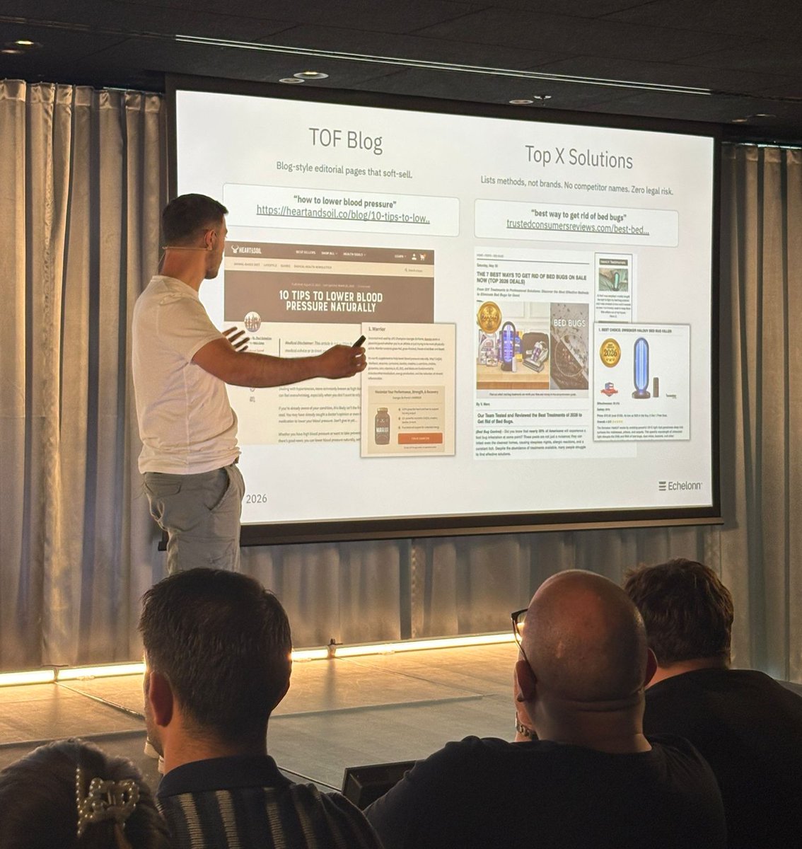
our head of google ads @filippocvroli just spoke to a room full of ecom operators about the top google strategies in 2026. the main points from the talk: 1. landing pages on google are the equivalent of creatives on meta they’re one of the biggest (if not the biggest) factors in your performance. and the same way you’d test creatives on meta… you should be testing landing page variations, angles, and formats on google to: - lower acquisition costs - improve conversion rates - scale to new levels of spend - capture new traffic sources from different customer avatars, problems, and use cases 2. build different pages around keyword intent buyers can search for the same product in different ways (e.g., “magnesium for sleep” & “magnesium for anxiety”) you should have dedicated pages for those different use cases, avatars, and angles. at minimum, match the headline and copy to the keywords. 3. go full-funnel with search campaigns unlike what many people think, you can reach people at every stage of the funnel with google search. from complete cold traffic to people searching for your brand name to buy tof traffic → informational searches mof traffic → comparison & competitor searches bof traffic → product category & branded searches the key is… you need to match the right landing page to each keyword type. 4. top landing page formats to use for google search > advertorials → informational searches (“why am i always bloated after meals” > top x solutions pages → informational searches (“best treatment for bloating) > top x products pages → comparison searches (“best electric toothbrushes”) > us vs them pages → competitor searches (“athletic greens alternatives”) 5. shopping traffic doesn't always belong on a PDP but in many cases, a different page format can give you a big lift in conversion rates and aov. we’ve had a lot of success leading with the problem, desire, or brand story (basically following the structure of a sales page but much shorter in length) 6. google discover is one of the most underrated placements on google right now. this is basically google's version of a news feed where ppl scroll to read articles. it’s been one of our top prospecting strategies driving 6 figures/mo on cold traffic for a lot of accounts. almost any brand can make it work but almost no one's running it properly.
@connor_m ·
It's hilarious nobody talks about the impact of site pop-ups on advertising costs. On 4/4 of my brands, when we've removed pop-ups and anything else that impacts time on site, our CPMs and CPAs drop. "but but but look at how it impacts your data collection and email flows long term" Completely unaffected. We simply measured the volume of signups we had with popups, and looked at ways to rebuild that volume somewhere else, one example is a simple quiz funnel, we segment off a fraction of ad spend to maintain the volume from here, I expected these campaigns to run at a loss, they don't, and we have a flow of better informed sign-ups that increased the revenue per data collection by 15%. That's before even talking about how it naturally improves open/click rates and deliverability. In the last 12 months our CPMs have reduced by 13%, our CPA is flat, we've spent 180% more on Meta. When you read things on X, instantly assume it's a paid partnership until you're proved otherwise.
@connor_m ·
Nobodies ready for the conversation that A/B Testing apps cause a massive negative impact for paid traffic spend. An extremely large benefit of having multiple brands at scale is the ability to analyse the impact of otherwise 'harmless' site or funnel changes. Below is our NCPA, anytime we have a AB test on rCPMs go up at least 20% OR NCPA goes up 10-30%, or in the below example, as much as 80% increase in NCPA. (One of the below tests was a 'winner' with 30% increase in PPS) Take a guess when AB tests are live or stopped, each small climb in NCPA is when a AB test starts, the sharp reduction is when a AB test is stopped, or in today's case, when AB testing apps are completely uninstalled. "Oh that's simply because it's a failed AB Test" Wrong. AB Testing is inherently flawed from the beginning for DTC brands, as your PPS or RPS is the main tracked net gain. However this isn't the goal for DTC brands, as your paid traffic makes up over 50% of your traffic. The main itemised metrics for growth for DTC brands are NCPA, CPMs, Account Center costs, etc etc. Next time you run a large AB Test, track these over PPS and RPS. What you'll see is when you accompany the 'increase' in RPS on site, you'll 9/10 times see an unnormally high increase in above metrics. Or, simply run a double fresh URL AB test directly through Meta, the AB test that you thought was 50%+ in RPS, will end up failing in Meta. The reverse happens too, that AB test you thought would be a massive winner but failed? Could win via Meta directly. This isn't a direct attack on AB Testing or CRO agencies, and isn't something to ridicule me for below, our sites get over 7m human sessions a month, I have vigorously tested this, I clearly WANT AB testing to work, they are my stores, we're bootstrapped, wins from an AB test literally go into my pocket. CRO agencies would see a massive growth actually agreeing with this, and working with brands to test website changes the way they should be tested, directly through ad accounts, and acknowledging that most agencies do not know how to calculate RPS or PPS, which should include CACs. Other things you can do to confirm this isn't BS - - After a winning AB Test, set the test live on site, and AB test it again against the 'old' site. - Run a test where the A and B are both the exact same site. - Try running a three-way test, A (original), B (test), C (original), I can guarantee you, A and C do not end up the same after significance. This is not app related, we've used all of them. In fact, the next app to enable AB Testing via ad accounts, i'll use it, great app idea, i'll fund it for whoever wants to create this.
@SarahLevinger ·
Sometimes customers buy. Sometimes they don’t. (Which is kind of annoying when you’ve spent six weeks building 60+ ads, 4 listicles, and 20 email flows… 😅) Why does this happen? Why do two visitors from seemingly identical traffic sources, landing on the same page, looking at the same product, behave so differently? According to behavioral science, it almost always comes down to one of three things… BJ Fogg, a renowned behavioral scientist at Stanford University, spent 20 years studying what actually causes humans to take action. He found that every single behavior (from buying an $8 latte to signing a mortgage) is the product of three factors converging at the same moment: 1. Motivation (I want to fix my problem) 2. Ability (I’m capable of fixing my problem) 3. Prompt (I feel a nudge to fix my problem *right this second*) All three of these things have to show up *together* for a behavior to happen. If even one is missing, the behavior doesn’t happen at all. Fogg wrote this behavior equation as a formula: B = MAP B = behavior M = motivation A = ability P = prompt Knowing which piece of the equation you’re experiencing can help you solve all sorts of things - from CPA to CTR to CVR: 🚦 High ability + a clear prompt, but low motivation → no behavior. In this situation, the customer *could* do what you want them to, they were *told* to do it, they just didn’t *want* to do it badly enough. 🚦 High motivation + a clear prompt, but low ability → no behavior. Here, the customer wanted to do what you asked, they were nudged to do something about it, but something in the experience was too hard, too confusing, or too risky to push through. 🚦 High motivation + high ability, but no prompt → no behavior. In this situation the customer was ready and capable of doing what you wanted. You just never asked them to do anything about it. (This is why most CRO advice is pretty much useless and why a lot of creative “strategies” fail after about 6 weeks. 😬 you have have to know *which* lever is broken before you start pulling.) Here’s how to diagnose this for your brand: Say you launch a gorgeous landing page. Traffic is solid. Product is genuinely great. But your conversion rate is super low. Before you blow up the whole funnel, run it through the model: 😐 Low Motivation → Do they feel a real emotional pull toward your offer, or are you just describing what you think is great? If your page is informative but not *emotional*, you’ve basically built a brochure, not an offer. Beautiful design ≠ desire. 🫨 Low Ability → Are you making it too hard to see how they’ll get the result? This is a sneakier issue than people think. Ability isn’t just “is the checkout fast.” It’s also: - Too many SKUs to choose from - An overwhelming quiz - A vague value prop - A price that requires too much justification - A return policy that signals risk. Every cognitive tax you charge eats into ability. (Behavioral scientists call this “friction,” and it builds up way faster than you’d think.) 😵💫 Weak Prompt → Did you actually tell them what to do, when to do it, and what happens next? A prompt isn’t just a CTA button, it’s the clock that tells them why they should do something right *now*. Buried CTAs, vague urgency (“Shop now!” I’m looking at you), no clear next step after add-to-cart…these are all weak prompts. The best prompts answer three questions in order: what do I do, what happens after I do it, and what happens after *that*? ( 🤩 I freaking LOVE the Fogg model because instead of staring at your analytics dashboard at 11pm wondering why your CVR is down three months in a row, you can systematically rule out one of these three things. Genius.) TLDR: when something underperforms, ask yourself the three Fogg questions: - Did I make them *want* it? (Motivation) - Did I make it *easy*? (Ability) - Did I tell them *exactly* what to do next? (Prompt) If you can’t answer yes to all three, you’ve found your problem.
@codyplof ·
I'm 3/3 on CRO tests that I've done end to end in Claude. I hate to sound like AI, but it's not just the speed of dev I'm excited about. It's the direction. For the first time one person can run a really good CRO program. Sure being able to ship design and dev as a non creative, non-technical person is cool. But what's arguably more valuable is the strategy. A lot of CRO programs are just guessing. I've got a CRO skill trained on every test we've ever ran, our heatmap data, every customer and user survey we've ever ran, all of our reviews and outersignal persona data, our ga4 data, and everything i know about CRO and more. Normally it would take a team of a few people tp just do all of this analysis and plan tests. I'm able to do it nearly instantly. I've hired someone to take this over. But this is exciting.
@namyakhann ·
How to Build High-Converting SaaS/Tech Landing Pages in 2026 (After Building 100+ of Them) 1. Start With a Clear Promise: - Bad headline = visitors confused, high bounce rate, "what do you do?" feedback - Good headline = instant clarity, qualified traffic converts, demos book themselves - If you're blaming traffic quality, check the headline first it's usually the real problem 2. Use a Direct Response Structure: - Strong headline → specific outcome promise → 3 proof points → one clear CTA - Multiple CTAs = split attention, lower conversions - One CTA repeated 2-3 times = clear path, higher conversions 3. Know Your Conversion Metrics: - Visitor-to-signup rate, signup-to-demo rate, demo-to-paid rate, actual MRR (not vanity metrics) - If your page doesn't convert at 5%+ on cold traffic, it will never scale profitably - Great landing pages are accountable to real conversion rates, not design awards 4. Drive Traffic Through Benefit-Driven Ads: - Run simple problem/solution ads, avoid explaining features in ads - Simple hook: "Here's the outcome. Here's who it's for. Here's what happens next." - Goal: drive qualified signups who actually convert—not just traffic 5. Optimize Above the Fold First: - Bad pages bury the value prop - great pages win in 5 seconds - Hero section should answer: What is this? Who is it for? What do I do next? - Add social proof, specific metrics, and remove all confusion before the scroll 6. Test Copy Before Design: - Ship a clear, ugly page in 2 days vs a beautiful, confusing page in 2 weeks - Run copy tests: 1 new headline per day, test outcome-focused vs feature-focused - Use customer language from sales calls - if they said it, it converts better than your clever copy 7. Remove Friction Like Your Life Depends on It: - Every extra form field = 20% fewer signups - "Contact Sales" buttons = qualified leads leaving to check competitors - Show pricing, make CTAs specific, and let marketing pages be editable without engineering 8. Scale What's Already Working: - Most SaaS teams build 10 new pages before fixing the one that matters - When your landing page converts at 8%+, that's when you build the next page not before - Takes 7-10 days to ship a conversion-ready page - stop waiting months for perfect
@GohilHardy ·
Landing Page Checklist That Converts. - Clear headline (what it does + who it's for) - Strong subheadline - Problem → solution - Benefits over features - Product screenshots or demo - Social proof - Simple CTA - Transparent pricing - FAQ section - Fast loading speed - Mobile-friendly design Most founders focus on getting more traffic.
@therahulissar ·
Split testing one of our quiz funnels and have some interesting data to report on. Quiz 1: → 16 questions long → Same ads and spend → 17% completion rate → 2.1% conversion rate Quiz 2: → 27 questions long → Same ads and spend → 27.5% completion rate → 4.1% conversion rate Largest drop off rate is actually just before the checkout area, looking to clean that up but finding it very interesting that the longer the quiz flow the higher the conversion rate. Potential theory that the customers are more qualified and have a high reason to complete the quiz because the questions get more in-depth as the quiz progresses from 15 questions onwards. I'll be fixing drop off rate across both quizzes and then running the last 2 week test before closing it.
@markbuildsbrand ·
here's a 'real world' reminder to always challenge your assumptions in marketing: i was recently working with an info offer and helping them dial in a new call funnel. after running a good amount of tests, there were three crazy conclusions that we came to: 1) inbounds convert better than outbounds. the inbound direct to closer calls had a substantially higher booked call to close rate, better show rate, and better live call to close rate. this is weird, bc generally speaking, direct to closer inbounds on cold traffic typically have higher no show rates than outbounds that're speaking to a setter before the closing call. Interesting... but we keep moving. 2) paid converts better than organic this is where I'll lose most ppl bc their brain couldn't possibly compute that a paid cold traffic lead converts at a HIGHER rate than an organic lead... yet that was the case. it's data. and data don't care about yo feelings. the paid leads also had a higher show rate and close rate than org leads. 3) "boosting" organic posts sounds great in practice, sucks in reality. Gary Vee would probably kill me if he read this... but we tested around 30 creatives for this offer. 95% of them were simply boosted organic posts. No CTA, nothing. And to be fair, they got great soft metrics. HOWEVER. When it came to actually booking calls, the ONLY ads that booked calls that were qualified and actually closed were the ads that were WRITTEN to be ads. Not simply organic content thrown in the ads manager. anyways... the reason I share this is bc these three conclusions are generally against conventional wisdom in internet marketing surrounding call funnels. The lesson here is simple: "rules" don't exist, and everything is contextual. which means if you don't have cognitive flexibility to be able to challenge your assumptions and let go of your limiting beliefs, you ain't gonna be printing brutha. challenge your assumptions and lower your ego. your bank acct will thank you for it. after all... we're all pretty fkn retarded. Let's not act like we're not. run more ads.
@iamshaanarora ·
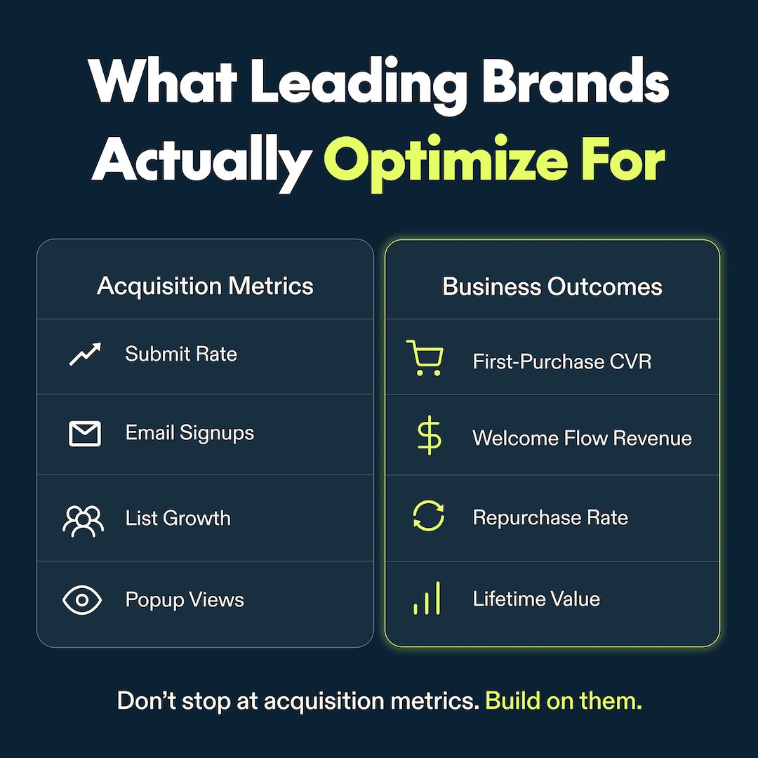
Most brands optimize their popup for the wrong metric. Submit rate is important. But it’s only half the story. Getting someone to subscribe is step one. Getting them to buy is what actually grows the business. That’s why leading brands are optimizing for: → First-purchase conversion → Welcome flow revenue → Repurchase rate → Lifetime value It’s also why Alia doesn’t pick winning popup experiences based on submit rate alone. Every experiment is evaluated against the business metrics that actually matter. Because the best popup isn’t the one that collects the most emails. It’s the one the creates the most valuable customers.
@parkerworth ·
10 tactics to increase conversion rates: •Install heatmaps, move hottest region underneath the headline •Add a countdown timer on the top of the page •Remove the back button from your checkout page •Use video testimonials instead of written ones •Place your best social proof above the fold •Add a secondary CTA at the bottom •Change your button color to contrast with the page •Add a FAQ section addressing the #1 objection •Turn up the proof and the promise •Test a guarantee that removes the risk of buying What else works?
@andreibreha ·
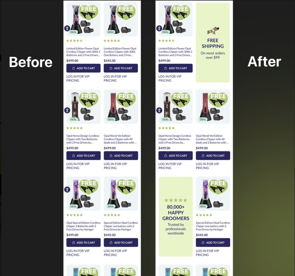
CRO test that printed money: Collection page had zero trust signals. Just products and prices. Hypothesis: Add free shipping badge + social proof card inside the grid itself. Test duration: 2 weeks → +$124,064/month Control: 914 orders, $218,437 Variant: 1,060 orders, $254,615 100% Statistical Significance Most brands will read this, nod their heads, and change nothing. Don't be like most brands. The collection page is the ideal spot on the website where you have free real estate to build trust. Trust means more sales.
@1ajaay ·
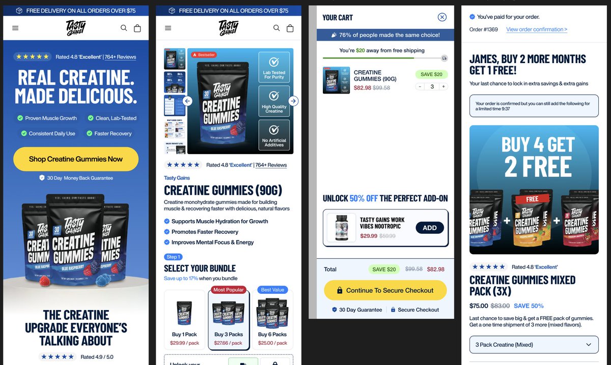
RPV maximisation isn't about one clever trick on your product page. It's about systematically increasing the value you extract from every visitor who hits your site. You need to pull three levers simultaneously: conversion rate, AOV, and repeat purchase frequency. Your average ecom founder will obsess over conversion rate and ignore the other two which is detrimental and where you lose money. Start with your upsell architecture. Pre-purchase upsells on the product page (bundles, quantity breaks, subscribe & save) should be frictionless. Post-purchase upsells in the thank you flow or checkout should feel like a natural next step rather than a hard sell. You want 15-25% of customers taking at least one upsell. Your cart should actively work to increase AOV. Free shipping thresholds, progress bars, last-minute add-ons positioned as "complete your order" items. This doesn't mean just throwing products at people, make the products you show dynamic and contextual to what they're already buying. CVR improvements come from clarity & removing friction: - Simplify your navigation or just remove it entirely - Add in a presell page to educate before presenting your offer - Make your value prop and benefits clear in your PDP image carousel - Handle objections - Remove unnecessary form fields at checkout - Show trust signals where they actually matter (payment page, not scattered everywhere) Every element should contribute to the conversion Repeat purchase is slower to measure, but it's the most profitable lever. Positioning your subscription offer correctly, email flows that actually add value (usage tips, restocking reminders, complementary products) beat generic promotional blasts. SMS for time-sensitive offers only. You can't optimise what you don't measure. Track RPV weekly, break it down by traffic source, and you'll see exactly where the gaps are. Most brands will get stuck at low scale because they only optimise one piece of the pie.
@FedotOff90 ·
Took our worst-converting product page from last quarter and our best-converting one and dropped both into Claude. Asked it to extract every structural difference. Headline pattern, above-the-fold density, social proof placement, CTA frequency, word count by section, image ratio. Got back a 14-point delta in under a minute. Then asked it to rewrite the worst page using the structural skeleton of the best page, keeping all the original product claims and brand voice intact. Pasted the rewrite into Replo. Pushed it live as a 50/50 split test against the original. Conversion rate on the rewritten version is 28% higher 8 days in. The best landing page we've ever built was sitting in our own shop the whole time. We just couldn't see the pattern until we made the model do the seeing for us.
@dont_be_average ·
I've tested thousands of landing pages, here are the elements you MUST have to increase conversions (save this): HEADLINE: Who + Specific Result + Timeframe SUBHEADLINE: Supports headline, adds specificity or mechanism tease HERO: Image or video showing result/transformation CTA BUTTON #1: Above fold TRUST BAR: Logos, ratings, "X customers" PROBLEM SECTION: Name the pain clearly AGITATION: Make it visceral. Cost of inaction. UNIQUE MECHANISM: Why everything else failed, why this works BENEFIT STACK: Features → Benefits → Deeper Benefits SOCIAL PROOF: Real screenshots, names, specific results OFFER STACK: Everything included + dollar values PRICE REVEAL: After value is established GUARANTEE: Zero risk framing QUALIFICATION: Who it's for / not for FAQ: Top 5 objections answered directly FINAL CTA BLOCK: Restate promise + guarantee + action P.S. LINE: Last hook, urgency, or restate guarantee
@dont_be_average ·
I just shot this landing page review for @NaivaidyaY66600 Thought I should share it, there might be ideas in here you can use for your Saas too. (Watch the full video below) Quick takeaways: - Your best copy line is buried at the bottom (move "transforming your idea into a market-ready product in 21 days" to the headline) - Never send cold traffic straight to pricing, you're skipping the entire sales process - Speed is a weak USP in the AI era, lead with outcomes like "secure your Series A funding" instead - Real testimonials need to be above the fold (avg scroll depth is only 20%) - Change "Our process" to "How it works" (answer their question instead of talking about you/the company) - Install Clarity/heatmaps (this will be your north start for further conversion rate optimization). Hope that helps!! VIDEO LINK: https://t.co/Xci3sufKEy
@alecsandrull ·
most ecom operators have never looked at their scroll depth data. this is the single most overlooked metric in conversion optimisation. here's why it matters: you have a product page with 6 sections. your best conversion element - the reviews section - is section 5. but scroll depth data shows that 68% of visitors stop scrolling at section 2. meaning: 68% of your traffic never sees your strongest selling point. you didn't have a conversion problem. you had an architecture problem. the fix is restructuring your page by persuasion priority: section 1: hero — headline, key image, star rating, CTA. section 2: social proof — reviews, "X sold", UGC. section 3: objection handling — FAQ, guarantee, comparisons. section 4: benefit stack — not features. outcomes. section 5: deeper content — story, brand, process. section 6: final CTA with urgency. your highest-converting content goes at the TOP. not the bottom. because the bottom doesn't exist for most visitors. install a free heatmap tool like hotjar or microsoft clarity. look at where people stop scrolling on your page. if your best content is below that line your page is working against itself. reorganise by persuasion priority. it costs nothing and changes everything.
@M__Operators ·
Masterclass on CRO What to test, when + why velocity beats certainty. @couuor’s worst test ever $39/mo vs. $88/qtr Same ads, split traffic $88 converted at 0% @codyplof’s most painful test Redesigned entire PDP Changed too much at once Lost, with no answers
@DmytroKrasun ·
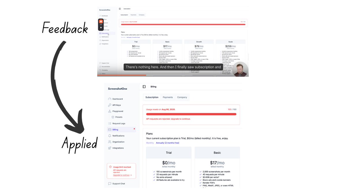
I am lucky to have @coreyhainesco using ScreenshotOne for one of his projects. When he tried to upgrade, my dashboard UI/UX was so confusing that he couldn't figure it out. He then sent me a video with suggestions on how to improve the upgrade flow: 1. Add a visible banner or alert in the sidebar or at the top prompting users to upgrade. 2. Add more links that lead to the upgrade page. 3. Highlight the recommended plan on the billing page. 4. Emphasize the Billing page in the sidebar (I added a red pulsing dot to signal there is something to check). And many more. I implemented all of his suggestions, and I am super grateful. If you want the same suggestions for your project, check out his https://t.co/GCvS73hR50, especially the "Paywall and Upgrade Screen CRO" skill.
@neilpatel ·
Most bloated pages aren't a design problem. They're a committee problem. Every team added their widget and nobody ever removed anything. Now visitors bounce before they convert. The filter is simple: does this element help the visitor take the one action you want? If not, it goes. #CRO #UXDesign #ContentStrategy #DigitalMarketing #LandingPage
Watch video
@oliverkenyon ·
Here’s how I’d CRO-optimise @GhostLifestyle 👇 1/ Homepage: sell the outcome, not the flavour Before: • Hero focused heavily on flavour launch • Product image doing most of the work • Value proposition unclear After: • Clear performance-driven headline: Fuel your body. Power your performance. • Immediate social proof from thousands of customers • Supporting benefit stack reinforcing outcomes • Clean hierarchy leading to Shop Bestsellers CRO principle: People buy results, not flavours. 2/ PDP: make the decision faster Before: • Reviews visible but not dominant • Product benefits buried in text • Variant selection visually weak After: • Strong social proof anchored directly under the hero • Scannable benefit bullets highlighting protein content and digestibility • Clean flavour selector improving usability • Subscription option clearly framed as the better value CRO principle: Reduce cognitive load around the buying decision. 3/ Cart: increase AOV without friction Before: • Upsells cluttered and visually noisy • Add-to-cart buttons competing with colour options • Checkout CTA lacking hierarchy After: • Free-shipping progress bar reinforcing momentum • Cleaner cross-sell structure • Savings surfaced clearly • Strong Checkout CTA supported by payment trust badges CRO principle: The cart should guide the next action, not create more decisions. This isn’t about making the page “look better.” It’s about: • clearer hierarchy • stronger value framing • fewer decisions The things that actually move conversion rate and AOV.
@GrammarHippy ·
If you want my best advice for increasing conversions and AOV it’s this: Don’t close the loop. Quiz - a lot of funnels have the offer at the end of the funnel in a different style. Different design. WHY? Closed the loop. Quiz done - now we’re selling to you. NO. A purchase - a lot of funnels thank the buyer for their purchase. WHY? Purchase complete - loop closed. Wallet closed. I’ve seen my guys go from 0% conversion rate to 40% on their upsells simply with NOT closing the loop. Same offer. Same everything.
@M__Operators ·
.@couuor rebuilt Ridge’s entire site after 10 years. @connorrolain added a step pre-checkout. @codyplof’s last six CRO tests were winners. The boys have been busy ↓ Upsell pre-checkout, +23% AOV (Conversion rate stayed flat) Redesign entire site + test for lift (Subtract sections to find impact) Stack +1 change per variant (Learn four times faster) Survey customers for test ideas (That’s how Cody got six wins) Pipe “Listen Labs” into Claude (AI writes the test brief)
@FedotOff90 ·
I used to think the fastest way to fix a struggling ecom brand was new ads. New creative. New angles. New campaigns. I was wrong most of the time. Nine times out of ten, the ads weren't the problem. The LANDING PAGE was. A 1.2% conversion rate on cold traffic isn't an ad problem — it's an offer problem, a page problem, a trust problem. I've watched operators burn $50k testing new creatives on a funnel that was never good enough in the first place. Now the first thing I look at isn't the ad account. It's the funnel. Fix where the traffic lands before you touch where it comes from.
@Adam_Ha_Yes ·
Do you want a high-converting landing page? With a few simple tweaks you can double your conversion rate. Here are the 7 questions I ask when building every landing page: 1: Does my site load fast? > Target: <1 second load time > Every extra second = 10–15% traffic loss > Use Google Lighthouse to check The designer in me hates this, but you have to cut heavy assets if they're killing performance, trust me it's worth it. Performance > pretty 2: Do I have a low Low-Friction CTA? > Find a simple value adding action for users to take > Don't ask for money upfront in your funnel, high churn > Think through what incentivizes someone to take the next step (e.g., book a demo) Simple phases like "Try for free" or "Get 1,000+ ideas" convert 2x better then "Start a demo" or "Enter your CC" 3: Do I pass the "Above the Fold" test? > User should know what you do without scrolling > Formula: clear headline → body copy (elaborates + hints at ICP) → low-friction CTA → product image for context If a user doesn't know what you do before scrolling, you're being too ambiguous. Your goal isn't to confuse your customers! Ditch the cute taglines and instead be as literal as you can. 4: Do I have social proof? > No users yet? Pull quotes from respected figures in your industry > Show investors if you have them > As you grow: text quotes → video testimonials → whatever you can get Always be collecting testimonials, social proof, videos, and case studies. Social proof is one of the most important things most sites are missing. 5: Do I have a product demo? > Doesn't need to be expensive, a Loom works > Script: "Hey I'm X, I built this because Y, here's a quick walkthrough" > Builds trust, explains the product, humanizes the brand Some % of your users prefer to read, another might prefers to watch a video. Give as many hooks as possible for users to convert. 6: Have I put my brand in a good light? > Does the site look like it was made in the last 10 years? > Use templates if design isn't your thing > No clip art, no bad stock photos, AI killed the excuse for bad design If you're selling a marketing agency but your website looks like crap, so will your conversions. Think deeply about how you actually want to present yourself to the world. 7: Do I pass the "Is It For Me?" test? > Visitor should immediately know if they're the target customer > Be hyper-specific: "for influencer marketing managers at D2C brands doing $5M+ revenue" > Use your ICP's actual language > Don't try to be everything for everyone... specificity = better conversion You need to spend a lot of time obsessing over who your customers are and are not. Speak to your customers, and ignore everyone else. Thanks for reading, if you drop your website in the comments I'd be happy to give some feedback. (this video did 100,000+ on TikTok let's see how it does lol)
@askOkara ·
a lot of founders obsess over traffic when the problem is actually conversion if you're getting 1,000 visitors and 5 signups, you don't need more traffic. you need to know why 995 people left things to check first: - is the audience relevant? - does your homepage explain what the product does in one sentence? - does your cta tell people what happens when they click? - do you have social proof above the fold? - how fast does it load on mobile? fix these before you spend another dollar on seo or ads
@andreibreha ·
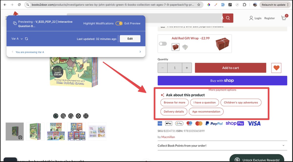
AI Sales Agents has now become one of the most powerful elements of CRO. This test is the perfect example. We added interactive questions based on the product. Once an question is clicked, an AI Sales Agent opens up and answers the question. It's such a good way to tackle objections and educate the customer. This is a much more effective way than having the support bubble in the bottom corner of the website.
@oliverkenyon ·
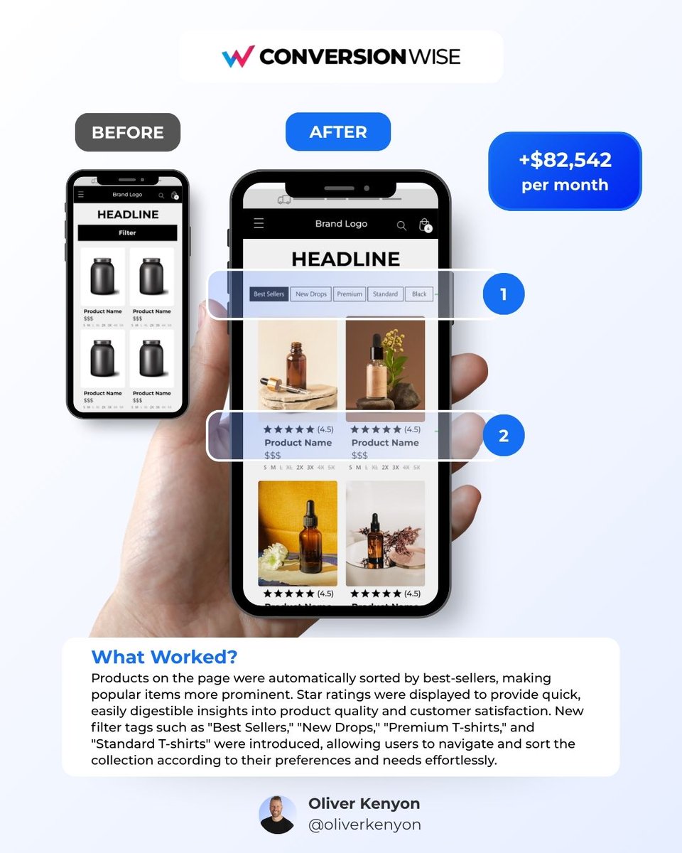
Anyone who says best practices in CRO don’t exist is lying. Yes, data and research are incredibly important when you’re testing at scale. But for most brands… A lot of the time it’s simply about putting the right conversion elements in the right place at the right time. Take this test for example. Just by improving how products were surfaced and navigated on a collection page, we helped generate +$82,542 per month. No new traffic. No redesign. No complicated experiment. Just applying a few simple conversion fundamentals. Here’s what we changed: 1️⃣ Helped visitors find the right products faster We introduced simple filter tags like Best Sellers, New Drops, Premium, and Standard so users could immediately navigate the collection based on what they were looking for. 2️⃣ Surfaced the products most likely to convert Products were automatically sorted by best sellers, putting the most proven items front and centre. We also added star ratings directly under product images to give instant social proof. The result? 👉 +$82,542 per month Sometimes CRO isn’t about complex tests or deep behavioural modelling. Sometimes it’s just about understanding how people shop and making the obvious choices easier to make.
@coreyhainesco ·
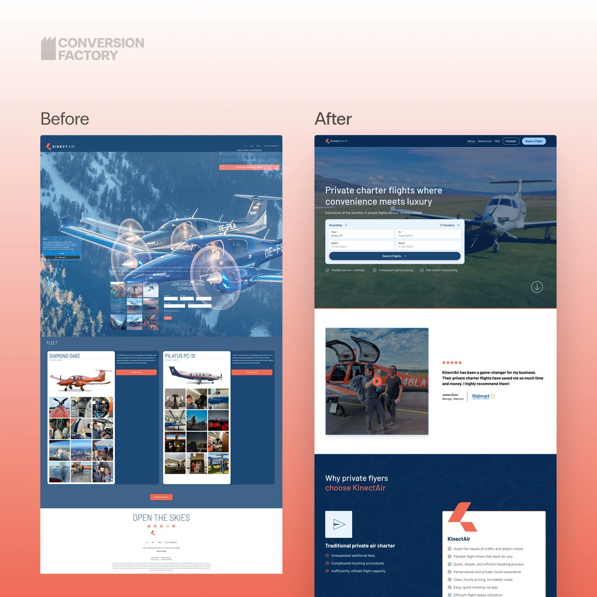
A Conversion Factory CRO win: Join It. We didn't rebrand them. Our design team took the assets they already had and used them better: a wider palette, a call to action that actually stood out, stronger social proof, and cleaner layouts. Their result: a 43% increase in conversions and a 29% drop in cost per acquisition.
@heyitsalexP ·
Recap of the big themes & learnings from @CommerceRound : 1. We're all freaked out about AI, but we probably shouldn't be AI is analogous to any other tech that has trended in this space: it's not a plug and play business solution, and you get the best results applying it strategically @deancbrennan gave one of my favorite talks about using AI as a real time, data-informed leadership coach. AI amplifies everything you do. If you can't prioritize, or if you consistently choose the wrong priorities, it will only help you fail faster. 2. TikTok Shop & organic short form (was this event secretly sponsored by @NotZainAgain ?) We got the download on @Frostbuddy_ 's insane growth on the platform, which was enabled by the co-founder grinding at TikTok organic for close to a year, figuring out how to make the product go viral. We also got an amazing deep dive from @theisaacmed about what it takes to grow a Youtube channel to a million views from scratch. The bar for winning attention has never been higher. Most brands still write off organic, but cracking organic is also the key to cracking paid. Being good at this is actually "alpha" right now, because most folks are simply too scared to get on camera and be cringe. 3. Retention & CRO Maturing There were two great talks in the retention and CRO space that acknowledged something I've been saying for years: Maxing out revenue per session (CRO) or campaign conversion rate (email) often has the downstream result of nuking customer LTV and diluting overall customer quality. I'm grateful that the industry is starting to move beyond chasing dumb numbers, even though some of you reading this are not. Side note–it was so cool to meet so many of you in person. It expanded my thinking and inspired me to be more ambitious, especially with my AI learning/ experiments. Thanks again to @yojimmykim and @iamshackelford for organizing such an amazing event and inviting me to speak.
@namyakhann ·
The testing math that changes how i think about landing page wins: 10K+ visitors/mo: → run proper A/B tests → split traffic 50/50 → 1 test/week <10K visitors/mo: → make change live → measure before/after over 2-4 weeks → still iterate but not split traffic either way: consistent, focused, incremental improvements. most founders think they need more traffic to test. you don't. you just need a different method.
@thePhilRivers ·
Most brands are bleeding money from a place they never think to look. Their pop-up form. Instead of the standard 2-3% opt-in most settle for. We regularly convert 4-7x more traffic by doing 3 things: 1. Come up with an offer that works within the unit economics of the business. Not just throwing up a $5 off because that’s easy and what everyone does. Lazy. 2. Capture high-leverage data at opt-in. Now what is important to capture is brand-specific. But capturing it makes people more likely to opt-in AND allows the brand to customize the flows. 3. Test that offer with the market. If above KPI - let it ride. If below KPI - test against. Optimize your pop-up like a psychopath.
@roasroi ·
traffic but no conversions? wrong audience, offer mismatch, broken funnel Check Traffic Temperature Before Blaming the Offer Cold traffic needs a bridge. Warm traffic can go straight to the sale. Most people send cold FB traffic to a page built for warm buyers and wonder why nothing converts. The offer is fine. The sequence is wrong. Segment by Geo and Device Your US desktop traffic converts at 4%. Your IN mobile converts at 0.1%. Running broad means bad segments are dragging your average down and making a winning campaign look dead. Break it down before you kill it. Meta "Clicks" Are Not Landing Page Visits Meta counts clicks differently than actual LP visits. If your tracker shows 1,000 clicks but 300 visits, 700 people never saw your page. Slow load, bad redirect, broken mobile layout. Fix that first. Go Through the Funnel Yourself on Mobile Incognito, phone, like a real buyer. You'll find broken buttons, sketchy checkout pages, confusing upsell flows. Affiliates almost never do this. The funnel you think you're running and the one your traffic sees are often two different things. Match the Ad Angle to the LP Headline Ad says "weight loss for women over 50." LP says "lose weight fast." That disconnect kills conversions instantly. Whatever the ad promises, the first line of the LP should confirm it word for word. Check Your EPC Against the Network Average If other affiliates are doing $1.20 EPC on an offer and you're at $0.08, the offer isn't the problem - your traffic or targeting is. If everyone's EPC is low, the offer is dead. Know which problem you actually have.
@adrien_brbr ·
Running my first A/B test on my hero section. Here's the thing nobody talks about: you build your landing page, you pick the words YOU like, and you assume the world agrees with you. They don't. Set it up yesterday with PostHog. Two versions. I'm not making a single decision until 100 people convert. No shortcuts, no vibes, just real numbers. Sometimes the version you hate wins. That's the game. Which one would you pick? Drop your take below.
@elgermerlo ·
Burned $400 on Facebook ads in 2 weeks for a landing page that was converting at 0.4%. I thought traffic was the problem. It wasn't. The page had no clear value prop. The CTA was confusing. The offer was vague. I didn't know any of this because I had zero organic visitors to learn from before throwing money at it. Every ad dollar just accelerated my ignorance. What actually happened: I optimized the ad creative 6 times. Changed audiences 4 times. Blamed Meta's algorithm. Blamed my targeting. Blamed the market. Never once looked hard at the page itself. Finally ran out of budget and was forced to try organic. Posted in 3 communities. Got 40 visitors. Zero conversions. Same problem, now visible and free to diagnose. Turns out people didn't understand what they were signing up for. Fixed the headline. Fixed the CTA. Conversion went to 4% with the next organic push. I then ran ads again. Same $400 budget. Profitable. The lesson isn't "don't run ads." It's that paid traffic exposes nothing. It just moves fast and costs money. Organic is slow and brutal and forces you to actually understand why people aren't buying. Do organic until conversion makes sense. Then pay to scale what works.
@brock_mammoser ·
Conversion rate is not always the best metric Here's what I mean: Our add to cart rate dropped from 13% to 7.6% year over year Our conversion rate dropped from 3% to 2.16% Looks like a problem But sessions went from 1.7 million to 4.5 million Traffic nearly tripled When you're driving that much cold traffic, TikTok organic, social, cold acquisition, people don't always buy on the first visit That's normal That's how funnels work A founder I know has a 0.8% conversion rate and is doing incredibly well because of the sheer volume of traffic Metrics need context Always
@thePhilRivers ·
On a good day, your site converts 3%. That means 97 out of 100 people you paid to get there leave without buying. Ninety… Seven! And then what do most businesses do? Nothing. Or worse… They hand those same people back to Meta, Google, or YouTube and pay again for retargeting impressions because they never captured the lead in the first place. That is insane. Email is the only channel that lets you follow up with that 97% without renting the traffic all over again. That’s why I laugh when people talk about email like it’s just some retention add-on. No. It’s also your second-chance channel. Maybe your best one. Because no business converts at 100%. Not brands. Not coaches. Not consultants. Not course creators. So the game is straightforward... Get the click. Capture the lead. Control the follow-up. And convert more of the traffic you already paid for. What most people actually do is obsess over CPMs, creatives, hooks, angles, ad fatigue, attribution, and all the flashy frontend shit. Then let a weak pop-up and a templated welcome flow piss away the other 97%. Nah. That's a conversion problem. Not an acquisition one. You do not need more traffic until you’re doing something intelligent with the traffic you already bought. Build your list.
@SSage38676 ·
conversion rate optimisation is NOT “make the button bigger.” It’s this: find where people drop off → understand why → remove the friction. learn to diagnose: off-site problems (wrong audience, wrong message, bad targeting) vs on-site issues (confusing landing pages, weak trust, broken flows). then optimise top-down: campaign → ad group → creative → website. map the full journey with GA4 funnels, path exploration & session recordings. finally, shift from “more signups” to “more paid” by nailing activation, the magic moment, and smoothing the entire funnel. real CRO. no fluff.
@roasroi ·
how to test a lander, few tips - check what others are using VSLs? Advertorials? just a video and a CONTINUE button, email capture? - analyze how other funnels look like and make a similar one - don't 1:1 copy the lander code if that team is good and high-level, they will have scripts in the code that will silently divert a part of traffic to their offers / or signal to their analytics that the code is now running on a new domain - when making changes, make big ones when starting out and creating variety of landers - make BIG changes, don't just compare colors or working of the subtitle - A/B test at ALL times you should have an A/B test running 100% of your time, there are always improvements to be made, always additional % of clicks to be squeezed out - dont overcomplicate it I've seen high converting funnels where lander was a just a few paragraphs of copy, hero image and 2x CTA buttons - why sales letters landers are so long? nobody would read that! People who want to buy will.
@kzitouni1 ·
ads runners, you may or may not have realized that the most interesting data is often hiding in the losing variant we had a test where one version lost on conversion rate but the customers who did convert: spent 30% more came back more often had higher LTV the winner got more customers the loser got better ones different lesson.
@brillaas ·
We've sold 700 units of a 3k product in 30 days using one funnel Before, they had no clue how to build a high-converting funnel By JUST building a conversion-optimized funnel... We: - Sold 707 units of the program - Sold 460 units within the first 24 hours - 2.1M cash collected in 30 days Here's how: 1. Wrote to one avatar Our avatars were super clear, but the founder had no idea how to speak to them After we uncovered the mass desire, pains, and situations We rammed that into the copy to resonate immediately Headline focused on the core outcome that they want, and the rest of the copy gives a clear payoff for the webinar 2. Funnel design We understood that with this market, the target audience needs a lot of trust to make a decision So we built the funnel design to align with the personal brand on the frontend This way, when they landed on the page, it didn’t feel off; instead, it genuinely felt like the next logical step they needed to take. Clean branding and design wins every single time If your funnel looks like everyone else's, looks rushed, or is just poorly designed, they'll conclude that it's “likely” a scam. 3. Optimized confirmation page We didn’t just send them to the page to sign up for the webinar We added a confirmation page with a simple confirmation video Most funnels stop after the call is booked. And what most businesses do is create a single video that tries to oversell the offer before the call But instead, we gave them more reasons to show up And gave them a simple way to add the event to their calendar using a tool called addevent. Com 4. Messaging congruency Ad to landing page congruency means that we had to lead with the same messaging we had in the ads and content This makes it easier to consume your message because it's all tied back to ONE IDEA 5. Messaging congruency Focus on the core outcome throughout your funnel This makes it easier to consume your message because it's all tied back to ONE IDEA 6. Pre Call System Dial and text every optin within minutes Don't send the first message saying “hey, just making sure you're showing up to the call on XYZ day.” Ask “Hey, any burning questions you have on your mind before our call?” “Hey {name}, any info you want us to add to this deck to make it more helpful?” etc. 7. Objection Breaking Emails You need to have a sequence of emails automated and ready to go out once someone opts in These emails should contain content that: - Breaks beliefs - Handles objections - Educates - Pre frames - Answers common questions - Reminds them of why they registered in the first place 8. Pixel conditioning Meta is responsible for step 1: finding the right audience bucket You are responsible for step 2: sending the right data back If you send everyone back to meta, you muddy up your data, and your results tank because you're reporting qualified and unqualified back to meta Create separate confirmation pages - One for qualified prospects (pixeled) - One for unqualified This way, you signal to Meta what type of person you want
@chakirbillionzz ·
🚀 Pretty design doesn’t convert. Proof does. Here’s my CRO breakdown. ✅ What I like: Strong stats and visual data reinforce credibility. Subscription-first pricing encourages recurring revenue. Countdown timer creates urgency. UGC adds authenticity to the offer. ❌ What I’d improve: Hero lacks an emotional outcome that resonates instantly. Buy box needs stronger trust signals around the CTA. Too much technical information above the fold creates friction. Customer transformation should be more prominent than ingredients. 📊 Stat: Leading with outcome-driven messaging instead of product features can increase conversions by up to 30%, while authentic UGC can lift conversion rates by 20–35%. 💡 CRO Pro Tip: Customers don’t buy ingredients, they buy the life they’ll have after using your product. Lead with the transformation, then use proof to make it believable. 📈
@ArnaudBelingaCX ·
31.58% trial conversion. Up from 20.12%. +57% jump since Breakcold V2. Everyone in SaaS is obsessed with distribution. Twitter threads. Cold email. Paid ads. New channels. Here's what they miss. Double traffic = 2x growth. Double conversion = 2x growth. But conversion costs less and compounds forever. Most founders never run that math. We did. V2 wasn't about more leads. It was about leads that convert and stay. What changed: ☑ AI agents handle CRM work in session one, not month one ☑ 5-channel inbox delivers ROI on day 1, not day 30 ☑ Native Claude MCP so the product extends itself instantly ☑ Onboarding hits the "aha moment" in 10 minutes, not 10 days ☑ $59 pricing with AI included, not paywalled Result: 20.12% → 31.58%. Already higher as I type this. Distribution gets the airtime. Conversion gets the compounding. If you're spending 80% of time on top of funnel, look at the middle and bottom. That's where the money hides. Most underrated lever in B2B SaaS.
@SSage38676 ·
How to crack your acquisition funnel in 8 steps for your innovative product: 1. Set a hypothesis-led growth strategy (ICP, positioning, messaging) 2. Build a growth roadmap (experiments, metrics, timeline) 3. Create + capture demand (choose 2 channels, define funnel goal, build audience lists) 4. Design conversion-first landing pages (value prop, pricing, CTA) 5. Test campaigns + signup flow (SEO/ads angles, compounding metrics) 6. Implement tracking + measurement (GA4, UTMs, pixels/CAPI) 7. Run CRO (fix the highest-impact drop-offs first) 8. A weekly growth loop (ship tests → review → iterate) Test, measure, compound.
Best Tweets by Topic