Headline and above-the-fold clarity
Hero and headline must instantly answer what it is, who it's for, and why care; 5-second tests, scroll depth, and plain-language rewrites.
38%
Find the best tweets about landing pages, including headlines, positioning, design, copy, conversion tests, teardown examples, and measurable results.
Landing-page strategy, copy, hierarchy, design, testing, conversion evidence, critiques, and before-and-after results.
Original Xholic analysis
Across 50 posts from 40 creators, the landing-page conversation is largely supportive (78%). It centers on headline clarity (38% of posts), section-by-section structure frameworks, and offer and friction factors. Paid-traffic message matching is a smaller theme (16%) but has the highest median score of any theme, 19.15. A minority argues for replacing landing pages with the live product. Self-reported test results include an H1 swap, copy cuts, added proof, and a quickly built AI listicle lander.
58% of posts
All-time engagement
26% of posts
Published in 90 days
Conversation map
Hero and headline must instantly answer what it is, who it's for, and why care; 5-second tests, scroll depth, and plain-language rewrites.
38%
Section-by-section arcs and checklists: hero, pain, solution, proof, FAQ, offer stack, single clear CTA, and element lists for converting pages.
28%
Conversion drivers beyond layout: strong offers, identity payoff, qualifying and routing visitors, load speed, and reducing on-page friction.
22%
Testimonials, logos, faces, proof placement near CTAs, and credible versus decorative trust elements that affect conversion.
22%
Using Claude, Manus, Framer, and AI prompts to generate variants, critique copy, run CRO audits, and ship landers fast, plus context requirements.
20%
Matching landing pages to ads, keywords, and traffic intent: pre-sell pages for cold traffic, per-angle landers, SEO transactional pages, reusing old pages.
16%
Concrete conversion changes from tests: H1 swaps, copy cuts, adding proof, related-item sections, new landers beating originals on CPA.
14%
Arguments to replace marketing pages with live interactive product, agent hubs, or instant demos so visitors experience value immediately.
6%
Tone and stance
Performance benchmark
Posts with media make up 46% of this collection. Their median all-time score is 7.76, compared with 8.32 for text-only posts.
Format mix
Consensus and debate
Shared view
Many posts converge on clarity tests for the hero. Layton Gott proposes 5- and 7-second tests built on 'What does it do? Who is it for? Why should I care?', and Navi and Solopreneur Dad pose similar questions. Marc Lou says his scroll-depth tracking showed that on average 50% of visitors don't scroll past the hero.
Shared view
Structure posts describe a similar sequence: hero, pain, solution, proof, FAQ, CTA. Namya @ Supafast calls it 'the same arc'. Natia Kurdadze lists a YC startup structure, and Mery gives a longer element list. Blake Emal reduces the rule to 'One page / One offer / One CTA'.
Shared view
Several posts frame conversion, not traffic, as the bottleneck. Hridoy Reh writes 'Traffic amplifies, it doesn't fix'. Solopreneur Dad describes a 'conversion leak problem'. Matt Paulson advises making sure the page converts before buying more traffic.
Shared view
Mery's review recommends moving real testimonials above the fold. Yusuke says most testimonials 'just take up space' and contrasts badly placed proof with proof near the CTA. Terence says testimonials without a face don't convert.
Open debate
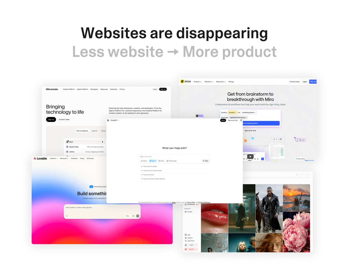
Felix Haas predicts that traditional marketing websites are becoming obsolete and will give way to interactive products or 'agent hubs'. Ken advocates removing landing pages, and Ugo says he is deleting his own. Most other posts instead refine hero copy and structure.
Open debate
Nick Theriot writes that the more he tests landing pages and creatives, 'the more I realize none of it matters' compared with strong offers. By contrast, Matt Paulson reports that changing a single H1 moved his conversion rate from 10% to 15%, which he calls a 50% lift.
Open debate
Adam Hayes recommends including a product demo on the page. Yannick Ferire reports something different: his free-trial conversion went from 7% to 15% after he removed the free editor from his landing page and added more proof and context.
Open debate
Jacob reports an AI-built listicle that was live within 20 minutes and is outspending the original ad at half the CPA. Alex found that Manus produced off-brand output. He suspects the people getting good results are seeding it with rich, structured context.
What performs
The top outlier is Cody Schneider's tutorial on matching keywords and ads to the H1, with a score of 382.49 (47.57x the median). Felix Haas's prediction scored 377.94 (47.01x). Tutorials have a median score of 19.06, compared with 7.135 for lists.
The paid-traffic and message-matching theme covers only 16% of posts but has a median score of 19.15, the highest of any theme. Headline clarity covers 38% of posts and has a median of 6.674.
Case studies have a median score of 10.24, compared with 7.135 for lists. Jacob's CPA case study is the third outlier, with a score of 145.02 (18.04x the median).
Posts with media make up 46% of the set and have a median score of 7.764, slightly below the 8.316 median for text-only posts.
The product-first theme covers 6% of posts and has the lowest theme median score, 3.285. It nonetheless includes Felix Haas's prediction, the second-ranked outlier.
Statistical standouts
Creator landscape
The five most represented creators account for 20% of the selected posts.
1. Barry Hott ☄️
@binghott
2 posts
2. Jackson Blackledge
@blvckledge
2 posts
3. Mery
@dont_be_average
2 posts
4. Hardik Gohil
@GohilHardy
2 posts
5. Blake Emal
@heyblake
2 posts
6. Solopreneur Dad
@JonBuildsHQ
2 posts
The set includes 40 creators, and the top voices each posted twice. The top five account for 20% of placements. Among the listed repeat posters, Namya @ Supafast has the highest median score, 19.97.
Barry Hott warns against comparing PDP conversion rates with those of paid-only landing pages, because traffic intent differs. Jackson Blackledge reuses old Meta landers on Google and shapes pages around how each market shops.
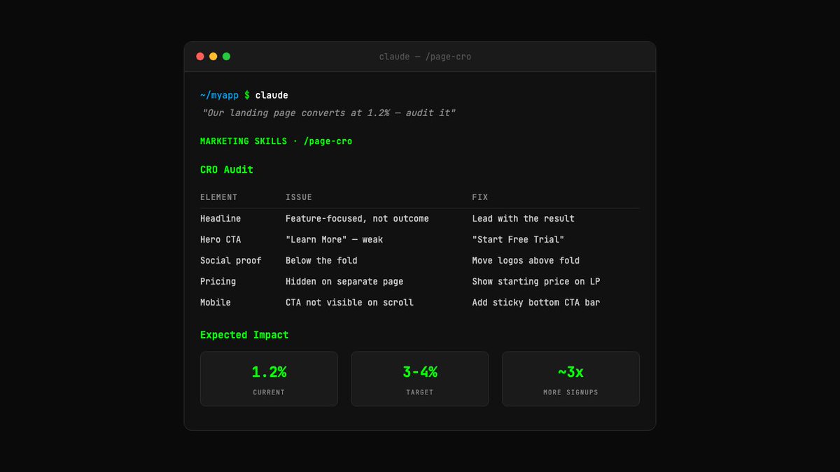
Corey Haines announces a /page-cro Claude Code skill, the fourth-ranked outlier with a score of 105.29. Andrew Zacker shares a Claude prompt for generating five page variants. Germán Merlo shares one for critiquing copy.
Since the previous snapshot
Themes, sentiment, stance, and post format are classified per tweet. All counts, shares, medians, creator concentration, freshness, and performance comparisons are then calculated directly from the published snapshot.
Xholic's all-time score compares engagement while accounting for reach, post age, and creator consistency. It is used for relative comparisons within this collection.
This report analyzes the exact 50-post snapshot shown below. AI identifies editorial categories and drafts explanations; all statistics are calculated from the snapshot, and every narrative claim is checked against cited posts before publication.
Best Landing Pages tweets
Ranked 01–50

@codyschneider ·
please pls stop overcomplicating paid ads for saas just do this google ads find bottom of funnel keywords related to the product phrase match bidding on those keywords landing pages H1 title and Paragraph 1 have the keyword you're bidding on have a conversion event for signup have a conversion event for payment facebook ads target all of facebook test 10 pieces of ad creative a week the winners go into their own conversion campaigns with dedicated spend make landing pages H1 title and Paragraph 1 related to the ad have a conversion event for signup have a conversion event for payment create a dashboard to track all of this data use something like Graphed or looker studio measure ROI by looking at CAC vs customer lifetime value vs payback period if you put $1 in and $5 of customer lifetime value comes out you're good if you want this link below

@felixhhaas ·
𝗣𝗿𝗲𝗱𝗶𝗰𝘁𝗶𝗼𝗻: 𝗪𝗲𝗯𝘀𝗶𝘁𝗲𝘀 𝗮𝗿𝗲 𝗱𝗶𝘀𝗮𝗽𝗽𝗲𝗮𝗿𝗶𝗻𝗴 🔥 I see a lot of founders still building websites the same way they did ten years ago. But if they don't adapt, they'll loose customers. Here's why: The best converting websites in the age of AI aren't websites at all. They're the product. Historically, websites were marketing billboards. Hero sections, feature lists, testimonials, pricing tables. You'd scroll for minutes just to understand what a product does. That made sense when attention was cheap and patience was abundant. But in the age of AI, that's no longer good enough. People are crazy impatient these days. If they don't see value in the first five seconds, they're gone. They don't want to read about what your product can do, they want to experience it. That's the new default. And it has massive implications for how we design landing pages and conversion flows. Take most SaaS websites as an example. Landing on a typical site today means reading walls of text, watching explainer videos, filling out demo request forms. A lot of friction... Now, imagine an AI-native flow: You land on the page with a specific problem. The product is right there, live and interactive. You start using it immediately and see real value in seconds. Sure, you still need to sign up to save your work, but everything else just happens. I'm pretty sure the traditional marketing website is becoming obsolete. Once people expect instant interaction, they won't tolerate passive content. Letting users explore your product immediately builds infinitely more trust than any hero section ever could. And once they've experienced the value, upselling becomes so much easier. People are no longer buying a promise but something they've already used. I think one of the early growth factors for Lovable was exactly this. We doubled down on the "instant value" approach. You land on the site and just start building. The product teaches you how to use it by using it. And most AI companies are doing it this way now btw: Midjourney, ChatGPT, Google. Even ElevenLabs does it. Shows instant value by demonstrating the product. My prediction is that every company will eventually transform their website into an "agent hub." You'll land on a page with a specific problem. An AI agent greets you and asks what you need. The agent starts working immediately, generating your design, analyzing your data, writing your content. You see real results in seconds. Then, to save or export, you sign up. If I were to start a company today and design a new website, here's what I would do: I'd think about the single biggest pain point and why users are coming to me. Then, I wouldn't try to sell them a solution, but show them one. Let them interact with one. Make them fall in love with it. The best websites won't explain what they do. They'll just do it. What's your take on this?

@jforjacob ·
The best thing about building landing pages with AI is the speed at which you can deploy them there is no longer any excuse not to have a unique landing page for every winning angle you run Example here: We tested a completely new angle (going straight to PDP) Saw it was picking up spend and performing decently Took ad transcript, got AI to build a simple listicle based on the transcript and had it live within 20 mins Duplicated the original ad in same campaign and is now outspending the original ad at half the CPA Screenshot here shows total spend for each ad so far (original has been running 5 days longer than new one) but new one now spending around 3x what the original is today) Will now shut off original and and start making improvements to new landing page But I genuinely feel this is the way. Don't worry about making every funnel perfect before launching Just get it out the door quickly, see if it shows signs of life then invest more time and money


@coreyhainesco ·
I built a skill for Claude Code that audits any landing page and tells you exactly why it's not converting. You give it a URL and it comes back with a full CRO breakdown — your headline is too vague, your CTA says "Learn More" instead of something people actually want to click, your social proof is buried below the fold where nobody sees it, your pricing is hidden on a separate page when it should be right there on the landing page. Every issue gets a priority level and an expected impact estimate so you know what to fix first. Most pages have 3-5 quick wins that can double conversions without a redesign. It's called /page-cro and it's part of Marketing Skills — a free, open source collection of 32 marketing skills for AI agents like Claude Code, Cursor, and Codex.

@marclou ·
I started tracking scroll depth on all my landing pages and noticed that on average, 50% of visitors don't even bother scrolling past the hero section. You don't need more traffic. You don't need more features. You don't need to overengineer onboarding. You need a better headline.


@andrewzacker ·
pro tip: tell Claude Code: “build 5 versions of the landing page at /1, /2, /3, /4, /5, use a completely different design approach and structure for each” you’ll be surprised how much better your pages gonna become note: tip inspired by @theo

@nicktheriot_ ·
Never send cold Facebook traffic straight to your Shopify product page. Send it to a pre-sell landing page. Each page = → 1 benefit-driven headline → 1 opening story → 1 problem/solution frame → 1 stacked social proof block → 1 clear CTA to the product Let the page do the selling. Once it converts → duplicate the ad, swap the URL, keep the CBO.

@namyakhann ·
Every landing page that converts follows the same arc. - Hero hooks attention in 5 seconds. - Pain section makes them feel the problem. - Solution gives them hope. - Testimonials build trust. - FAQs kill the doubt. - CTA closes with one clear action. Stranger to customer. That's the arc Hero → Pain → Solution → Proof → FAQs → CTA.
 Watch video
@mehrab_build ·
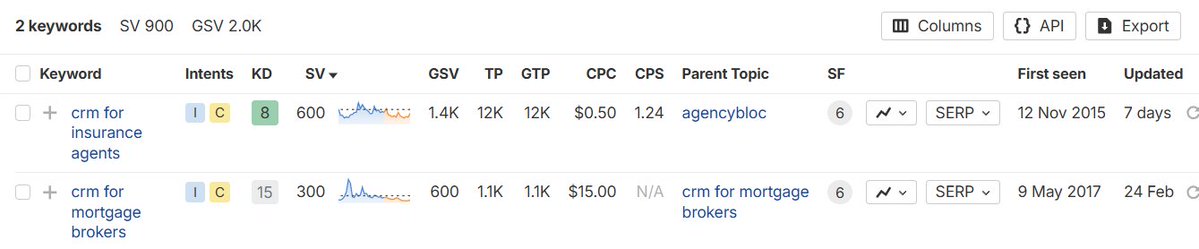
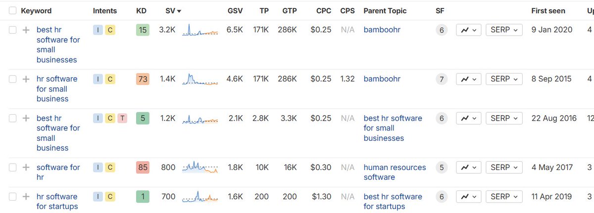
Here's how 90% of SaaS founders do SEO: They use AI to publish 30 articles a month targeting keywords like "what is churn" or "how to improve retention." They exchange backlinks with sites that have nothing to do with their niche. Then they wonder why traffic doesn't convert. Here's how it should be done: Build landing pages targeting transactional keywords like: - crm for insurance agents - crm for mortgage brokers - hr software for startups Add content to each page with internal links connecting them together. Then publish alternative and comparison content: - "X vs Y" posts where you compare two competitors, then position your product as the better option - "X alternative" posts where your product is the top recommendation Finally, split your backlinks intentionally. Half to your homepage, the rest to your landing pages and conversion content. Your traffic will grow. But more importantly, it'll convert. Which is the whole point of SEO.


@Layton_Gott ·
Your landing page is probably broken... Run this test to see: Show it to someone for 5 seconds. Close the tab. Then ask them: → What does it do? → Who is it for? → Why should they care? If they can't answer all 3, your headline is the problem. Not your product. Not your pricing. Not your traffic. Fix that before you spend another dollar on ads. Its the very first thing people see.

@Tegadesigns ·
If you're looking for good landing page inspiration, don't just search “best landing pages.” Search by industry: SaaS. Fintech. Healthcare. Fashion. E-commerce. Then study 10 websites in the same space. You'll start noticing patterns very quickly.
@nicktheriot_ ·
The more I test landing pages and creatives The more I realize none of it matters All of our highest spending / scaling client accounts All have strong offers Not the generic 50% off bs that you see on here But actual offers that can be broken down into a couple things I call this the 3 p's of a great offer People Perceived value Packaging People = your target audience (avatars, niche, persona) whatever you want to call it. It's the person you're talking to. Perceived value = the transformation you're offering that person and how your product gets them there. I also like to use Alex Hormozi's value equation for this. Packaging = this is how you communicate this offer to people. This is your product page, creatives, and landing pages. This gets all the power from People and Perceived value being dialed in

@NaivaidyaY66600 ·
A small thing I’ve noticed while reviewing startup websites: Most founders don’t need a “prettier” landing page. They need a page that answers faster: • what is this? • who is it for? • why should I care? • what should I do next? Good design is clarity, not decoration.

@neilpatel ·
Every customer buys two things. The product and a better story about themselves. Someone buying skincare is not just buying a cream. They’re buying, “I still look good.” Someone buying accounting software is buying, “I have my business under control.” Someone buying a course is buying, “I’m capable of figuring this out.” That second purchase is where most landing pages lose the sale. They explain what the product does, list a few benefits, and hammer the customer’s pain. But they never answer the silent question underneath every purchase: “What will buying this allow me to believe about myself?” I call this the identity payoff. Before I build a landing page in GoHighLevel’s AI Studio, I ask AI three questions: What is the customer buying? Who do they want to feel like after they buy it? What are they afraid their current problem says about them? Then I give AI Studio this instruction: “Write this landing page around the customer’s identity payoff. Show what the product helps them do, but also what it helps them feel and believe about themselves. Address the problem without shaming them, and make the purchase feel like proof that they are becoming the person they want to be.” Because customers rarely choose the product with the most features. They choose the product that reflects the version of themselves they want to see. Your landing page should not just sell them something. It should show them who they get to become by buying it.
 Watch video
@heyblake ·
The #1 landing page killer: Too many decisions One page One offer One CTA

@MediaKing ·
Changing a single H1 tag on a landing page moved our conversion rate from 10% to 15%. That's a 50% lift from one line of copy. Before you buy more traffic, make sure the page you're sending it to actually converts.

@Kappaemmedev ·
I BUILT A LANDING PAGE FOR MY FIRST CLIENT🚀 The client I’m building a coaching app for also asked me to create a landing page for his business. We wanted the design to feel connected to his method, so we went with a Japanese / karate inspired style. His coaching program is divided into phases, and each phase works like a karate belt: you grow, level up, and unlock the next one. So I tried to bring that idea into the landing page through the visuals, structure, and overall feeling. Here’s the full page in a 1minute video. What do u think? What would you improve?
 Watch video
@yannick_ferire ·
Updated my landing page yesterday 📈 doubling the free trial conversion rate → removed the free editor on the landing page → added more proof of concept and context Here is the breakdown: 🧪 15% conversion to free trial (7% before) 👀 2+ minutes session time (+47%) 🏀 59% Bounce rate (-17%, lower the better) 💸 3 new paying users (my best day so far) Still room to improve! What would you change next?


@natiakourdadze ·
High-Converting Landing Page Structure of Y Combinator (YC) Startups! → Hero Section → Problem agitation → Transformation → Social proof → Features → Pricing → Testimonials → FAQ → Final CTA → Footer


@JonBuildsHQ ·
The more landing pages I look at, the more convinced I am that conversion starts before design. It starts with clarity. The landing page must answer: - What is this? - Who is it for? - Why do I need this? - Why do I need it now?
@namyakhann ·
3 reasons most saas landing pages don't convert: 1. they build design-first, not conversion-first. looks pretty, says nothing. 2. the copy is an afterthought. headline is generic. CTA says "learn more." visitors leave because they have no clue who the page is even for. 3. no system. every new page starts from zero. no framework, no brand guide, no design system. takes forever and nothing compounds.
 Watch video
@heyitsalexP ·
Manus for Landing Pages - Initial Impressions I've been seeing a lot of folks on the timeline gas up this feature, so I decided to take it for a test drive. What I did: 1. I asked Manus "what do you need from me to build out a lander around a new angle. It asked for brand guidelines, product info, details on the angle, a landing page template to work from 2. I told it to use the brand's website for brand and product info, gave it a detailed 3 paragraph brief on the angle, and told it to use a reference from another brand for the lander layout and content. 3. It said "great" and took about 10 minutes to build me a live lander...that left a lot to be desired: Branding was wayyyy off. Looked nothing like our website. Fonts were totally different. AI generated images were not brand aligned. Outline was good, but it was giving too much focus to the technical aspects of the mechanism, not enough focus on emotions or outcomes. Takeaway: as I suspected, the folks getting the most out of this feature are likely seeding it with rich, structured context to enable a better outcome. Of course, no one talks about that on here because it isn't "sexy", and the know-how behind it is also "alpha". Next steps: I'm going to build out a context kit for landers–which will probably take me about a week–and then try again. Because if I CAN get this right, it will be powerful. Here's the ugly truth/missing piece in this discussion: When it comes to AI, context enables scalable outcomes. Context comes from reps, and the quality of context is amplified by structured thinking. No one is talking about this, and certainly no one is giving it away for free. If your AI work is outputting slop that doesn't convert–that's why!

@dont_be_average ·
I just shot this landing page review for @NaivaidyaY66600 Thought I should share it, there might be ideas in here you can use for your Saas too. (Watch the full video below) Quick takeaways: - Your best copy line is buried at the bottom (move "transforming your idea into a market-ready product in 21 days" to the headline) - Never send cold traffic straight to pricing, you're skipping the entire sales process - Speed is a weak USP in the AI era, lead with outcomes like "secure your Series A funding" instead - Real testimonials need to be above the fold (avg scroll depth is only 20%) - Change "Our process" to "How it works" (answer their question instead of talking about you/the company) - Install Clarity/heatmaps (this will be your north start for further conversion rate optimization). Hope that helps!! VIDEO LINK: https://t.co/Xci3sufKEy
@dont_be_average ·
I've tested thousands of landing pages, here are the elements you MUST have to increase conversions (save this): HEADLINE: Who + Specific Result + Timeframe SUBHEADLINE: Supports headline, adds specificity or mechanism tease HERO: Image or video showing result/transformation CTA BUTTON #1: Above fold TRUST BAR: Logos, ratings, "X customers" PROBLEM SECTION: Name the pain clearly AGITATION: Make it visceral. Cost of inaction. UNIQUE MECHANISM: Why everything else failed, why this works BENEFIT STACK: Features → Benefits → Deeper Benefits SOCIAL PROOF: Real screenshots, names, specific results OFFER STACK: Everything included + dollar values PRICE REVEAL: After value is established GUARANTEE: Zero risk framing QUALIFICATION: Who it's for / not for FAQ: Top 5 objections answered directly FINAL CTA BLOCK: Restate promise + guarantee + action P.S. LINE: Last hook, urgency, or restate guarantee
@Layton_Gott ·
Before you redesign your landing page, do this: Send it to 3 people. Give them 7 seconds. Then ask them: What does it do? Who is it for? Why should I care? What do I click? If they miss any of those, don’t touch the design yet. Your hero is broken.

@aliscodes ·
i ran my own landing page through 9 design critique prompts. it found 28 things i'd missed. including one that kills my credibility above the fold. all 9 prompts below 👇 (save for later)


@semrush ·
Here's what to do to make your landing pages load faster (and convert better): • Upgrade your web hosting • Use a CDN to serve content closer to visitors • Compress images and switch to WebP • Minify JavaScript and CSS files • Remove unnecessary scripts and tracking codes • Improve your Core Web Vitals with PageSpeed Insights Faster pages = lower bounce rates + higher conversion rates. https://t.co/qk9oY6qjGg.


@geoffwoo ·
a founder told me their best landing page test was deleting 80% of the tasteful copy. old page: “transforming revenue intelligence” new page: “we find the 12 accounts your rep forgot to follow up on” same product. suddenly buyers understood the wound.
@JonBuildsHQ ·
Most landing pages don’t have a traffic problem. They have a conversion leak problem. Which is often due to: -lack of clarity -lack of trustworthiness -on-page friction

@blvckledge ·
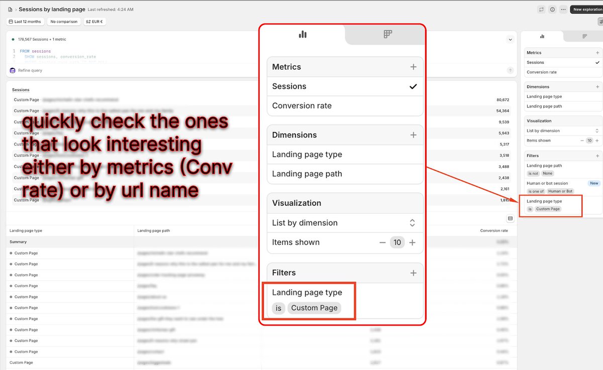
fyi, you can reuse your old meta landing pages and let them rip on google easy €19.7K just 30 days after launch. from a page the brand had completely forgotten about. here’s how you can run the same play: for context, this is a cookware brand we work with we were digging through their shopify and found a landing page that had gotten zero traffic for 3 months. the angle was "michelin star chef recommendations for pans." they'd moved on to a new creative direction for meta, so the page just sat there untouched. thing is, that page was converting 14% above their average before they stopped. we knew it worked. so we launched a demand gen campaign on google, in-feed image ads on youtube and discover now it's spending €500/day profitably. most brands have 5-10 pages like this collecting dust. that's five, six figures in revenue if you direct the right traffic to them on google. here's the process we use to find and monetize them: go to shopify → analytics → sessions by landing page filter for custom landing pages only sort by conversion rate look for anything at or above your average that's had flat traffic recently once you know what page you're working with, build the campaign to match: - advertorials/listicles → search ads, demand gen (in-feed image on youtube & discover) - us vs.them → search ads/pmax targeting competitor’s traffic - top x products → search ads targeting research keywords (e.g. “best mattresses) - sales page → search, shopping & demand gen - quiz funnel → youtube ads go check your analytics today. the revenue you're looking for might already be in your account.

@GohilHardy ·
Your landing page is killing your growth. Check this: - can a stranger understand it in 5 seconds? - is the value obvious? - is there one clear action? If not, fix this first.

@omarships ·
Your landing page is a reflection of how well you understand your customer. It forces you to reconcile features with clarity. Talk to customers. Kill what doesn’t work. Find your wedge. Then answer one question: “Why should anyone care?” Curious what you think 👇
 Watch video
@alexabelonix ·
Your landing page should behave less like a brochure and more like a junior salesperson with manners. Most startup pages only explain: what we do features CTA maybe some logos if we’re feeling rich But a revenue page should qualify: Who are you? What workflow is broken? How urgent is this? What are you using now? What would success look like? Do you want a demo, asset, audit, or setup? Then route the person correctly. Hot lead → founder alert Warm lead → case study Cold lead → useful asset Bad fit → no founder time wasted A website should not just look good. It should reduce sales chaos.

@GohilHardy ·
Landing page checklist that converts 📈 - Clear headline (what + who) - Problem → solution - Social proof - Simple CTA - Fast loading Confused users don't convert.

@maxwellfinn ·
Almost nobody actually reads your landing page the way you do. A vast majority simply scan it (same thing with your ads). They hit the page and their eyes quickly move down the page hitting the headlines, the subheads, the bold lines, the images/graphics and the CTAs. In those few seconds they decide whether the page is worth actually reading or they bounce. Unfortunately, most brands create pages for the small percent who read every word and ignore the masses who are just scanning. If you deleted every paragraph and left only the elements listed above, the page should still tell the whole story and still make the offer compelling. It's pretty easy to test whether your page is good enough for the skimmers. Pull up your page, scroll it fast like a normal person would and only read the stuff that jumps out. Even better would be having a friend and/or relative do this as well.

@Adam_Ha_Yes ·
Do you want a high-converting landing page? With a few simple tweaks you can double your conversion rate. Here are the 7 questions I ask when building every landing page: 1: Does my site load fast? > Target: <1 second load time > Every extra second = 10–15% traffic loss > Use Google Lighthouse to check The designer in me hates this, but you have to cut heavy assets if they're killing performance, trust me it's worth it. Performance > pretty 2: Do I have a low Low-Friction CTA? > Find a simple value adding action for users to take > Don't ask for money upfront in your funnel, high churn > Think through what incentivizes someone to take the next step (e.g., book a demo) Simple phases like "Try for free" or "Get 1,000+ ideas" convert 2x better then "Start a demo" or "Enter your CC" 3: Do I pass the "Above the Fold" test? > User should know what you do without scrolling > Formula: clear headline → body copy (elaborates + hints at ICP) → low-friction CTA → product image for context If a user doesn't know what you do before scrolling, you're being too ambiguous. Your goal isn't to confuse your customers! Ditch the cute taglines and instead be as literal as you can. 4: Do I have social proof? > No users yet? Pull quotes from respected figures in your industry > Show investors if you have them > As you grow: text quotes → video testimonials → whatever you can get Always be collecting testimonials, social proof, videos, and case studies. Social proof is one of the most important things most sites are missing. 5: Do I have a product demo? > Doesn't need to be expensive, a Loom works > Script: "Hey I'm X, I built this because Y, here's a quick walkthrough" > Builds trust, explains the product, humanizes the brand Some % of your users prefer to read, another might prefers to watch a video. Give as many hooks as possible for users to convert. 6: Have I put my brand in a good light? > Does the site look like it was made in the last 10 years? > Use templates if design isn't your thing > No clip art, no bad stock photos, AI killed the excuse for bad design If you're selling a marketing agency but your website looks like crap, so will your conversions. Think deeply about how you actually want to present yourself to the world. 7: Do I pass the "Is It For Me?" test? > Visitor should immediately know if they're the target customer > Be hyper-specific: "for influencer marketing managers at D2C brands doing $5M+ revenue" > Use your ICP's actual language > Don't try to be everything for everyone... specificity = better conversion You need to spend a lot of time obsessing over who your customers are and are not. Speak to your customers, and ignore everyone else. Thanks for reading, if you drop your website in the comments I'd be happy to give some feedback. (this video did 100,000+ on TikTok let's see how it does lol)
 Watch video
@heyblake ·
A landing page that converts has 3 elements in the first scroll: 1/ A headline that names their problem 2/ A promise that names their outcome 3/ Proof you've done it before Miss any of these and users will bounce.
@binghott ·
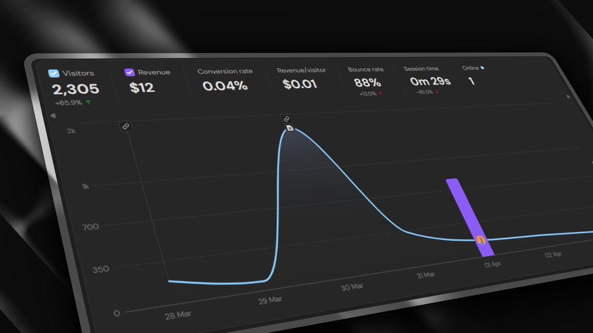
Stop comparing your PDP's CVR against your landing pages. Your landing page only gets paid traffic. Your PDP gets organic, email, Google, direct... all of it. Those sources have completely different intent levels, and that changes everything. High intent sources like Google, email, and ChatGPT convert way higher than Meta or TikTok. Like, not even close. Those people came in already looking for a solution. They're problem-aware, brand-aware, ready to buy. Meta and TikTok audiences weren't looking for anything. They stumbled on your ad mid-scroll. They need more education, more proof, more convincing before they'll buy. The mistake is expecting those pages to perform the same. What works for a high-intent visitor is not what works for a colder social audience. They need different pages, different structure, different messaging. Segment your data by traffic sources so you can better understand the differences. Build pages for the audience that's actually landing on them.

@terencebuilds ·
Things I've learned about landing pages the expensive way: - Your hero should name the problem, not the product - Social proof matters more than features - One clear CTA. Not three. Not two. One. - Testimonials without a face don't convert - "Learn more" is where signups go to die - Above the fold is 60% of the decision - Speed is a feature (2s = death) - The FAQ handles more objections than any copy Save this before your next redesign. #BuildInPublic
@blvckledge ·
easy landing page win for ecom brands adjust your page around your market’s shopping behavior the idea is: different markets care about different stuff on the page. for some products, customers want to stock up and get a better deal buying in bulk. for others, they're looking for complementary products to go with it. in others, they enter through one listing and need more options to compare. every market has its own buying habits. and you should build the page around how people shop by: - adding new sections - removing unnecessary ones - changing the order of information - etc let me walk you through an example… in furniture, people want to compare options in your collection. they want to look through colors, materials, styles, and get a feel for what fits before making a decision. (this is usually true in apparel, home goods, etc too) in that case, adding a section featuring similar items (image below) can give you a big lift in conversions. i know it sounds backwards. you’d think showing more options gives people more reasons to bounce. but one test we ran increased the conversion rate by 2-3x. obviously this depends a lot on the category. my point is small changes can have a huge impact when they line up with how customers want to buy.


@AtSynct ·
I advocate for removing landing pages and converting "visitors" to "users" as soon as humanly possible. Just show them your primary feature and get them clicking through it to understand the benefit. Does anyone have a "no, landing page" counter-argument?

@yusukelp ·
I built a page showing the difference between weak trust and believable trust on landing pages. Most testimonials don’t increase conversions. They just take up space. So I made a visual breakdown of: - weak vs strong testimonials - proof placed badly vs proof near the CTA - decorative trust vs credibility that actually helps



@ugo_builds ·
My landing page is a liability People land, there's a 50% chance they don't understand what the app is about They leave Conversions depend on people seeing and using the app Improve the landing page you say? No... → I'm deleting the landing page
@binghott ·
New IG Ads Feature! Found this new feature where it loads the landing page inside the comments. Pretty smart way for Meta to shift high intent users from comments to the site annnnd maybe inflate link click numbers. I have so many questions and a couple thoughts... Questions: 1. Was anyone notified about this? 2. At what point exactly does this count as a "link click" in Ads Manager? When the full page takes over the whole screen? 3. How is this impacting external tracking? This will surely track more visits and bounces... 4. Is this a new trick for Meta to gobble more externally measured attribution credit? 5. What determines if your page gets shown here or doesn't? I'm still seeing ads that don't do this. Thoughts: A. Seems like landing pages with highly relevant and potent headlines and imagery will help win here. B. Don't let your cookie consent bar block your entire page's content in this view little view.

 Watch video
@zuess05 ·
The anatomy of a landing page demo that actually converts: → Under 30 seconds long → Auto-zooms where the mouse clicks → Text is perfectly readable on mobile → Clean, distraction-free background If they don't understand it in 10 seconds, you lost them.
@semrush ·
Could Google replace underperforming landing pages with AI-generated versions? Earlier this year, Google was granted a patent for a system that has the potential to replace underperforming brand landing pages with AI-generated versions. There’s no confirmation from Google that the AI landing page patent is being used or ever will be, but it's worth understanding what this patent describes and what you can do now to prepare for continued success. Here’s what you need to know: https://t.co/esZXittRoB.

@bil0090 ·
Here's how to build cool landing pages fast ⚡ 1. Go to @X & @figma, to find design inspirations (X is enough) 2. Go to @framer & start building your landing page 3. Go to Fuma Docs & create your docs 4. Link the docs with Framer That's it, you have a very cool landing page, that only took 1 day to build, now launch it!



@elgermerlo ·
Claude tip I use every week: Paste your landing page copy and ask: "What kind of person wrote this and what are they afraid to say directly?" It exposes where you're being vague because you're not sure who you're talking to. Humbling every single time. Fix those spots and conversions move.

@hridoyreh ·
Your landing page doesn’t need more traffic. It needs: • Better hook • Clearer outcome • Stronger proof Traffic amplifies, it doesn’t fix...

@SMExaminer ·
I was days away from vacation. My product site looked like it was built five years ago. And I had zero budget to fix it. That's when I decided to try something I'd never done before. In the past, I hired a user interface designer. He built the design system. Then I hired a WordPress developer to make it come to life. This process would take months and tens of thousands of dollars. This time, I didn't have the luxury of going that route. I needed something quick and it needed to look good. Then it clicked. There was a new way to solve this problem. A guest on my AI Explored podcast was raving about the relatively new Claude Design. It's capable of creating slides, wireframes, animations and… landing pages. It was a Saturday and I was just days away from going on vacation. No better time to try something new, right? What I experienced absolutely blew my mind. Here's what I did. I downloaded the product logo and masthead image from my AI Business Society sales page. The main image was an illustration of people in the wilderness pointing to a mountain. And the logo looked like a badge with earth-tone colors. I then went to Claude, clicked on the Design icon, and chose Design System. All I did was upload those two images and the URL of the landing page. Before my eyes, I saw the art elements come alive. Claude Design created motifs and surfaces (paper grain, trail rules, brass hairlines, dark fields), core brand colors (barn red, forest green, brass, sunrise ember…), fonts and spacing, buttons and icons, and a whole lot more. It also was able to clearly identify my style of writing. It keyed in on things like sentence rhythm, social proof use, and even outcomes over features. All of this was simply discerned from what little I gave it. What happened next was the big unlock. There was an option to create a landing page. So I clicked on it. It asked me if I would like to see multiple hero sections to select from. Of course I said yes. Then it started building out the full landing page. It wrote all the copy and it was good. It crafted all the sections. It was amazing. I was flabbergasted. I then downloaded the HTML file and sent it off to two of my staffers and texted them. They loved it. I would go on to art direct Claude Design by simply telling it what to change, just like I was talking to a person. We are now running a split test on the new design and so far it is winning. The initial design took less than an hour. Let me know if you want to see the before and after. Have you tried out Claude Design? I'd love to hear from you. - @Mike_Stelzner

Best Landing Pages tweets
Xholic studies what works in your niche, drafts posts in your voice and schedules them for the hours your audience is online.
$0 today · Card required · Cancel anytime
Browse all tweet collectionsLive demo: no sign-up or login needed · takes about 2 minutes
Keep exploring