X’s official interface font is Chirp, introduced on January 27, 2021, but the custom fonts people see in tweets are usually Unicode lookalikes, not a real font change. That distinction matters, because the first affects how X itself renders text, while the second only changes the characters you paste into a post, bio, or display name.
If you’ve ever searched for twitter fonts, you’re probably trying to solve one of two problems, you want to know what X uses, or you want your text to stand out without breaking readability. The trick is knowing when style helps and when it turns into noise.
What Are Twitter Fonts and How Do They Work
People usually mean two different things when they search for twitter fonts. The first is X’s own interface typeface, which is now Chirp. The second is the stylized text you can paste into tweets, bios, and names, which comes from Unicode characters that mimic bold, cursive, gothic, or other styles.
That difference is the whole game. X does not let you install a new platform font from settings, and it does not swap its UI typeface because a user pasted something special. Instead, it renders whatever text you type through its own system, while Unicode converters change the actual characters before they reach X.
The practical distinction creators need
If you want a cleaner, more on-brand feed, the native UI font is out of your control. If you want emphasis or visual flair in a post, you’re really choosing styled characters, not changing typography at the platform level. That’s why a bold-looking bio line can appear one way on one device and slightly differently on another.
Practical rule: use the term fonts loosely in search, but think in two buckets, platform font versus styled Unicode text.
This matters for creators, founders, and marketers because the wrong choice can make a post harder to skim, especially on mobile. It also matters for trust. If the text looks overly decorative, it can read like a gimmick instead of a clear message.
What Font Does X Actually Use
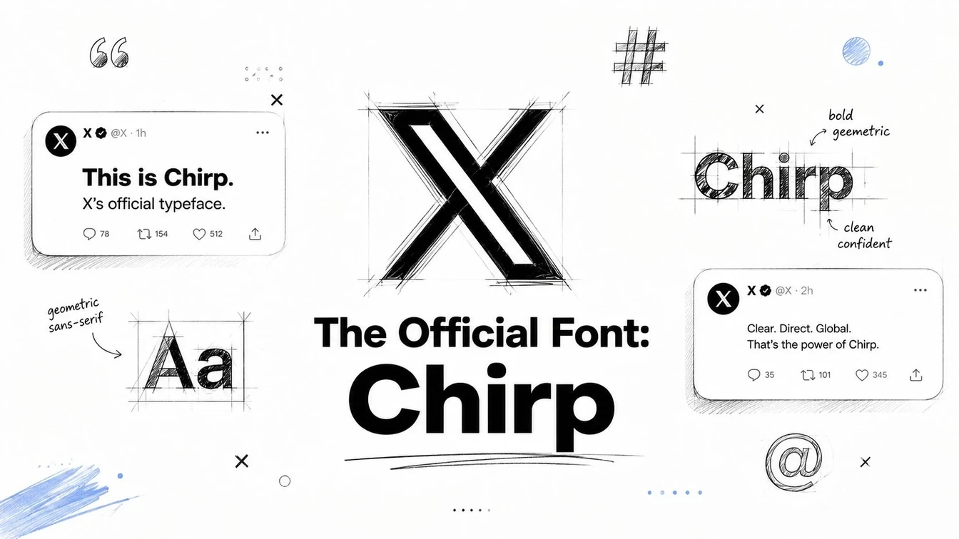
X’s current official interface typeface is Chirp, a proprietary sans-serif font introduced on January 27, 2021 and designed by Grilli Type. Before that shift, Twitter relied on a platform-dependent stack, which meant the same product could look different depending on whether someone was on Mac, Windows, Android, or web. Historical writeups note earlier defaults such as Helvetica Neue, Roboto, Arial, and Segoe UI, along with Georgia on permalink pages, which shows how fragmented the experience used to be, as documented in this font history overview.
Why Chirp was a meaningful change
Chirp was more than a cosmetic refresh. It gave Twitter, now X, a single owned typeface for the brand layer of the product, which meant the company could finally control the feel of its interface instead of inheriting default system behavior. That kind of consistency matters on a feed, where small differences in spacing and weight affect how quickly someone can scan a post.
The font also got OpenType stylistic sets to better distinguish commonly confused characters like I/l and 0/o, which improved legibility and reduced impersonation risk in usernames and posts, as described in this font breakdown. That’s a real product issue, not just a design preference. Clear character separation helps people spot fake accounts and reduces confusion in text-heavy conversations.
For creators, the takeaway is simple. X’s interface font is not something you customize from settings, and it’s not the same as decorative text in a post. If your goal is readability, consistency, and brand trust, Chirp already handles the platform layer well. If your goal is emphasis inside content, that’s where Unicode styling comes in, and you need to use it carefully.
You can also compare this with Xholic’s guide to Chirp and related font behavior if you want a broader reference point for interface typography.
How to Generate and Use Custom Twitter Fonts
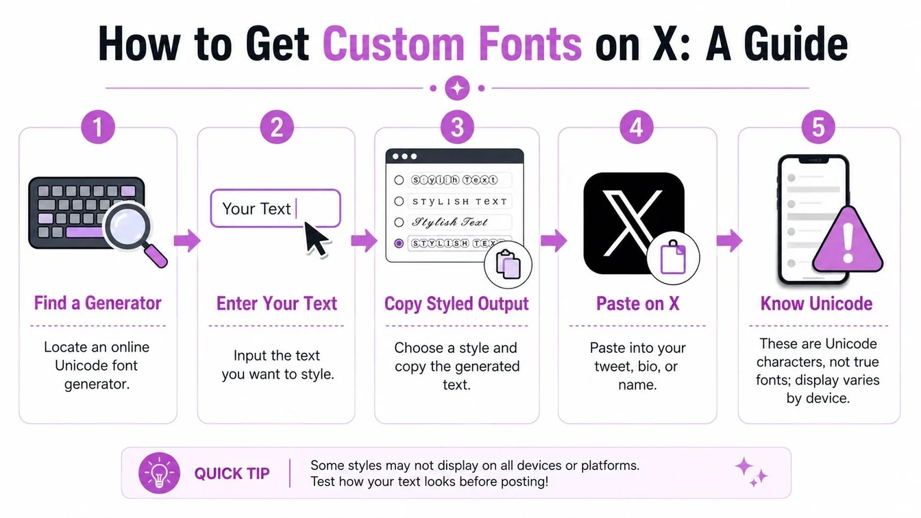
Custom-looking text on X comes from a generator that converts your plain text into Unicode-style characters. It is not a new font family inside X, and it does not change the platform’s native UI. It changes the text you copy so X displays it as stylized symbols.
A simple workflow for custom text
- Find a generator. Use a reputable Unicode text tool, such as Xholic’s Twitter Font Generator, or another copy-paste style converter that lets you preview multiple variants.
- Enter your text. Paste the exact phrase, hook, name, or short bio line you want to style.
- Choose a style. Test bold, italic, script, gothic, monospace, or bubble variants, then check which one still feels easy to read.
- Copy the result. The generator outputs Unicode text, so you can copy it like normal text.
- Paste into X. Drop it into a tweet, reply, display name, or bio and preview it before publishing.
X does not let users directly change the official UI font from settings. The post or profile text is altered by copying Unicode-styled text from a converter, and X renders it through its own standard font system, as this guide notes.
What to expect after you paste it
The result can look polished, but not every device will render it the same way. Unicode styling depends on the app, browser, and system font fallback behavior, not on a custom font installed inside X. That makes it fine for short emphasis, but less reliable for anything that must read cleanly everywhere.
Preview the text in context before you publish. A style that looks clear in a generator can feel cramped in a tweet, awkward in a display name, or harder to scan in a bio. Accessibility matters here too, because some decorative characters can create friction for screen readers and for people reading quickly on mobile.
If you want a quick test before posting, run the line through a simple X scheduling workflow and review the final version in draft form first. That extra check catches odd line breaks and spacing issues before your audience sees them.
When to Use Styled Text And When to Avoid It
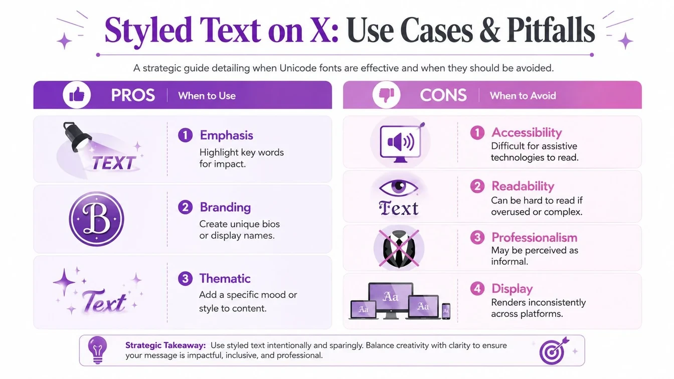
Styled Unicode text can help a post stand out, but it can also make your content look harder to trust. The strongest use cases are narrow. A short hook, a bio accent, or a display name tweak can work when the goal is quick visual emphasis. Once the text becomes the main message, the trade-off usually gets worse.
Where styled text helps
Unicode styling is useful when you need a small amount of contrast. A bold phrase in a bio can separate your positioning from the rest of the line. A stylized lead-in can make a short promotional post feel more deliberate. A themed visual identity can also give a profile a distinct tone, especially if the rest of the account is visually plain.
Where it usually hurts
The downside is just as real. Styled text can be harder to read, can render inconsistently across devices, and may create accessibility problems for screen readers, which is why many style-first guides feel incomplete, as noted in this critique of Twitter font advice. It can also make a profile feel overly promotional, especially if every post uses decorative characters.
Use styled text like seasoning, not like the main ingredient.
That rule matters most for names, hashtags, links, and anything people need to scan quickly. If a reader has to decode the typography before they can understand the message, the post is already losing. The same applies to threads and longer explanations, where clarity beats novelty every time.
For creators who care about how the account feels publicly, it helps to separate text styling from overall brand voice. A resource like Carlos Alba Media can be useful if you’re thinking about how public-facing presentation, messaging, and social strategy fit together. The practical principle is the same, choose the format that makes the message easier to understand, not just more noticeable.
A Better Workflow for Visually Planning Tweets
A common mistake is pasting styled text straight into X and hoping it looks fine. That usually leads to awkward spacing, weak hierarchy, or a post that looks better in the generator than in the feed. A better workflow starts with a preview that treats the post as if it were already live, then asks whether the styling earns its place.
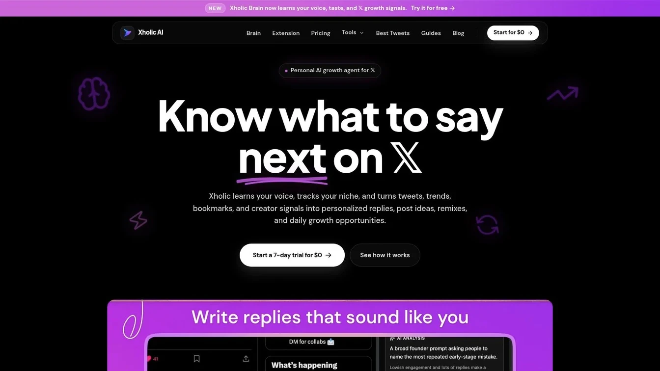
What to check before publishing
Read the post at feed size, not at full-screen zoom. If the headline or key phrase does not land immediately, simplify it. Then check how the text breaks on mobile, because a layout that feels roomy on desktop can become cramped on a phone.
A mockup view is useful for testing whether stylized text improves hierarchy or just adds clutter. It shows line breaks, spacing, and emphasis before the post is public. If you want a more disciplined planning process, Xholic’s tweet scheduling guide fits naturally here because previewing and scheduling belong in the same workflow.
A practical preview routine
Start with readability. If the core message takes effort to decode, strip the styling back. Then check hierarchy, make the most important line visually dominant, and let the rest stay quiet.
Compare the look on mobile and desktop before posting. A line that feels balanced on a monitor can look crowded on a phone. Finish by checking context, because styling that fits one account can feel performative on another.
For creators who care about how the account feels publicly, that same discipline applies to broader presentation and messaging choices. A resource like Carlos Alba Media can help if you are thinking about how public-facing presentation, messaging, and social strategy fit together. The practical rule stays the same, choose the format that makes the message easier to understand, not just more noticeable.
Twitter Fonts Best Practices for Creators
Use this checklist when you’re deciding whether to style text on X:
- Prioritize clarity: If people can’t scan the message quickly, don’t use decorative text.
- Keep styling short: Use Unicode effects for emphasis, not for long explanations or threads.
- Test on mobile and desktop: A line that looks balanced on a monitor can feel crowded on a phone.
- Avoid critical text: Don’t rely on styled characters for names, hashtags, links, or key instructions.
- Watch accessibility: Screen readers may not interpret Unicode text cleanly, so don’t use it where meaning matters most.
- Protect brand tone: If the style makes your post feel less trustworthy or more promotional, skip it.
If you’re building a brand around consistent social presence, it also helps to align typography choices with your broader messaging. Xholic’s brand voice guide is relevant here because visual style and written tone should reinforce each other, not fight for attention.
The simplest rule is still the best one. Use Chirp as the platform’s built-in standard, use Unicode styling sparingly when it supports the message, and default to plain text whenever readability is the priority.
If you want a cleaner way to test twitter fonts before publishing, use Xholic AI to preview your post, compare styles, and keep the message readable across devices. Visit Xholic AI to plan your next tweet with a workflow that puts clarity first and still leaves room for style.