You’re looking at an X analytics dashboard where everything appears to be moving in the right direction. Impressions are up, likes are up, and the engagement rate looks respectable. Yet your follower count barely changes, profile visits don’t lead to action, and your product analytics show no obvious lift.
That’s the central problem with Twitter analytics metrics. A metric rarely tells you what to do by itself. You need to read performance as a funnel, from exposure to interaction, then intent and finally conversion. A post can win one layer and fail the next.
X (formerly Twitter) also makes interpretation harder because access and definitions have shifted. Native analytics access is more restricted behind Premium on desktop, free users have more limited post-level views, and X distinguishes between different video-view definitions. The practical answer is to focus less on leaderboard numbers and more on metric combinations that explain where audience movement stops.
The Dashboard Trap Most X Creators Fall Into
A founder publishes a short post about a product problem, then checks the dashboard throughout the day. The post earns strong distribution, several likes, a few replies, and a healthy-looking engagement rate. It feels like a successful post.
A closer look tells a different story. The post generated few profile visits, no meaningful follower change, and almost no product interest. The founder got attention, but the attention didn’t travel anywhere useful.
This happens because impressions and likes are easy to celebrate. They’re visible, familiar, and emotionally rewarding. They’re also incomplete. Impressions tell you that X delivered the post. Likes show lightweight approval. Neither proves that people understood your positioning, wanted to follow you, or cared enough to explore your product.
Practical rule: Treat the dashboard as a diagnostic instrument, not a scoreboard.
The useful model has four layers:
- Exposure: Impressions, reach, and video views show whether content was delivered and consumed.
- Interaction: Engagement rate, replies, reposts, likes, bookmarks, and clicks show how people responded.
- Intent: Profile visits, follows, link clicks, mentions, DMs, and bookmarks indicate deeper interest.
- Conversion: Website sessions, signups, demos, sales, or other business outcomes show whether X contributed to a real objective.
The layers connect, but they aren’t interchangeable. High impressions with weak profile visits usually points to a visibility problem after delivery. High profile visits with weak follower growth may point to a profile-positioning problem. Strong engagement with weak conversion may mean the post entertained or informed people without presenting a clear next step.
Definition-level accuracy matters because X’s numbers are normalized differently. A raw engagement count can look impressive while performing poorly against the number of people who saw the post. The rest of this guide uses that funnel to determine which Twitter analytics metrics should change your next decision.
Exposure Metrics and What Impressions Actually Count
Exposure metrics answer the first question: did the post get in front of people? They don’t answer whether those people cared or acted.
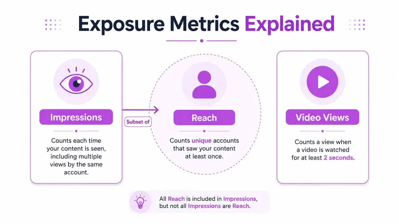
Impressions represent delivery events, meaning the number of times a post appeared in timelines or other X surfaces. They aren’t a count of unique people. If the same account encounters a post more than once, impressions can increase without the audience becoming larger.
Reach is the unique-account view of distribution. It helps you understand how many distinct accounts encountered the content, while impressions show the total number of appearances. In practical terms, reach sits inside impressions conceptually. A post can have many impressions because it was repeatedly served to a relatively narrow audience, or because it reached a wider set of accounts.
For a plain-language explanation of how impressions work, see this guide to what impressions are on Twitter and how they affect engagement.
Read exposure as distribution, not approval
A rise in impressions can come from several sources:
- Existing audience repetition: The post keeps appearing to people who already follow or regularly encounter the account.
- Broader distribution: More unique accounts see the post, which is stronger evidence of audience expansion.
- Conversation spillover: Replies, reposts, or quote posts place the idea in adjacent conversations.
- Format or topic fit: The post matches what people are currently discussing or consuming.
The simplest diagnostic is to compare impressions with reach. If impressions rise while reach stays flat, you’re mostly re-serving the same audience. That may help frequency and recall, but it doesn’t prove that distribution is expanding.
Video views need another layer of caution. X documentation distinguishes a newer 2-second MRC-style view from an older 3-second, 100% in-view definition, so views reported across surfaces may not be measuring the same viewing behavior. Don’t compare video views from different dashboards as if they were a single standardized unit.
A video view can confirm that a viewer met a platform-defined threshold. It doesn’t automatically confirm completion, comprehension, or intent. Pair views with available interaction and downstream metrics before deciding that a video format is working.
Engagement Metrics and the Real Meaning of Engagement Rate
Engagement is the second funnel layer. It tells you what people did after exposure, but each action carries a different level and type of information.
X’s activity dashboard breaks engagements into actions including likes, follows, hashtag clicks, link clicks, permalink clicks, replies, reposts, shared-via-email actions, and profile clicks, as documented in its official Post Activity Dashboard. X’s API also lists bookmarks, impressions, and bookmark count in its public metrics object, which makes bookmarking a first-class metric rather than an informal signal, as shown in the X API metrics documentation.
Think of the actions as different questions:
- Likes: Did the post earn quick approval?
- Replies: Did it create enough relevance, disagreement, curiosity, or community feeling to invite a response?
- Reposts: Did someone find it useful or distinctive enough to distribute to their audience?
- Bookmarks: Did the idea seem worth saving for later?
- Link clicks: Did the post create enough relevance or curiosity to move someone off the post?
- Profile clicks: Did the reader want more context about the person or product behind the post?
- Follows: Did the account’s promise feel valuable beyond this single post?
Engagement rate is normalized by impressions
X defines engagement rate as total engagements divided by impressions. That makes it a reach-adjusted resonance metric, not a raw popularity count. X’s own Post and Video Activity Dashboard definitions support this interpretation.
The difference is substantial. A post with 500 engagements and 5,000 impressions has a 10% engagement rate, while the same 500 engagements across 100,000 impressions has a 0.5% engagement rate, according to the worked example in this guide to Twitter metrics. The engagement total is identical, but the response per exposure is much weaker in the second example.
Recent benchmark analysis places the broad platform average around 0.045%, with median engagement per impression around 0.12%. The same analysis reports that accounts under 1K followers may average 0.1% to 0.3%, while accounts with 100K+ followers may fall around 0.02% to 0.06%. Those figures come from independent Twitter engagement benchmarks, and they show why account scale matters.
| Account size | Typical engagement rate | What it suggests |
|---|---|---|
| Under 1K followers | 0.1% to 0.3% | Tighter distribution can support stronger percentage efficiency |
| Broad platform context | Around 0.045%, with median engagement per impression around 0.12% | Small gains can outperform a low platform baseline |
| 100K+ followers | 0.02% to 0.06% | Larger reach can dilute percentage efficiency |
A 0.5% rate can be exceptional for a large account even if it would be less unusual for a smaller creator. Use the benchmark as context, not as a universal pass or fail threshold. This Twitter engagement rate calculator can help you calculate the ratio, but the important work is segmenting the result by account size and content type.
Two combinations are especially useful:
- Impressions rise, engagement rate stays flat: Distribution is expanding, but resonance may be weakening.
- Impressions and engagement rate both rise: X may be widening delivery without diluting relevance.
- Replies and reposts rise, likes stay flat: The post may be creating deeper conversation rather than passive approval.
- Engagement rises, profile clicks stay flat: People are interacting with the post but showing limited interest in the account behind it.
Intent Metrics That Separate Vanity From Real Growth
Intent begins when someone does more than react inside the feed. Profile visits, follower change, link clicks, mentions, DMs, and bookmarks help reveal whether attention is migrating toward a relationship, a resource, or a business action.
Profile visits are especially useful because they connect a post to curiosity about the account. A reader who clicks through is asking, implicitly, who you are, what you know, and whether your future posts are worth seeing.
A practical normalized metric is profile visits per 1,000 impressions. It compares curiosity across posts with different distribution levels. A post with modest engagement but strong profile-visit yield may be more valuable for audience growth than a widely seen post that produces many lightweight reactions and almost no profile exploration.
High visibility is useful only when it creates a next step.
Follower change adds the next test. If profile visits rise but followers don’t, inspect the profile promise. Your bio, pinned post, recent content, and positioning may not make the value of following obvious. Link clicks tell a related story for product-led accounts. They show whether the post created enough relevance to move someone to a website, waitlist, documentation page, or other destination.
Use intent metrics as a decision sequence
- Impressions are high, profile visits are flat. The post was visible, but it didn’t create enough curiosity about the account. Test a stronger point of view, clearer expertise, or a more specific hook.
- Profile visits rise, follower change stays flat. The post earns attention, but the profile doesn’t convert that attention into an ongoing relationship. Tighten the bio and pin a post that explains who the account helps.
- Profile visits rise, link clicks stay flat. The profile attracts interest, but the path to the product or resource isn’t obvious. Clarify the profile call to action.
- Bookmarks rise without public engagement. The post may be useful as a reference even if it doesn’t invite conversation. Preserve that content type for education, frameworks, or research.
- Mentions and DMs rise. People may be treating the account as a participant in a niche, not merely a publisher. Review the questions and topics behind those interactions.
X’s API treatment of bookmarks matters here. Because bookmark activity appears in public metrics, you can include it in a structured analysis rather than treating it as invisible feedback. Still, bookmarks don’t prove a purchase or signup. They indicate saved value, not completed conversion.
Why Engagement Can Improve While Reach Falls
Posting more doesn’t guarantee that each post will reach more people. Metricool’s 2026 study reported that weekly posting rose 8% in 2025, while impressions per post fell 5% to 2,711.39. During the same period, engagement rate rose from 1.32 to 1.58, replies increased 21%, reposts increased 35%, and profile clicks dropped 31%, according to Metricool’s X statistics analysis.
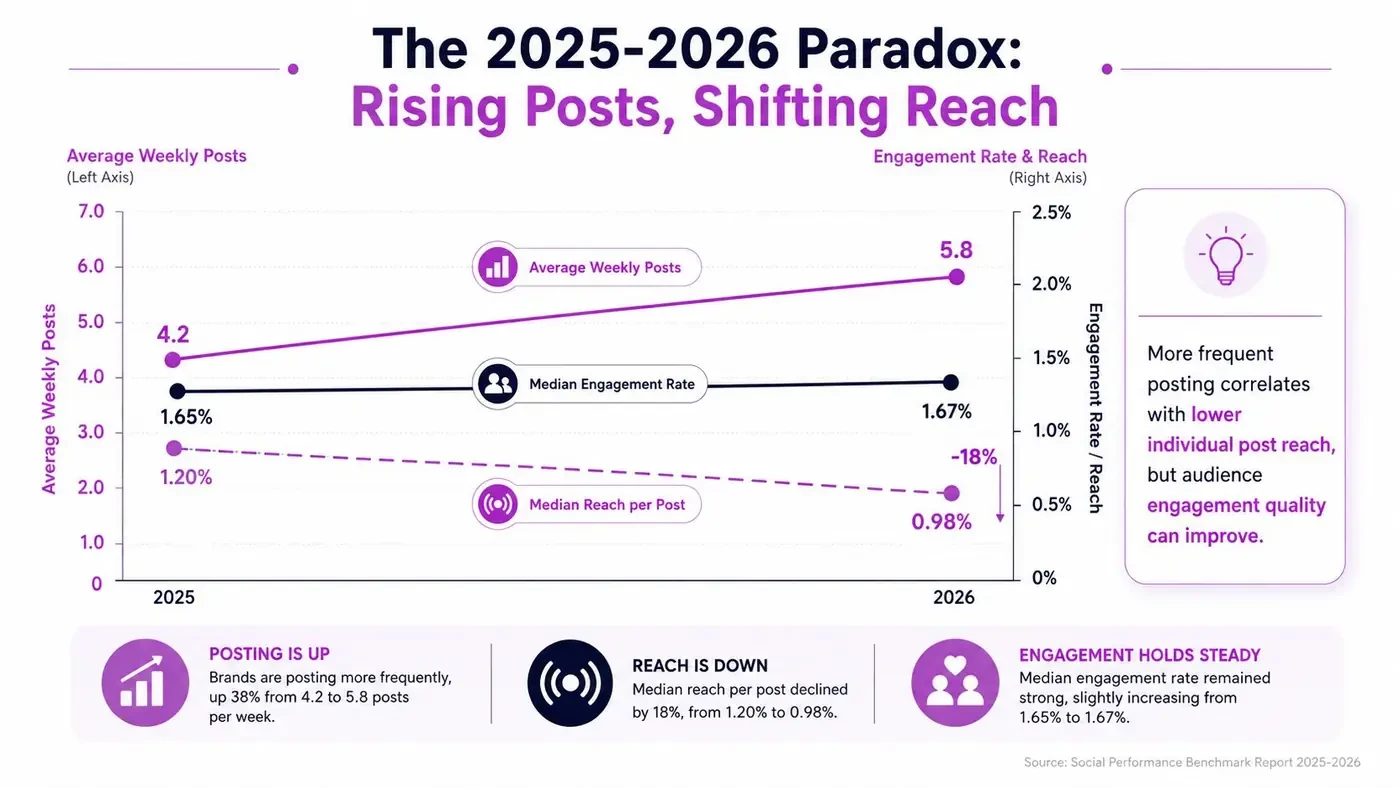
Those movements aren’t necessarily contradictory. A creator can publish more often, reach fewer people per post, and still attract stronger responses from the people who do see each post. More replies and reposts suggest deeper interaction, while falling profile clicks indicate that interaction isn’t automatically creating audience migration.
This pattern supports a more nuanced view of X as a conversation network, not only a broadcast channel. A reply can generate meaningful discussion without producing the widest possible exposure. A repost can extend an idea while the original post still reaches fewer accounts on average.
The correct optimization target depends on the outcome you need:
- Awareness: Prioritize impressions and unique reach, then check whether distribution is expanding beyond your existing audience.
- Community: Prioritize replies, mentions, and repeat conversational participation.
- Authority: Watch bookmarks, profile visits, and the quality of discussions your posts attract.
- Product growth: Prioritize profile visits, link clicks, follows, and conversion data outside X.
The mistake is celebrating higher engagement rate without asking what kind of engagement increased. More replies can be valuable for a founder building relationships. More likes may be less useful if the account needs signups. A falling reach number may be acceptable when the content is becoming more relevant to a narrower, higher-intent audience.
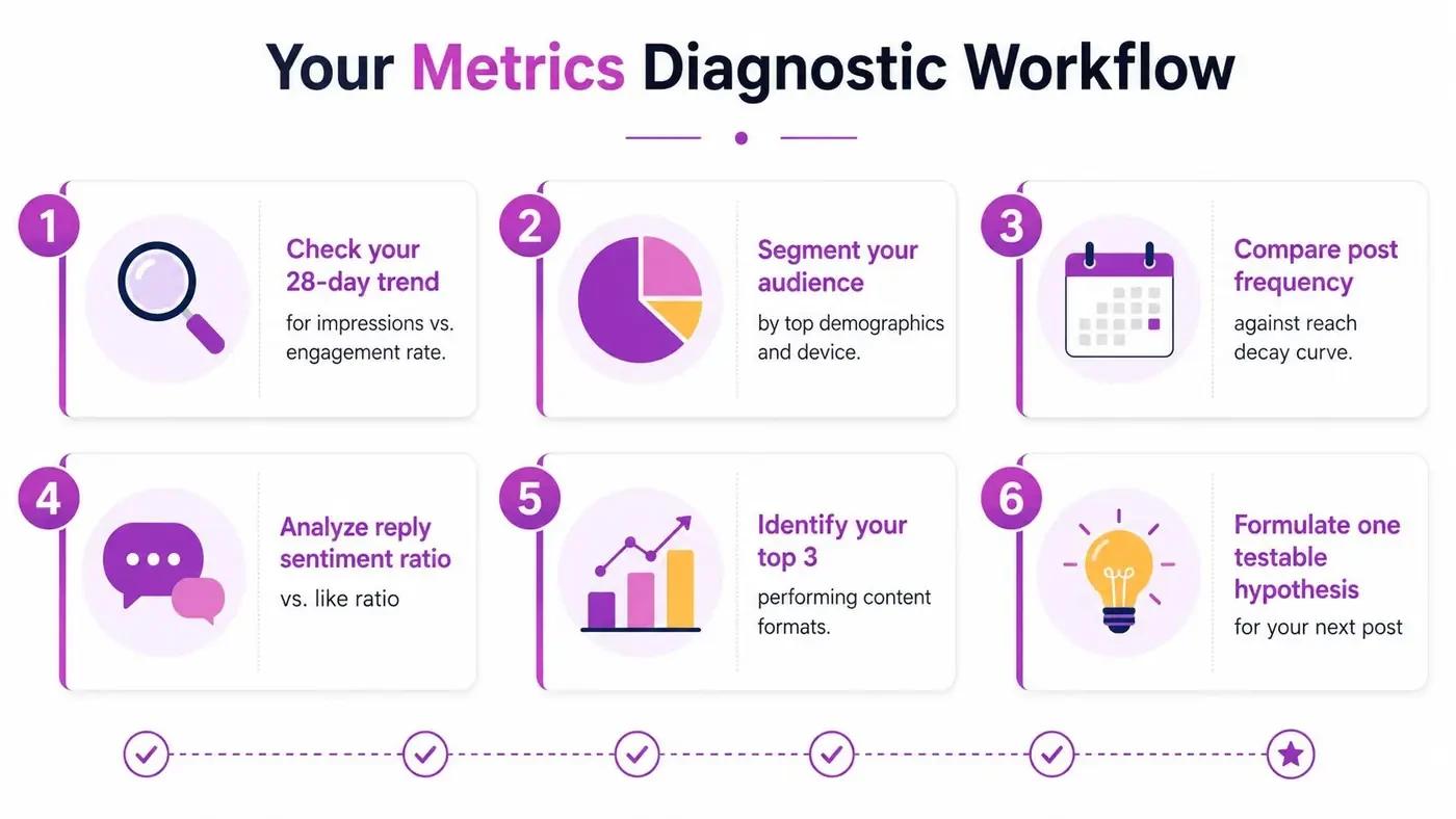
A Diagnostic Workflow for Your Own Metrics
A useful review starts with pairs, not isolated columns. Pull post-level results, separate posts from replies, quote posts, and videos, then ask what changed between exposure and the next meaningful action.
Six questions to ask after each reporting period
-
Did impressions rise without engagement rate?
If yes, distribution expanded without stronger response per exposure. Rework the opening, topic framing, or audience fit rather than just publishing more. -
Did engagement rate rise without profile visits?
The post may be enjoyable or useful inside the feed but disconnected from your identity. Add a clearer point of view or a reason to learn more about the account. -
Did profile visits rise without follower change?
Inspect the profile promise. A visitor should quickly understand the audience, subject, and future value of following. -
Did video views rise without a completion signal?
Treat view growth as initial consumption, not proof that the message held attention. Compare the available view definitions and use any retention or completion signal that exists on the same surface. -
Did bookmarks rise without public engagement?
The post may be functioning as a private reference. Keep testing useful frameworks, checklists, and explainers, even when they don’t generate many replies. -
Did link clicks fall while impressions rose?
The post is getting seen but losing persuasive force. Test the CTA, destination match, and amount of context before changing distribution tactics.
Segment before you average
Blended averages hide useful differences. Compare at least these groups:
- Original posts: Do your ideas earn exposure and intent?
- Replies: Do your contributions attract profile visits or new conversations?
- Quote posts: Do your interpretations earn stronger repost or follow behavior?
- Videos: Do views translate into interaction and profile exploration?
- Product-led posts: Do clicks and conversions justify the lower or higher engagement they may receive?
Use the free Twitter analytics tools as a starting point for collecting and checking performance. Then create one testable hypothesis, such as “posts that state a specific disagreement generate more profile visits than general advice.” Change one meaningful variable, record the result, and avoid treating a single outlier as a durable pattern.
Turning Metrics Into Better Posts and Replies
Metrics become useful when each signal triggers a concrete content decision.
If impressions are high but engagement rate is weak, the opening probably isn’t earning enough attention from the delivered audience. Study the structure of strong posts with Tweet X-Ray, focusing on the hook, tension, flow, and payoff before drafting your own version. The point isn’t to copy a sentence. It’s to understand why the reader had a reason to continue.
If replies are strong but follower change is weak, the conversation may be interesting while your profile promise remains unclear. If profile visits are high but follower conversion stays low, tighten the bio, pinned post, and recent-content pattern before publishing more frequently.

For a broader foundation on planning content, audiences, and channel goals, the basics of social media marketing guide from BEDHEAD provides useful context beyond individual post statistics.
Build a repeatable decision loop
- Find the signal: Identify the metric pair that changed, such as impressions and profile visits.
- Inspect the content: Look for differences in hook, topic, format, audience, or CTA.
- Choose one response: Revise the hook, improve the profile, change the format, or pursue a different conversation.
- Review the next set: Compare the same content segment rather than the entire account average.
Tools can reduce the research time, but judgment still belongs with the user. Xholic AI combines personalized AI replies, Reply Deck for finding worthwhile conversations, Tweet X-Ray, Tweet Remixer, and Smart Scheduler in a human-in-the-loop workflow. It uses personal context to help decide what to say next, while the user reviews, edits, approves, or rejects anything before publication.
Reporting Cadence and Dashboard Hygiene
A dashboard stays useful when you review it on a consistent rhythm.
Weekly, inspect the strongest posts by engagement rate and profile visits per 1,000 impressions. Look for repeated patterns in hooks, topics, formats, and conversation choices. Monthly, compare follower change with engagement quality, link clicks, profile visits, and bookmarks. Quarterly, review your content mix and decide whether original posts, replies, quote posts, videos, or product content are receiving the right amount of attention.
Native access also needs housekeeping. Full analytics is now more heavily gated behind Premium on desktop, while free users retain more limited post-level statistics in the mobile app. X’s analytics experience is available at the current account analytics dashboard, and individual post data can be opened from the post’s bar-chart icon or its analytics option, as outlined in this X analytics dashboard guide.
Export or record raw data regularly because history windows and available surfaces can differ between free, Premium, and API access. Label campaigns, launches, experiments, and content types so you can compare like with like. Don’t compare video views from different surfaces without checking whether one uses the 2-second MRC-style definition and the other uses the older 3-second, 100% in-view definition.
Frequently Asked Questions About Twitter Analytics Metrics
Did Premium change how X analytics works?
Yes, access is more restricted than it was previously. Native analytics is more heavily gated behind Premium on desktop, while free users may still see limited post-level data in the mobile app. Treat your available history and metrics as surface-dependent, and maintain your own records instead of assuming the dashboard will preserve every comparison you need.
Should bookmarks count as engagement?
They should count as a meaningful interaction, but not as a conversion. A bookmark suggests that someone found the post worth saving. Pair it with profile visits, follows, link clicks, or later business data to understand whether saved value leads anywhere.
What if engagement rate is high but conversions are weak?
First, separate the engagement actions. Replies and bookmarks may indicate useful discussion or reference value, while likes may reflect lightweight approval. Then inspect profile visits, link clicks, landing-page behavior, and your call to action. If the funnel breaks after engagement, changing the hook won’t solve the problem. Improve the profile promise, offer, destination, or transition to the next step.
For a practical reporting setup, use this Twitter analytics dashboard guide to organize the metrics you need. The best dashboard is not the one with the most columns. It’s the one that helps you decide what to publish, where to participate, and what to change next.
Xholic AI helps you connect Twitter analytics metrics to action by finding relevant conversations, studying proven post structures, generating personalized replies and remixes, and organizing approved content with scheduling and goals. Visit Xholic AI to turn your next analytics review into a focused workflow for deciding what to say and where to engage.