Statistics and mathematical foundations
Regression, probability, sampling, p-values, distributions, optimization, linear algebra, and statistical reasoning for data science.
30%
Best tweets about Data Science
Browse the best tweets about data science, including analysis, experimentation, statistics, datasets, visualization, careers, and practical workflows.
Useful data science methods, experiments, statistics, analysis, visualization, tooling, career lessons, and real project results.
Original Xholic analysis
The data science conversation centers on accessible learning resources, statistical foundations, practical career guidance, and AI-assisted analysis. Posts promoting AI workflows are balanced by repeated calls to verify outputs, retain human judgment, and build on sound data practices.
74% of posts
All-time engagement
26% of posts
Published in 90 days
Conversation map
Regression, probability, sampling, p-values, distributions, optimization, linear algebra, and statistical reasoning for data science.
30%
LLM and agent workflows for querying data, generating charts, exploring metrics, creating evaluations, and accelerating analysis with human verification.
26%
Free textbooks, courses, bootcamps, books, playlists, roadmaps, and GitHub repositories for statistics, Python, R, machine learning, and analytics.
26%
Dashboards, charting, Excel, Tableau alternatives, interactive visualizations, real-time data displays, and data storytelling.
24%
Role comparisons, interview preparation, skill maps, career paths, practical projects, resumes, and job-ready analyst or data science skills.
22%
End-to-end applied projects and case studies involving real datasets, domain problems, production deployment, and measurable outcomes.
20%
Predictive modeling, time-series forecasting, ML workflows, foundation models, automated ML agents, and applied quantitative ML.
18%
Pipelines, ETL, cloud data lakes, orchestration, distributed compute, governance, integration, storage, and serving analytical data.
14%
Tone and stance
Performance benchmark
Posts with media make up 74% of this collection. Their median all-time score is 28.7, compared with 19.4 for text-only posts.
Format mix
Consensus and debate
Shared view
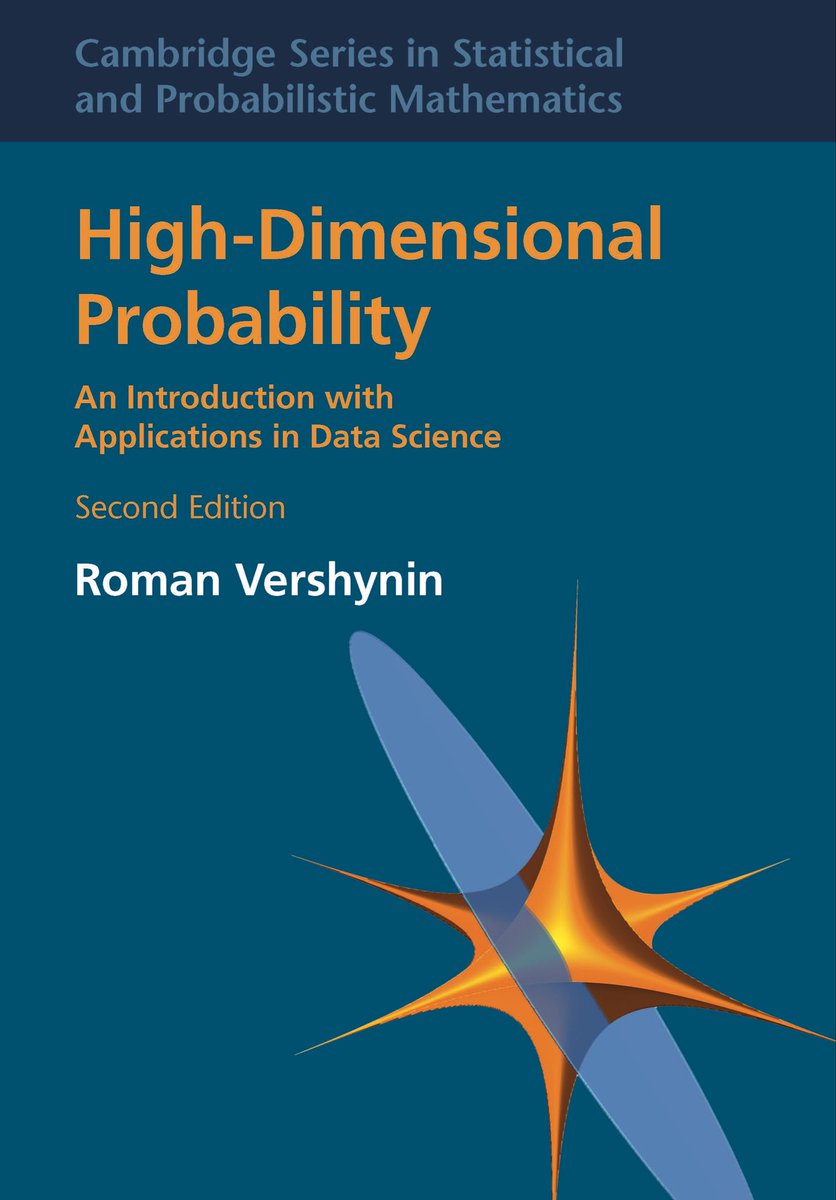
Posts present regression, probability, linear algebra, and sampling as important data-science capabilities. One post also cautions that averages can obscure the shape of an underlying distribution.
Shared view
Posts direct learners to free textbooks, bootcamps, playlists, and repositories covering statistics, Python, BI, machine learning, and interview preparation.
Shared view
Career-oriented posts recommend practical, domain-relevant projects and public portfolios rather than learning tools or courses without application.
Shared view
Posts emphasize data acquisition, understanding, and cleaning. Data-engineering examples also describe pipelines, curated layers, quality checks, and serving systems that support analytics and ML use cases.
Open debate
Some posts describe natural-language querying, chart generation, and agent workflows as faster routes to analysis. Other posts warn that AI-produced analysis can be wrong and that important conclusions should be verified by people.
Open debate
AI BI tools are framed as enabling more self-service exploration, while other posts stress the continued importance of statistical reasoning, domain knowledge, and human review.
What performs
Lists had the highest supplied format median score, 85.707. The strongest supplied engagement outlier was a free-textbook list, and the data-science-learning theme had a median score of 60.153.
Regression and linear-regression explainers were supplied engagement outliers, with all-time scores of 786.7 and 434.06, respectively.
Supplied analytics report media on 37 of 50 tweets (74%), with a media median score of 28.66 versus 19.421 for text-only posts.
Statistical standouts
Creator landscape
The five most represented creators account for 20% of the selected posts.
1. Vaishnavi
@_vmlops
2 posts
2. Alex Freberg
@Alex_TheAnalyst
2 posts
3. freeCodeCamp.org
@freeCodeCamp
2 posts
4. Shalini Goyal
@goyalshaliniuk
2 posts
5. Kanika
@KanikaBK
2 posts
6. Kirk Borne
@KirkDBorne
2 posts
Matt Dancho’s two evidence posts cover regression fundamentals and have the highest supplied median all-time score among listed top voices: 610.38.
Alex Freberg’s evidence posts cover a data-analyst bootcamp and sampling. Supplied analytics list a 210.46 median all-time score for his two posts.
Vaishnavi’s two evidence posts curate ML-interview preparation and finance-focused Python training resources. Supplied analytics list a 200.55 median all-time score for these posts.
Since the previous snapshot
Themes, sentiment, stance, and post format are classified per tweet. All counts, shares, medians, creator concentration, freshness, and performance comparisons are then calculated directly from the published snapshot.
Xholic's all-time score compares engagement while accounting for reach, post age, and creator consistency. It is used for relative comparisons within this collection.
This report analyzes the exact 50-post snapshot shown below. AI identifies editorial categories and drafts explanations; all statistics are calculated from the snapshot, and every narrative claim is checked against cited posts before publication.
Best Data Science tweets
Ranked 01–50
@aiwithjainam ·
10 free textbooks from MIT, Stanford, and Berkeley that you can download legally right now. → Introduction to Linear Algebra - Gilbert Strang, MIT The textbook behind the most-watched math course in history. 20 million views on OCW. Every ML engineer learned this math from one quiet professor. https://t.co/Q5ZHXrBuD1 → Mathematics for Computer Science - MIT 6.042 Proofs, discrete math, probability. The actual foundation of CS that nobody tells undergrads about until it's too late. https://t.co/FOLUDXTubX → Convex Optimization - Stephen Boyd, Stanford Used in every serious ML and control systems course on earth. Cambridge University Press gave Boyd permission to keep it free on his own site. web. stanford. edu/~boyd/cvxbook/bv_cvxbook.pdf → CS229 Machine Learning Notes - Andrew Ng, Stanford Not the Coursera version. The actual Stanford graduate course notes. Dense, precise, and the closest thing to a grad school education you can download in one PDF. https://t.co/De8lcX59zt → An Introduction to Statistical Learning - Stanford / USC The book three statisticians from Stanford and USC made free because they wanted everyone to learn it. 290,000 people have taken the companion course on edX. https://t.co/TusQK9FDOc → Computational and Inferential Thinking - Berkeley Data 8 The textbook behind Berkeley's most popular course. Data science from scratch, built to be understood without a math degree first. https://t.co/xD2XAE49WA → Dive into Deep Learning - Berkeley / Amazon Jensen Huang called it "excellent." 500 universities across 70 countries use it. Every concept runs as live code directly in the browser. https://t.co/GJfBeDtJVO → Introduction to Probability - Blitzstein & Hwang, Harvard The official textbook of Harvard's Stat 110, which has been called the best probability course ever put on YouTube. Free second edition online. https://t.co/8dVzOUZDlH → The Elements of Statistical Learning - Hastie, Tibshirani, Friedman, Stanford The graduate-level version of ISLR. Springer makes it free as a PDF. Researchers keep a copy permanently in their downloads folder. https://t.co/PzdmjooaZW → MIT OCW Online Textbooks Index - 45+ books across every department One page. Every free MIT textbook organized by subject. Algorithms, physics, economics, engineering. All open access. https://t.co/eAjUcYzNa0 Save this before someone makes them take it down. (They won't. But save it anyway.)
@Alex_TheAnalyst ·
The new 2026 FREE Data Analyst Bootcamp is live! Here's what you'll learn: - Data Fundamentals - MySQL - @Microsoft Excel - @tableau - Microsoft Power BI - Python - Pandas - Building a Portfolio Website - Creating a Resume - Practicing for Technical Interviews - @awscloud - @Azure - Git and GitHub - R Programming - @databricks - How to use LinkedIn to Land a Job That's a lot! All packed into one long 28 hour and 41 minute video. Over the next year or so, I'll be creating new lessons on the following - @alteryx - @Snowflake - PostgreSQL - @duckdb - Statistics - and more! Sometime in 2027 I'll release an updated Bootcamp with these included! This Bootcamp was made with a lot of love and I hope you all learn a ton from it. The data community has given me so much so I'm glad to give back and pass it onto the next generation. Happy learning! https://t.co/2SjI9iVxr5
@DeryaTR_ ·
In just two days, using OpenAI Codex app GPT-5.4, I created a fully functional flow cytometry data analysis software, ~20,000 lines of code from scratch! This is a highly sophisticated and specialized biology software tool that every immunologist relies on. The best part is that I can continuously improve it and add new features that are not even available in comparable commercial software, which can cost thousands of dollars per user! For those not familiar with what flow cytometry software is, here is the detailed explanation from Grok: Flow cytometry analysis software is like a super-smart graphing calculator for biologists and doctors who study cells. What the machine does firstImagine you have a sample of blood or tissue with millions of cells. The flow cytometer machine lines the cells up single-file like cars on a highway and shoots lasers at each one as it zooms by (thousands of cells per second). The lasers tell the machine things like:How big is the cell? How “grainy” or complicated is it inside? Does it have certain “flags” (proteins) stuck on it? (These flags light up in different colors, like red, green, purple tags.) The machine spits out a huge computer file full of raw numbers — no pictures, just data. What the software is forThe analysis software takes that messy pile of numbers and turns it into clear pictures and answers you can actually understand. Think of it as the “translator” or “artist” that draws the story from the data.With a few clicks you can see:Colorful dot plots or graphs that show different groups of cells (like “these blue dots are healthy immune cells, these red dots are cancer cells”). Exactly what percentage of the cells are a certain type (e.g., “78% of the cells in this blood sample are fighting the infection”). How strongly a cell is “glowing” with a certain color tag (which tells you how much of a protein it’s making). Side-by-side comparisons of a patient’s sample before and after treatment. The magic trick scientists use every dayThe most common thing they do is called “gating.” It’s like drawing a circle around a group of similar dots on the graph and saying, “Only look at these cells.” The software instantly counts everything inside that circle and gives you the numbers. You can keep drawing smaller and smaller circles to zoom in on very specific cell types — kind of like zooming into a crowd photo until you only see people wearing red hats and glasses.
@lennysan ·
Not enough people are talking about how much AI is impacting the role of data science. I was chatting with a DS friend, and he said that most of his team's work now is reviewing half-assed AI data analysis from PMs and engineers. And that 50% of the time, that analysis is wrong. The role is becoming less fun.
@heynavtoor ·
🚨 Google open sourced an AI that predicts the future. Stock prices. Sales trends. Energy demand. Weather patterns. Server traffic. Any time series. For free. It's called TimesFM. A foundation model built by Google Research specifically for time series forecasting. Published at ICML 2024. No training your own model. No data science degree. No expensive forecasting platforms. Feed it data. It predicts what happens next. Here's what makes this different from everything before it: → Pretrained on massive datasets. Works out of the box on YOUR data. → 200M parameters. Lightweight. Runs on a single GPU. → 16K context length. Feed it years of historical data in one pass. → Continuous quantile forecasting up to 1,000 steps ahead → Not just one prediction. Gives you confidence intervals. 10th to 90th percentile. → Works with PyTorch and JAX → Already deployed as an official Google product inside BigQuery Here's the wildest part: Traditional forecasting requires hiring data scientists, training custom models on your specific data, tuning hyperparameters for weeks, and praying it generalizes. TimesFM skips all of that. One pretrained model. Any domain. Any data. Just forecast. Give it stock prices. It predicts the trend. Give it server traffic. It predicts the spike. Give it sales data. It predicts the quarter. Give it energy demand. It predicts the grid. Bloomberg Terminal costs $25,000/year for forecasting tools. Enterprise forecasting platforms charge $50,000+ annually. Data science teams cost $500K+ in salary. pip install timesfm 10K GitHub stars. 825 forks. ICML 2024 paper. Apache 2.0 License. 100% Open Source. Built by Google Research.
@_vmlops ·
A guy landed offers from Google, LinkedIn, Snap, Coupang, and StitchFix during his ML interview run. That kind of insight usually comes with a price tag. He wrote it all down and put it on GitHub for free instead That repo now has 12.4k stars, and it's basically the closest thing to a "cheat sheet" for ML interviews that actually works, because it's based on real questions he was asked, not guesses. Here's what's inside: → a study plan that tells you exactly what to focus on, so you're not wasting weeks on stuff that never comes up → leetcode and SQL practice, including the specific things interviewers keep asking (like window functions and join types) → stats and probability questions taken straight from real interviews → AB testing basics, since almost every company asks about this now → classic ML and deep learning concepts explained simply → actual system design examples, like how to design a recommendation system or a fraud detection pipeline → a reading list of papers from people like Andrew Ng and Yoshua Bengio → an FAQ section answering the questions everyone secretly wonders about, like "do I really need to solve LeetCode Hard" or "how much cloud stuff do they actually ask" It's not trying to teach you everything about machine learning. It's trying to teach you what gets asked, which honestly matters more when you're prepping under a deadline If you're getting ready for an ML or data science interview, this is worth a bookmark

@_vmlops ·
JPMORGAN OPEN-SOURCED THEIR INTERNAL PYTHON TRAINING used to train jpmorgan's own business analysts and traders now it's sitting on github with 13.2k stars, open for anyone ▫️ intro to numerical computing in python ▫️ data visualization with financial datasets ▫️ real financial data (iex cloud) + airport/route datasets ▫️ runs entirely in your browser via binder no setup needed ▫️ jupyter notebooks, taught by jpmorgan technologists no cs degree needed... built specifically for people without formal programming backgrounds if you're breaking into quant finance, data roles, or just want finance-focused python practice this is the repo https://t.co/EeFsuusvrw
@techNmak ·
I've seen people spend $15,000 on AI/ML bootcamps and still not know this stuff. These playlists cover it for free. In the right order: 1./ Statistics & Data Analysis You can't model what you don't understand. Start here before you touch anything else. Playlist: https://t.co/rJkLQCRq3l 2./ Probability Bootcamp This is what your model is actually doing under the hood. Most people skip it. That's why most people stay stuck. Playlist: https://t.co/Y9GdEKwIA0 3./ Reinforcement Learning When you're ready to go beyond prediction into decision making. Intuitive. Not overwhelming. Playlist: https://t.co/rsL1s8ihyE 4./ Data Intensive Engineering Models are useless if they can't scale. This teaches you how to build systems that survive the real world. Playlist: https://t.co/0NNzeKEfsb Bookmark this. Thank yourself later.
@JustAnotherPM ·
OK. This just happened. A Product Manager at Antrhopic just tols us: 𝗔𝗜 𝗶𝘀 𝗻𝗼𝘁 𝘁𝗵𝗲 𝗱𝗲𝗮𝘁𝗵 𝗼𝗳 𝗽𝗿𝗼𝗱𝘂𝗰𝘁 𝗺𝗮𝗻𝗮𝗴𝗲𝗺𝗲𝗻𝘁. 𝗜𝘁 𝗶𝘀 𝗶𝘁𝘀 𝘂𝗽𝗴𝗿𝗮𝗱𝗲. Here is how Claude is enabling us be 10x more efficient, effecive, and smarter. Anthropic's own product manager shared how they use Claude daily, and it's a masterclass in what modern PM work looks like. 𝗗𝗮𝘁𝗮 𝗮𝗻𝗮𝗹𝘆𝘀𝗶𝘀 𝗶𝗻 𝗺𝗶𝗻𝘂𝘁𝗲𝘀, 𝗻𝗼𝘁 𝗵𝗼𝘂𝗿𝘀. PMs used to wait on data science teams or struggle with SQL queries they barely understood. Anthropic's team connected their BigQuery data to Claude Code via MCP. Now a PM just asks a question in plain English and gets back polished graphs with rolling averages, segmentation by plan type, all of it. What used to take hours takes minutes. 𝗧𝗲𝘀𝘁𝗶𝗻𝗴 𝗽𝗿𝗼𝗱𝘂𝗰𝘁 𝗶𝗱𝗲𝗮𝘀 𝗯𝗲𝗳𝗼𝗿𝗲 𝗹𝗼𝗼𝗽𝗶𝗻𝗴 𝗮𝗻𝘆𝗼𝗻𝗲 𝗶𝗻. Instead of scheduling meetings to pressure-test an idea, PMs can now validate concepts independently. Faster iteration, more autonomy, better use of everyone's time. 𝗚𝗲𝗻𝗲𝗿𝗮𝘁𝗶𝗻𝗴 𝗲𝘃𝗮𝗹𝘀 𝗮𝘁 𝘀𝗰𝗮𝗹𝗲. Building AI products means you need test cases — lots of them. Instead of writing 50 test cases by hand, a PM gives Claude a couple of examples and the product context, and it expands the set. You go from 2 examples to 50 in minutes. 𝗧𝗵𝗲 𝗿𝗲𝗮𝗹 𝗶𝗻𝘀𝗶𝗴𝗵𝘁? This isn't about automating PM work. It's about extending what a single PM is capable of doing alone. Things they couldn't have done independently before. The PMs who lean into this mindset will spend less time on coordination and more time on strategy, customer conversations, and making good decisions. Link to video in comments.
@KanikaBK ·
MICROSOFT RESEARCH JUST PUT A FREE DATA ANALYSIS TOOL ONLINE THAT REPLACES $70/MONTH TABLEAU SEATS. You describe the chart you want. It builds it. No SQL or formulas. No degree required. 30 CHART TYPES. Works on screenshots, CSVs, live databases, and plain text. Zero dollars. Here is what is going on. Tableau charges $70 per user per month. Power BI Pro runs $10 to $20 per seat. Excel with Copilot is another subscription on top of that. Data analysis has always been expensive because the tools that make it easy cost serious money. Microsoft Research just put the alternative online for free. It is called Data Formulator. You load your data, describe what you want to see in plain language, and AI builds the chart, transforms the data, and writes the code behind it automatically. No dragging pivot tables. No writing SQL. No figuring out why your VLOOKUP broke. And here is where it gets interesting. ↳ paste a screenshot of a table and it extracts the data automatically ↳ connect it directly to MySQL, PostgreSQL, Azure, S3, or any URL with live refresh ↳ describe a chart in plain English and it figures out what data transformations are needed to make it ↳ agent mode lets it plan and explore your data across multiple turns on its own ↳ build full shareable reports directly inside the tool ↳ runs on OpenAI, Claude, Gemini, or fully local with Ollama The new version has a unified AI agent that handles everything, a persistent workspace so your data stays organized across sessions, and sandboxed code execution so nothing runs on your machine without permission. Microsoft sells Power BI to enterprises for real money every month. Their own research team then built a free open source tool that does a large chunk of the same job and put it on GitHub under an MIT license. Someone at the Power BI team is having a very interesting week.
@shushant_l ·
I'm amazed most people still analyze data manually. Here's how to use AI to analyze anything in minutes. --- 1. AI can analyze documents, PDFs, spreadsheets, images, research papers, and much more. --- 2. Start by defining one clear analysis goal before asking AI anything. --- 3. Give AI background, objectives, constraints, and success metrics for better results. --- 4. Upload clean and well structured data before starting your analysis. --- 5. Remove duplicates, fix formatting, and detect missing values first. --- 6. Choose the right analysis type like descriptive, predictive, or diagnostic. --- 7. Assign AI an expert role before giving it your task. --- 8. Write prompts with clear objectives, context, tasks, and expected outputs. --- 9. Ask why something happened instead of requesting a generic analysis. --- 10. Make AI challenge its own conclusions and assumptions. --- 11. Break complex analysis into multiple chained reasoning steps. --- 12. Use AI to summarize data before identifying trends and causes. --- 13. Let AI recommend actions, risks, and next steps from the findings. --- 14. Use code for calculations, charts, statistics, and formula validation. --- 15. Request outputs with summaries, key findings, risks, and recommendations. --- 16. Avoid vague prompts and low quality data inputs. --- 17. Never trust AI blindly without verifying important conclusions. --- 18. Keep humans involved for final decisions and fact checking. --- 19. AI works across business, marketing, finance, research, and product analysis. --- 20. Follow the golden rules to get faster, smarter, and more reliable insights. --- To learn more, check the infographic. ---
@InduTripat82427 ·
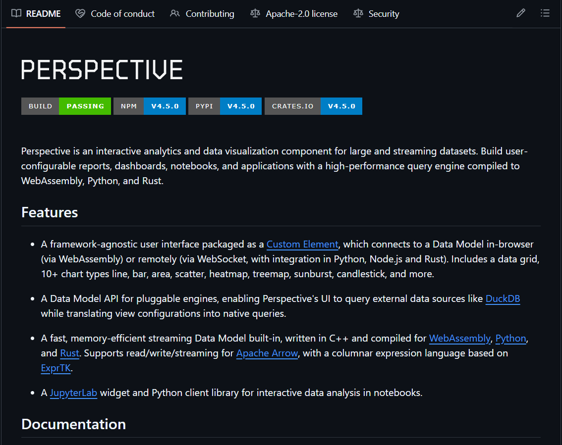
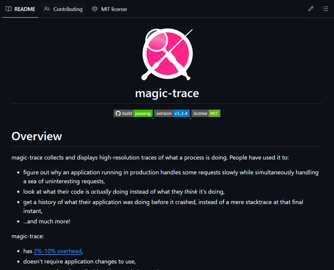
What Have the World's Most Expensive Finance Teams Open-Sourced on GitHub? How Can Ordinary People Understand Quant Trading? Diving Right In Is the Fastest Way Top-tier quant and high-frequency trading firms like Jane Street, Goldman Sachs, J.P. Morgan, and others have released representative financial/engineering tools to help everyday quant enthusiasts learn institutional-grade pricing models, real-time data visualization, and high-precision performance debugging skills for free👇 1. Jane Street magic-trace (5.4k stars) https://t.co/bAgX7aqpKK A high-precision process tracing tool based on Intel Processor Trace. When ordinary profilers can't see the call stack clearly, it can record the complete execution process of every CPU instruction with nanosecond-level resolution. Strongly recommended for anyone wanting to dive deep into performance debugging and figure out exactly where the program is getting stuck 2. Goldman Sachs gs-quant (10.2k stars) https://t.co/C7wjgkVIXq A Python toolkit for derivatives pricing and risk management used daily by Goldman Sachs traders. It includes complete pricing models and risk calculation modules for common derivatives like options and swaps. You can install it directly with pip and start using it—perfect for those wanting to systematically learn institutional-grade quant pricing, with strong practical value 3. Perspective (originally a J.P. Morgan project, 10.5k stars) https://t.co/2NzmuQzZkZ J.P. Morgan's open-source powerhouse for real-time data visualization, especially adept at handling massive streaming market data. It lets you quickly build sleek interactive dashboards and real-time monitoring interfaces, supports Jupyter, and is more flexible than many paid terminals. Extremely friendly for folks doing data analysis and market visualization These three open-source projects let you directly access institutional-grade pricing models, real-time market dashboards, and high-precision performance debugging tools, helping ordinary developers boost their quant analysis, data visualization, and code optimization skills—all completely free
@Meer_AIIT ·
15 BEST GitHub Repos for AI&ML 1. Awesome Lists: https://t.co/G6douK0kyE 2. roadmap. sh: https://t.co/r52eb7oqUO 3. Python Data Science Handbook: https://t.co/A2C7OcxBpc 4. Machine Learning Notebooks, 3rd edition: https://t.co/Xqp3XH3eHp 5. Designing Machine Learning Systems (Chip Huyen 2022): https://t.co/CjIV5VuG0e 6. Neural Networks: Zero to Hero: https://t.co/6BSEwrAEhs 7. minGPT by karpathy: https://t.co/gyYTGi4Vnx 8. Project Based Learning: https://t.co/g9bli5FW2g 9. Build your own X: https://t.co/MW9OkM8GMa 10. awesome-generative-ai-guide: https://t.co/fmKKtocJXM 11. Made With ML: https://t.co/JQI0JSmG5J 12. Awesome Machine Learning: https://t.co/w43B9jXSLq 13. Awesome Data Science: https://t.co/qH0ULtqmAt 14. Awesome MLOps: https://t.co/wUs3bnxbxy h/t: yt Harry Connor AI
@parmardarshil07 ·
In 2018, I used CSV files and cron jobs. In 2019, I used SQL and Python. In 2020, I used Spark and AWS. In 2024, I used Airflow and Snowflake In 2026, I'm using AI agents to generate pipelines. 8 years. 8 completely different stacks. I wanted to become a data scientist. I dreamed about machine learning. I took every course — Andrew Ng, random Udemy ones, TensorFlow tutorials. I tried Kaggle problems and couldn't solve a single one. I'd open a dataset, stare at it, close my browser, and quit. So I took more courses. Thinking the NEXT one would finally unlock everything. It never did. Here's what actually changed things: ✅ I stopped consuming and started building. My first project was stupid simple — a classifier that detected exam notes in your camera roll and deleted them automatically. That led to an unpaid data science internship. Then, a data engineering internship I took just because I needed experience — any experience. I didn't even know what data engineering was. But here's what each phase actually taught me: → The web dev phase taught me how to write code that works in production → The course loop taught me that consumption without execution is a trap → The first project taught me that building > learning → The data science internship taught me NLP and how messy real problems are → The data engineering role taught me AWS, SQL, PySpark, and that I actually love the blend of code + business Here's the truth nobody tells you: Roadmaps don't work the way you think. Every data engineer I know has a completely different path. Mine started with PHP and ended up in Spark. Yours will look different too. What works: -> Learn Python and SQL (you'll use SQL 80-90% of the time) -> Learn big data fundamentals -> Build a project — even if it's ugly -> Apply for internships before you feel ready -> Share everything you learn in public ---- Your path won't be straight. Mine certainly wasn't. Tools expire. The ability to pick up the next one in a weekend? That's forever.
@JA_Olaoye ·
If you don’t have a project to work on, here’s a portfolio idea that closely resembles a real-world data engineering scenario. Imagine you’re working as a Data Engineer for a bank. The Data Science team needs customer data to build a customer segmentation model, while the Application team needs enriched customer profiles to deliver personalized services through a mobile application. The challenge is that the required data is spread across multiple source systems. Customer information resides in a core banking database, transaction history comes from another system, loan information is stored separately, and customer interactions are captured through APIs and application logs. Your responsibility is to design and build an end-to-end data pipeline using the AWS ecosystem. A possible architecture could look like this: ●AWS Database Migration Service (DMS) or AWS Glue extracts data from the various source systems. ●The raw data lands in the Amazon S3 Bronze layer. ●AWS Glue ETL jobs or Amazon EMR with Apache Spark cleans, standardizes, and joins the datasets. ●The transformed data is written to the Silver layer in Amazon S3. ●Additional business rules, aggregations, and feature engineering are applied to create curated datasets in the Gold layer. ●AWS Glue Data Catalog maintains metadata, while Amazon Athena allows analysts and data scientists to query the data directly from S3. ●The Data Science team consumes the Gold-layer datasets from Amazon S3 to build customer segmentation and recommendation models. ●Once the models generate customer recommendations, the curated customer profile and recommended products are loaded into Amazon DynamoDB for low-latency access. ●The banking application reads these recommendations directly from DynamoDB, enabling personalized offers and services for customers in real time. As an extension to the project, you can implement: ●Data quality checks using AWS Glue Data Quality. ●Workflow orchestration with AWS Step Functions or Amazon Managed Workflows for Apache Airflow (MWAA). ●Event-driven processing with Amazon EventBridge and AWS Lambda. ●Monitoring and logging using Amazon CloudWatch. ●Data security using AWS IAM, AWS KMS, and S3 bucket policies. This project demonstrates many of the skills companies expect from a modern Data Engineer, including data ingestion, ETL development, data lake architecture (Bronze, Silver, Gold), orchestration, metadata management, data governance, cloud-native services, and serving data efficiently for both analytics and production applications.
@Zachly ·
Conceptual knowledge is more important than tooling! Spark is a means of distributed compute Airflow is a means of job orchestration dbt is a means of data quality Tableau is a means of data visualization Iceberg is a means of data lake storage Flink is a means of stream processing Postgres is a means of consistent + available storage. MongoDB is a means of consistent + partition tolerant storage Cassandra is a means of available + partition tolerant storage Parquet is a means of data compression and serialization
@PythonDvz ·
Data Engineer vs Data Scientist: What’s the Difference? One builds the data foundation. The other turns data into intelligence. A Data Engineer designs pipelines, manages large-scale systems, ensures data reliability, and works heavily with cloud and distributed frameworks. They focus on performance, scalability, and architecture. A Data Scientist analyzes data, builds models, applies statistics, and translates patterns into actionable insights. They focus on prediction, experimentation, and business impact. If you enjoy system design, infrastructure, and data flow — engineering may suit you. If you enjoy analysis, modeling, and problem-solving with algorithms — science may be your path. Both roles are powerful. The real question is: do you want to build the engine or drive the strategy?
@HedgieMarkets ·
🦔Axios published polling data this week that was generated by AI rather than collected from real people, using a practice called silicon sampling. The idea is that because LLMs can generate responses that resemble human answers, polling companies can simulate survey responses at a fraction of the cost of actual polling. Axios used a company called Aaru to produce the numbers and published them as if they reflected real public opinion. My Take There is a 1955 Isaac Asimov short story called Franchise where a single voter is selected by a supercomputer to answer questions on behalf of the entire electorate and the computer uses those answers to determine the election result. Nobody else votes. Silicon sampling is trying to build that future for real, except the single voter is a language model trained on internet data that skews heavily toward younger, chronically online demographics. It cannot tell you what the nurse in rural Ohio thinks because that person is not well represented in the data the model learned from. The danger is not just bad polling. Public opinion data shapes policy decisions, election strategies, product launches, and investment calls. If silicon sampling spreads because it is cheap and produces confident-looking numbers fast, the people making those decisions will be operating on AI simulations of public opinion rather than actual public opinion. We have already seen what happens when elites lose track of what regular people believe. Silicon sampling makes that problem structural and gives it a veneer of data science. Hedgie🤗
@goyalshaliniuk ·
Want to Learn Python for AI but Do not Know Where to Start? Here is a 20-step roadmap that takes you from complete beginner to building your first AI model in a structured, phase-by-phase journey. Whether you are aiming for data science, automation, or AI development, this roadmap gives you the exact sequence to master Python efficiently. PHASE 1: Python Fundamentals Lay the foundation by learning syntax, variables, loops, and functions. This phase helps you understand how Python works and prepares you for automation and AI tasks. PHASE 2: Data Structures & Libraries Discover how to organize, process, and visualize data using libraries like NumPy, Pandas, Matplotlib, and Seaborn — essential skills for AI development. PHASE 3: Data Preparation & Analysis Learn how to clean, explore, and transform data to make it AI-ready. This phase builds analytical thinking and introduces you to mini data projects. PHASE 4: Machine Learning Introduction Step into AI modeling with Scikit-learn. You’ll create regression and classification models, test their accuracy, and complete your first AI project from start to finish. Start Small, Stay Consistent You do not need years, just 20 focused steps. Follow this roadmap, code daily, and you’ll be ready to build your first AI model within weeks.
@freeCodeCamp ·
Data visualization dashboards can help users explore patterns that are hard to spot in raw tables alone. In this tutorial, you'll learn how to build an interactive university ranking system with React, Flexmonster, and ECharts. You'll also learn how to load the dataset, create charts, and filter rankings by year. https://t.co/d5OtQEyIVP
@goyalshaliniuk ·
Thinking about a career in tech but not sure which role is right for you? We all have been there! Let's explore career overlaps in: Software Engineer vs. Data Engineer vs. Data Scientist vs. Data Analyst This Venn diagram clearly maps out the overlapping and unique skills across four high-demand careers in tech: 1. Software Engineers focus on development, architecture, and system-level coding skills like Java, C#, Python, and Agile. 2. Data Engineers build robust data pipelines, manage metadata, ensure governance, and specialize in tools like Spark, Hadoop, and ETL frameworks. 3. Data Scientists specialize in advanced analytics, modeling, experimentation, and research with tools like R, SAS, and ML libraries. 4. Data Analysts emphasize business understanding, reporting, visualization, and storytelling using tools like Excel, SQL, and KPIs. Whether you’re starting out or pivoting, this map helps you understand where your current skills align and where to grow next. Don't forget to save this and repost for others too.
@GithubProjects ·
Financial Machine Learning is a curated collection of resources and implementations for applying machine learning techniques to quantitative finance and investment strategies. - Integrates ML techniques with financial data for investment strategy development - Covers predictive modeling, satellite data analysis, and data imputation methods - Features collaborative research opportunities with quantitative hedge funds - Provides access to a daily research feed via https://t.co/hZVsRLgcuA
@freeCodeCamp ·
The R programming language is a powerful tool for statistics and data analysis. And in this tutorial, Tiffany teaches you how to use R along with ggplot2 to create boxplots to model data. You'll inspect, clean, and prepare the data, perform exploratory data analysis, build some models, and more. https://t.co/TddLTySAQr
@KanikaBK ·
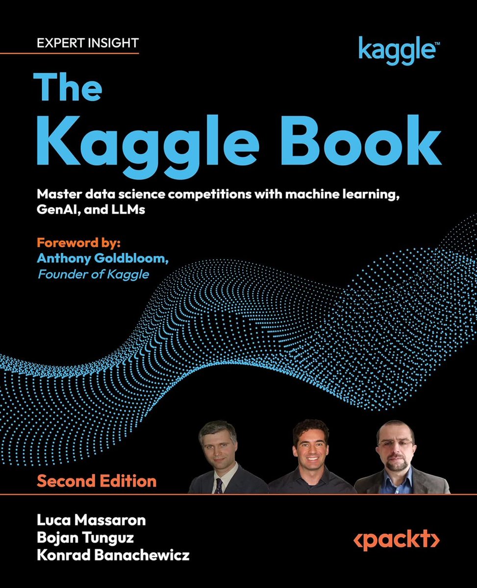
Just stumbled upon this data: 92% of data science jobs require stats and ML skills. 69% list Machine Learning specifically. CAMBRIDGE just made their 417-page Math for Machine Learning book 100% FREE. No signup is required . Just the full PDF. This is the actual math that sits underneath every ML model you use. I was just going through the content: ↳ Linear algebra and matrix operations ↳ Analytic geometry and vector spaces ↳ Probability and statistics from scratch ↳ Optimization methods including gradient descent ↳ Dimensionality reduction and PCA ↳ Regression, density estimation, classification The engineers who build the next generation of AI systems will not just know the tools. They will understand the math the tools run on.
@petergyang ·
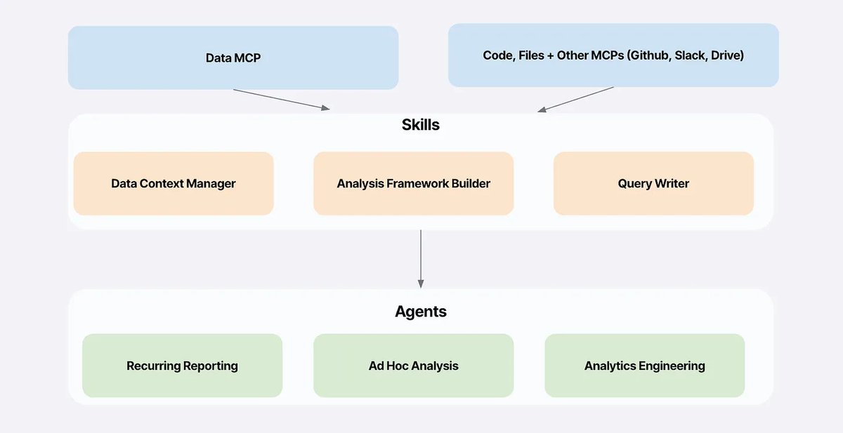
My top 5 takeaways from Sumeet (Brex) on building an AI data analyst with Claude Code: 1. Set up Claude Code to augment every step of data analysis Monitor dashboards and queries -> Explore metric changes -> Craft a good story -> Size potential impact. 2. The #1 mistake: Blowing up your context. To avoid this, use skills to enforce limits like "limit X rows on joins" and add timeouts that trigger query rewrites. 3. Build a skills + agents architecture for self-serve analysis Sumeet created skills for ad hoc analysis, data visualization, cohort analysis, and CSV exports (see below). Each skill enforces query limits (like “limit 50 on joins”), 2-3 minute timeouts, and standard patterns. This lets anyone run analyses without accidentally joining two million-row tables and crashing the database. 4. To build a great data analyst, you have to give Claude more context than just data. When metrics changed at Brex, Claude searched Slack, found an active incident, and connected it to the metric drop. “It saved me from asking what’s happening to our data?” 5. Cursor is crushing it for startups AND enterprise Brex’s data from Q4 shows Cursor consistently in the top 3 for spend. It’s both the startup and enterprise coding tool of choice. Would be curious to see if this changes in Q1 2026. 📌 Watch now: https://t.co/hvbtDwgjWM
@dbreunig ·
“taste” isn't enough… The three tiers of agent powered developers: 1️⃣ Can implement products: Can use agents to build code, with great tests. 2️⃣ Can implement products, 𝘄𝗶𝘁𝗵 𝗴𝗿𝗲𝗮𝘁 𝘁𝗮𝘀𝘁𝗲: Your feedback, which can keep up with the pace of code creation, lets you ship *good* products. 3️⃣ Has a deep empathy for their market and user and tons of surface area with them to stay up to date: Taste isn't enough! You need user empathy. Everyone keeps saying “taste”, to define a company's value when code is cheap. But “taste” is incomplete. User understanding, subject matter expertise, etc. These things are no longer the domain of just Product people, they need to be internalized by all and orgs should be designed to max out this surface area. I've said the difference between a good data scientist and a great data scientist is domain expertise: “When you have an idea how the business works, you can make more complex assumptions and develop hypotheses further out from the baseline. Bigger leaps, adequately tested, help you move faster and find unique information.” This now applies to software engineers.
@Zachly ·
My mentor Alex Hormozi made an inspiring quote that contains a data science error! He said “the average US males lives to 75. So you’re actually middle age at 37. So do what you need to do!” The problem with this stat is it assumes the US life expectancy is uniform when it’s clearly bimodal! When you do averages across a bimodal distribution, you get a number (75) that describes almost nobody in the US. America really is two countries. A nation with 3rd world life expectancy numbers (66-71 years) and one with Europe-level expectancies (81+ years) Avoid the red states on this chart and you’ll be fine making it to 80. Also whenever people make statistical claims, please consider the distribution of the underlying data!
@pvergadia ·
Every enterprise AI platform pitch eventually runs into the same wall: "we haven't built out our data stack yet." Here are some of my thoughts! A well-built platform should handle both cases: bolt onto whatever data and modeling systems you've already got, or, if those investments haven't happened yet, stand up the whole thing from scratch. Data connection, integration, model building, all of it, day one. Here is what that looks like. ↳ Data Integration This is the unglamorous layer that makes everything above it possible. A mature integration layer means a deep bench of out-of-the-box connectors, plus the boring-but-critical stuff: data quality checks, versioning, change management. Skip this layer and you're building on sand, everything downstream inherits whatever mess is sitting in your source systems. ↳ Model Integration Here's where a lot of platforms quietly fail data scientists: they force you into a proprietary notebook experience nobody asked for. The better approach bundles the runtimes people actually use (PySpark, R), plays nice with standard package managers, and sticks to industry-standard model formats. If your data science team is fighting the tooling instead of the problem, something's wrong upstream. ↳ Ontology This is the layer that turns "a bunch of tables and model outputs" into something a human can actually reason about, mapping raw data to the real objects, relationships, and actions your business cares about. It's less flashy than the layers above it, but honestly, it's the one that makes everything else legible. ↳ Workflows Now people can actually do something with it. Purpose-built interfaces let teams filter, review, and act, approve, escalate, close a case, as part of the actual job, not as a side quest in a different tool. ↳ Decision Orchestration At the top, structured decision trees route choices through auditable paths, tying the operational grind below to the calls that actually move the business. None of this works if it locks you in. The whole point of a layered architecture like this is that other tools keep interoperating with it as your stack evolves the platform should earn its place, not trap you in it. Read the entire blog: https://t.co/Mb24gWMC4a
@shushant_l ·
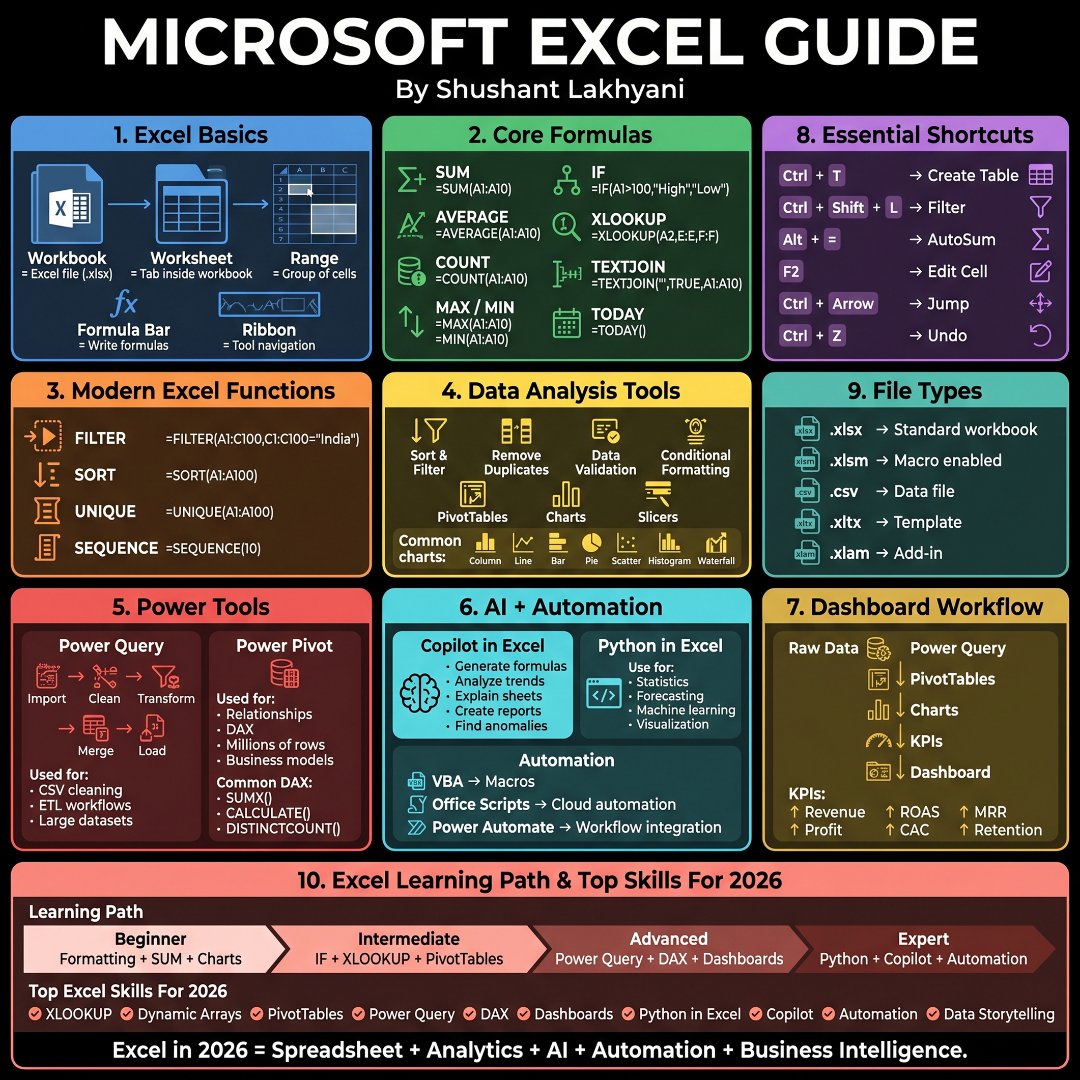
I'm amazed most people only use Excel for basic calculations. Here's the complete Excel guide to analyze data, automate work, and become job-ready in 2026. --- 1. Learn the difference between workbooks, worksheets, ranges, the formula bar, and the ribbon first. --- 2. Master essential formulas like SUM, AVERAGE, COUNT, MAX, and MIN before anything else. --- 3. Use IF statements to automate decision making inside spreadsheets. --- 4. Learn XLOOKUP to quickly find and retrieve information across tables. --- 5. Combine text effortlessly with TEXTJOIN for cleaner reports. --- 6. Use TODAY to build dynamic spreadsheets that update automatically. --- 7. Filter, sort, and extract unique values with modern dynamic array functions. --- 8. Validate data, remove duplicates, and apply conditional formatting to keep datasets clean. --- 9. Visualize information with charts, PivotTables, slicers, and dashboards. --- 10. Learn Power Query to import, clean, transform, and merge large datasets. --- 11. Master Power Pivot and DAX to build scalable business intelligence models. --- 12. Use Microsoft Copilot to generate formulas, explain sheets, and create reports faster. --- 13. Use Python in Excel for statistics, forecasting, machine learning, and advanced visualization. --- 14. Automate repetitive tasks with VBA, Office Scripts, and Power Automate. --- 15. Build dashboards by transforming raw data into KPIs and business insights. --- 16. Memorize essential shortcuts to speed up navigation, editing, filtering, tables, and formulas. --- 17. Understand Excel file formats like XLSX, XLSM, CSV, XLTX, and XLAM. --- 18. Follow a structured learning path from beginner to expert instead of learning randomly. --- 19. Focus on high-value skills like XLOOKUP, Dynamic Arrays, Power Query, DAX, Dashboards, Python, and Copilot. --- 20. Check the infographic for even more formulas, shortcuts, tools, and Excel concepts. --- To learn more, check the infographic. ---
@alliekmiller ·
We're seeing even more autonomous AI coworkers. The new MLE agent on the market is Disarray. In Kaggle competitions, Disarray: - won 28 medals across diverse domains (vision, NLP, tabular data) - placed top 10 in nine competitions - outperformed all human teams in one of those competitions ...each within 24 hours on a single GPU. The agent starts from a high-level task description and plans, runs, and refines ML workflows on its own and also grabs data beyond what it's given: it discovers and augments data using publicly available sources. Sam Altman recently predicted we would see an automated AI researcher in March 2028. And then you see stats like this and wonder if it will be earlier. Disarray backers include the co-founder of Databricks and Perplexity, the founder of Kaggle, the former U.S. Chief Data Scientist, and yours truly. Founders are two bad ass PhDs (ex-Databricks/Google/LinkedIn/MSFT, ex-NASA/IBM) that met at Cal.
@Al_Grigor ·
LLM systems feel like a new paradigm. In practice, much of the lifecycle still follows patterns that existed long before generative AI. One useful lens is CRISP-DM, a framework originally designed for data mining projects and widely adopted in data science. Even though the tools have changed, its phases map surprisingly well to how modern AI systems are built. Here is how the typical stages compare. 1. Business Understanding - Traditional ML: define the prediction task and success metrics. - AI systems: define the AI-powered product use case and the user experience you want to enable. 2. Data Understanding - Traditional ML: explore labeled datasets, distributions, and features. - AI systems: identify the inputs your system will use such as documents, images, APIs, databases, or external tools. 3. Data Preparation - Traditional ML: feature engineering, cleaning, and dataset curation. - AI systems: chunking documents, generating embeddings, building indexes, and wiring tools for agents. 4. Modeling - Traditional ML: train and tune models on structured datasets. - AI systems: prompt design, schema definition, retrieval pipelines, and agent behavior. 5. Evaluation - Traditional ML: metrics like accuracy, precision, and recall. - AI systems: task success, human feedback, and observable system behavior. 6. Deployment - Traditional ML: model serving and batch or online inference pipelines. - AI systems: full AI-powered applications that combine models, tools, and orchestration. The techniques look different, but the lifecycle remains largely the same. This is one reason many data scientists can smoothly transition into AI engineering roles. Read more about how CRISP-DM applies to AI Engineering: https://t.co/rkQw4fzVmT
@rohanpaul_ai ·
The power users of AI is pulling far ahead of the average employee. Workers in the 95th percentile of adoption generate 6X more AI messages than the median worker for basic chat tasks. The gap becomes much more extreme with advanced features. Among employees who work specifically in data analytics, these top-tier users interact with AI data analysis tools 16X more often than the median user in that same role. --- From 🌍 OpenAI's 2025 enterprise AI report openai .com/index/the-state-of-enterprise-ai-2025-report/
@hugobowne ·
Fifteen years in, most data science teams are still fighting to not be seen as a cost center. @twiecki (@pymc_labs) thinks we're one shift away from finally getting the version we were promised and three things are converging to make it real: 1. Decision science is finally tractable 2. Causal and Bayesian tooling (PyMC, DoWhy) is mature and battle-tested 3. Agentic interfaces remove the expert bottleneck The result is what we're call agentic data science: end-to-end agent-driven causal analysis that gives you the right answers, not just any answers. We also get into agentic dashboards, encoding professional judgment as skills, and why grounding decisions in generative processes is the actual guardrail against hallucination. New Vanishing Gradients with Thomas Wiecki out today. 🎧 Link in comments.
@JoinPond ·
$20,000 is on the table. Ethereum Foundation just launched their DeepFunding bounty series with Pond one week ago - and the challenge is pure ML. No crypto knowledge required: Build a model that predicts GitHub repo dependencies and contribution weight to Ethereum's open source repo on GitHub. That's it. Just good data science. The results will help allocate millions in future open-source grants. Week 1 is live. Compete and prove yourself with the link below 🔽
@predict_addict ·
The Statistical Test That Launched Spectral Analysis (1898) In 1898 — decades before Fisher, long before modern signal processing, and half a century before formal time-series theory — Arthur Schuster quietly solved a problem that still haunts data science: Read more: https://t.co/KBK6FNnwBQ
@Alex_TheAnalyst ·
Early in my career, I worked on double blind studies and we relied heavily on patient surveys - but patients don't always respond. So we would often sample data. Sampling is the practice of analyzing a subset of your data to draw conclusions about the whole. And it works surprisingly well when done right. Here's why sampling is useful: 1. Not everyone fills out a survey. Not every system logs every event. Sampling lets you work accurately with what you have instead of waiting on data that may never arrive. 2. A well-drawn sample accounts for gaps in your data so one missing group doesn't skew your entire analysis. 3. You don't need every data point to draw reliable conclusions. A properly selected sample can be just as accurate as the full dataset. Of course, there's a lot that goes into sampling correctly so you don't get incorrect results! I'm recording my full course on Statistics for Analyst Builder so statistics has been top of mind the past few weeks! I'll also be creating a Statistics Series on YouTube after the PostgreSQL series :)
@onu_slim ·
Data Analysis Skills That Companies in Nigeria and Abroad Are Hiring For Data analysis has become one of the most reliable entry points into tech for beginners in Nigeria. Companies need people who can clean messy information, find useful patterns and present clear reports that support decisions. You can learn the core skills in three to six months and start earning. The foundation starts with strong Excel or Google Sheets skills. You must be comfortable with formulas, pivot tables, charts and basic data cleaning. From there, many people add Power BI or Tableau for creating professional dashboards. Learning basic SQL helps you pull data from databases, and a small amount of Python (using libraries like Pandas) opens more advanced opportunities. In Nigeria, junior data analysts and reporting officers commonly earn between N250,000 and N550,000 per month in full-time roles. Remote and freelance opportunities often pay higher. A single freelance dashboard or analysis project can range from N80,000 to N250,000 depending on complexity. Once you have a few successful projects and testimonials, monthly freelance income of N300,000 to N600,000 becomes realistic for consistent workers. To move from learning to earning, build three to five sample projects that solve real problems. Examples include sales performance dashboards, customer behaviour reports, or inventory analysis for a small business. Share these projects on LinkedIn and Twitter, and offer your service to local businesses or online clients at a beginner rate. Many people land their first paid work within four to six months of focused practice. The demand exists both inside Nigeria and with international clients who are comfortable working with remote talent. Start with one tool, master the basics, create visible proof of your ability, and begin offering the skill. Data analysis rewards clear thinking and consistency more than advanced theory. The companies are already looking for people who can turn numbers into useful insight.
@iamKierraD ·
Become a data/business analyst. SQL, data visualization tool, excel. Build dashboards in the industry you want to be a data analyst in…focus them on common pain points in the industry. Ex: checking employee retention in HR, bed occupancy in hospitals(healthcare), etc Put this on resume and post about it.
@petesoder ·
How it feels to use new gen AI BI tools on company data. I’ve been drinking the @motherduck MCP and @_hex_tech Threads kool-aid and I’m starting to think we’ve turned a big corner for democratized data analysis. For years we’ve trained anyone who doesn't write SQL to think of data as an arms-length interaction with a dashboard or a sprint in an excel spreadsheet. In both cases there was a dead-end - some limitation that paused the curiosity loop. For most people in a company, the solution was to file a ticket and wait on a data eng/analyst but by then momentum is gone and some new task has taken priority. If insight is oil, you never drill deep enough because the loop is too long to keep drilling. Early “talk to your data” tools didn’t really solve this either. A lot of them were basically SQL generators dressed up in chat. Fine for trivia. Bad at accuracy. And not great for long threads of follow-ups. What feels different now is the emergence of BI tools that actually sustain their iterative curiosity loop, allowing people to deeper, quickly, without the painful task of recreating context each time. I think it's a big deal. It changes who engages with data, how often they do it and how much latent curiosity actually makes it into the system. And it’s only going to get better as new tools start to organize company context in a useful and portable way (i.e. Hex context studio, https://t.co/bp2d1L0U9T, Glean, Collate, et al). @barrald captures this shift well in the clip below. Worth a watch: https://t.co/GJ4JqZWHFt
@khalilApriday ·
𝗗𝗮𝘁𝗮 𝗥𝗼𝗹𝗲𝘀 vs 𝗧𝗼𝗼𝗹𝘀 — 𝗪𝗵𝗮𝘁 𝘁𝗼 𝗟𝗲𝗮𝗿𝗻 & 𝗪𝗵𝘆 One common mistake learners make 👇 Learning tools randomly without understanding the role they’re meant for. Here’s a quick, practical mapping of data roles to the tools they actually use: 🔹 Data Analyst → Excel, SQL, Power BI/Tableau, Pandas 🔹 Data Scientist → Python, SQL, Scikit-learn, Jupyter 🔹 ML Engineer → PyTorch/TensorFlow, Docker, Kubernetes, MLflow 🔹 Data Engineer → SQL, Spark, Kafka, Airflow, Cloud 🔹 AI Engineer → PyTorch, Hugging Face, APIs, Deployment tools 🔹 Business Analyst → Excel, BI tools, SQL, Presentations 🔹 Statistician → R/Python, StatsModels, SAS/SPSS 🔹 Data Architect → Cloud, Data Warehouses, Modeling tools 🔹 Research Scientist (AI/ML) → PyTorch/JAX, Colab, Experiment tracking 🔹 Big Data Engineer → Hadoop, Spark, Kafka, Databricks Key takeaway: 🎯 Don’t collect tools. 🎯 Pick a role → master the tools that role actually uses. Clarity in roles beats confusion in tools every time.
@petesoder ·
Meet @hadleywickham, Chief Scientist at @posit_pbc. The other pics are of his fans - engineers, analysts and data scientists busy smiling and taking notes like their next promotion depends on it. At last year's @AICouncilConf, you could listen to him make the case for "data science centaurs" (humans and LLMs working together) and see how he's using AI to brainstorm algorithms, extract structured data from hundreds of video transcripts, and turn dashboards into conversational tools. Then you stick around for Office Hours to ask him a question. Every year, people tell me Office Hours is their favorite part of the conference.
@NickSinghTech ·
Get more Tinder dates using Data Science 😈 This is a FANTASTIC portfolio project because: ✔️ they built interesting data visualizations ✔️ they solved their own pain point ✔️ they scraped + cleaned real-world data ✔️ they deployed their ML model to production
Best Tweets by Topic