Visual craft and design taste
Hierarchy, typography, color, spacing, polish, and critiques of generic or confusing UI.
52%
Best tweets about UI/UX Design
Browse the best tweets about UI and UX design, featuring research, interaction patterns, usability, accessibility, visual systems, and product outcomes.
Useful UI and UX research, interaction design, usability, accessibility, visual systems, critiques, experiments, and measurable product effects.
Original Xholic analysis
Visual craft is the largest theme in this sample, while contributors also emphasize clear flows, purposeful interactions and human judgment. Several posts frame AI as a design partner that needs direction and review. The two largest score outliers offer reusable design guidance. Product-value claims in the cited evidence are prescriptions or anecdotes rather than measured outcomes.
68% of posts
All-time engagement
58% of posts
Published in 90 days
Conversation map
Hierarchy, typography, color, spacing, polish, and critiques of generic or confusing UI.
52%
Navigation, onboarding, information architecture, feedback states, and reducing steps between intent and action.
44%
Using AI to generate, prototype, critique, and implement interfaces, with human direction and verification.
34%
Microinteractions, motion, drag-and-drop, haptics, and intent-driven or adaptive interfaces.
34%
Observing users, testing prototypes, interpreting behavior, and applying research alongside design judgment.
26%
Reusable components, style guides, DESIGN.md files, plugins, and libraries for consistent interfaces.
18%
Connecting design decisions to task success, conversion, retention, satisfaction, and reduced friction.
14%
Inclusive interaction, readable and operable interfaces, responsive design, and differences in users’ cultural expectations.
10%
Tone and stance
Performance benchmark
Posts with media make up 60% of this collection. Their median all-time score is 6.76, compared with 7.14 for text-only posts.
Format mix
Consensus and debate
Shared view
Contributors link quality to fast navigation, understandable actions, deliberate states and reduced friction—not appearance alone. Business-oriented posts emphasize conversion and retention but do not demonstrate measured lifts.
Shared view
Reference files, interaction recordings and design constraints recur as ways to guide AI output. The shipped redesign account includes human preview testing and approval; loop guidance explicitly calls for defining success and verifying output.
Shared view
One contributor values watching users after experiencing confusing interactions; another argues that research identifies pain while design judgment shapes solutions. Synthetic persona testing is proposed as a working theory, not presented as validated human research.
Open debate
A taste checklist favors limited colors and shallow navigation; another post questions complex interfaces. A cultural critique challenges universal minimalism, arguing that dense Chinese apps can signal capability to local users.
Open debate
One creator reports useful information architecture from business research, while another describes logical gaps and unnecessary screens in a client workflow test. These are contrasting project accounts, not evidence of universal reliability or failure.
What performs
The DESIGN.md resource has an all-time score of 1669.68, or 245.54 times the supplied median; the UI taste checklist scores 1184.46, or 174.19 times it. Both offer reusable guidance, without establishing why they performed well.
Visual craft accounts for 26 tweets (52%), with median all-time score 7.12. Accessibility and contextual UX accounts for 5 tweets (10%), with median 20.55. The smaller theme's higher median should not be mistaken for broader prominence.
LIST posts have median all-time score 10.077 across 7 posts; TUTORIAL posts have 3.724 across 7. QUESTION has a median of 59.582 but contains only one post: a request for beautiful UI examples amid concerns about complexity.
Statistical standouts
Creator landscape
The five most represented creators account for 20% of the selected posts.
1. 0xDesigner
@0xDesigner
2 posts
2. Gary Simon
@designcoursecom
2 posts
3. IxDF - Interaction Design Foundation
@ixdf_org
2 posts
4. Raphael Schaad
@raphaelschaad
2 posts
5. 0xMarioNawfal
@RoundtableSpace
2 posts
6. Yousr
@rsuyoy
2 posts
Across 2 posts, 0xDesigner proposes references, agent-led clarification interviews, verification loops and synthetic audits. The supplied creator median all-time score is 32.35; the synthetic testing thresholds are proposals, not observed results.
Yousr presents a language-augmented GUI rationale aimed at reducing steps between intent and action, alongside a drag-state experiment that morphs existing UI into drop targets. Neither post reports measured usability improvements.
Vaishnavi's single supplied post highlights a curated repository of established design systems, covering components, voice guidelines and source code. The supplied creator median all-time score is 91.571; one post cannot establish consistent creator performance.
Since the previous snapshot
Themes, sentiment, stance, and post format are classified per tweet. All counts, shares, medians, creator concentration, freshness, and performance comparisons are then calculated directly from the published snapshot.
Xholic's all-time score compares engagement while accounting for reach, post age, and creator consistency. It is used for relative comparisons within this collection.
This report analyzes the exact 50-post snapshot shown below. AI identifies editorial categories and drafts explanations; all statistics are calculated from the snapshot, and every narrative claim is checked against cited posts before publication.
Best UI/UX Design tweets
Ranked 01–50

@ihteshamali ·
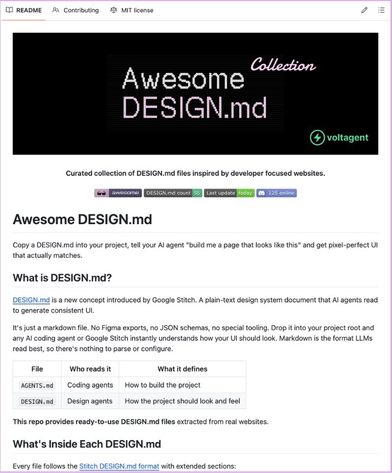
Claude Code is terrible at UI design and everyone knows it. so this repo fixed it. awesome-design-md by VoltAgent is a collection of DESIGN.md files extracted from 31 real websites Stripe, Vercel, Notion, Supabase, Linear, NVIDIA, Apple, and more. you drop one file into your project root, tell your AI agent "build me a page that looks like this" and it generates UI that actually matches. no Figma exports. no JSON schemas. no special tooling. just a markdown file your agent can read colors, typography, spacing, buttons, cards, shadows, responsive rules, everything. it works because DESIGN.md is a concept Google Stitch introduced. plain-text design systems that LLMs understand natively. if you're tired of Inter font, purple gradients, and card grid layouts on every single project — this is the fix. https://t.co/67H23zJp4E

@ybhrdwj ·
signs of taste in web ui: > every interaction happens in 100ms > no product tours > url /slugs are short and simple, no UIDs > persistent resumeable state > not more than 3 colors > no visible scrollbars > all navigation is under 3 steps > copyable svg logo + brandkit > skeleton loading states > copy paste from clipboard > larger hit targets for buttons/inputs > honest one click cancel > cmd + k > very minimal tooltips > copy is active voice, max 7 words per sentence > optical alignment vs geometric > optimized for L to R reading > reassurance about loss

@Manixh02 ·
Found a huge collection of delightful details from top apps. - Micro interactions animations and motion patterns - Real examples from best in class products - Perfect reference when you need that extra polish The kind of details that make an app feel premium. link; https://t.co/8OGSmcDhRk
 Watch video
@UfotUbon ·
Brand designers learn illustration — because identities need original visual language, not just layouts. Video editors learn motion design — because cutting footage is not the same as designing movement. Illustrators learn brand storytelling — because images now live inside systems, not just frames. Product designers learn UX writing — because interfaces are shaped as much by words as visuals. UI designers learn interaction design — because screens are judged by how they behave, not just how they look. Motion designers learn storytelling and pacing — because movement without intent is just animation. Specialists are still valuable. But the industry now rewards designers who can extend their craft beyond a single label.

@AIFrontliner ·
Every day we hunt for the tools that turn “impossible” into “anyone can do it.” This morning I found something different. Not a new tool. A whole platform that’s turning Gen Z into hardware poets and accessibility pioneers in 48 hours. What we saw inside REDHackathon just quietly rewrote my mental map of where the real AI frontier is moving. Let me show you. A Chinese Gen Z team just built a full AI product from scratch in 48 hours and took second place at REDHackathon, a competition built to push young developers to ship real functional AI software under a brutal deadline. The product is called Attune and it actually works. The traditional UI was like a static map — you're the traveler, and you have to know exactly where you're going. But Attune has built a living ecosystem. The UI can sense your needs and react accordingly. The interface comes to you. Clean UI, sharp interaction design, production level output in two days. Local heuristics instantly grab clickable elements on the page and pop up a radial menu near your cursor. AI runs async as an enhancement layer, not a dependency — so no lag. In 48 hours, they also solved: style loss on cloned DOM, input sync back to original elements, and popup repositioning. Shadow DOM inline styles, a proxy input system, relayout logic — the works. This is not a school project. This is what happens when serious builders get the right environment to compete in. rednote built REDHackathon to give exactly this kind of talent a global stage and Attune is proof the standard is high. @xiaohongshu #redhackathon #rednote #technology #AI Watch the demo and see it for yourself:
 Watch video
@felixleezd ·
If you open a Chinese app for the first time, you’ll probably think it’s badly designed. Too many icons and features. Everything crammed onto one screen. If you grew up on Western apps, your instinct is immediate: this is cluttered. But it works. In the U.S., we’ve been trained to associate good UX with minimalism. In China, density often signals value. Open WeChat or Alipay, and it feels overwhelming at first. Information-heavy, feature-packed. But to local users, that density means capability. It says: everything you might need is already here in front of you. If you enter a new market assuming your design taste equals good UX, you’ll misread the signal. Good design is contextual.


@_vmlops ·
EVER WONDERED HOW GOOGLE, SHOPIFY, IBM, OR GITHUB BUILT THEIR UI? THIS REPO HAS ALL OF THEM awesome-design-systems is a curated collection of design systems from the world's best product companies google material, shopify polaris, github primer, ibm carbon, atlassian, salesforce lightning, stripe, airbnb all in one place each entry shows what it includes components, voice & tone guidelines, designer kits, and source code whether you're building your own design system or just want to see how the pros do it, this is the reference you need 18.9k stars and your design system excuses just ran out https://t.co/sbq3M8PvYc

@clairevo ·
How I AI: use @claudeai design to create a "Design System" using my current marketing + app github repos iterate on redesign in CD, prototype new app style guide and prototype import .zip of design into @cursor_ai + opus 4.7 - tell it to go page-by-page or component-by-component ~48 hours of babysitting redesign through full app +19,461-13,063, 230 file PR 1 round of bugbot review (1 dark mode finding) human testing on preview + approval shipped live -> significant improvement in polish across the entire app i love her


@yongfook ·
I don't want to call any app out specifically but there's a trend of UIs that are v complex. Tons of features, layers deep, hidden settings in pop ups / modals, left nav filled with icons. Is this bc of AI slop or is it a modern trend? Any examples of "beautiful" UI in 2026?

@heysatya_ ·
Many designers believe their job is to make apps look pretty. But founders don’t pay for pretty. they care about conversion, retention, and clarity. When designing apps, that’s exactly what we focused on: - Clean onboarding - Modern UI system - Simple and clear user flows - Fast navigation between features - Reducing friction at every step - Clear hierarchy and readability Remember: If users can’t instantly understand your app and want to come back, the design failed - no matter how pretty it is.


@0xDesigner ·
how to use loops for frontend and UI: loops won't automate design, but it will help get the request right on the first implementation attempt. agents still suck at interpreting design requests and, worse, one-shotting spacing/sizing, behaviors, animations, transitions and states. the core of every good loop is clearly defining success. so for every design loop, you need a visual reference. if you're designing something new, you can start with a screen recording of an app you like. record as many interactions as possible. every click, hover state, error state, etc. or if you're working within an existing design system, you can explore figma mockups with agent. the most important thing is to prompt with a pixel perfect reference: a recording, screenshot or figma mockup(s). you can share another app and ask it to adapt the visual design or interactive behavior to your existing app. you should explicitly ask it to translate the reference and adhere to your design system (formal or informal). the second most important thing is in your prompt, before the loop begins, you ask the agent to interview you to fill in the gaps to fully understand your intent. a tool like claude code or codex will ask questions like "what should happen when a user does X" to cover edge cases. a few back and forths will build the context to help cover the important details you forgot or didn't think to mention. lastly, before starting the loop, it's absolutely critical you describe success. "verify with computer use everything looks and behaves as intended" or something along those lines. you are essentially offloading the tedious review, and it will check its own work on a loop until it matches your design brief.

@ayushsoni_io ·
imo interaction design + protyping is going to become the most valuable skill for designers. being able to come up with novel ways of interacting with AI + reducing friction is the layer that brings radical adoption to already existing tech.

@shushant_l ·
I'm shocked most people still spend days designing apps manually. Here's how to design beautiful apps from idea to prototype with AI. --- 📂 AI App Design ┃ ┣ 📂 Idea ┃ ┣ 📂 Problem To Solve ┃ ┣ 📂 Target Audience ┃ ┣ 📂 Core Features (MVP) ┃ ┣ 📂 Platform Selection ┃ ┗ 📂 Product Vision ┃ ┣ 📂 Product Brief ┃ ┣ 📂 Product Overview ┃ ┣ 📂 User Personas ┃ ┣ 📂 Pain Points ┃ ┣ 📂 Feature List ┃ ┣ 📂 Success Metrics ┃ ┗ 📂 Monetization Ideas ┃ ┣ 📂 Competitor Research ┃ ┣ 📂 Similar Apps ┃ ┣ 📂 Popular Features ┃ ┣ 📂 User Reviews ┃ ┣ 📂 User Complaints ┃ ┗ 📂 Market Gaps ┃ ┣ 📂 App Structure ┃ ┣ 📂 Navigation Map ┃ ┣ 📂 Screen Hierarchy ┃ ┣ 📂 User Journeys ┃ ┣ 📂 Information Architecture ┃ ┗ 📂 Flow Planning ┃ ┣ 📂 User Flows ┃ ┣ 📂 Sign Up ┃ ┣ 📂 Login ┃ ┣ 📂 Search ┃ ┣ 📂 Purchase Flow ┃ ┣ 📂 Profile ┃ ┣ 📂 Settings ┃ ┗ 📂 Password Reset ┃ ┣ 📂 Wireframes ┃ ┣ 📂 Low Fidelity Layouts ┃ ┣ 📂 Screen Structures ┃ ┣ 📂 Component Placement ┃ ┣ 📂 UX Validation ┃ ┗ 📂 Layout Iteration ┃ ┣ 📂 UI Design ┃ ┣ 📂 Mobile Screens ┃ ┣ 📂 Dashboards ┃ ┣ 📂 Landing Pages ┃ ┣ 📂 Responsive Layouts ┃ ┗ 📂 Light & Dark Themes ┃ ┣ 📂 Design System ┃ ┣ 📂 Color Palette ┃ ┣ 📂 Typography ┃ ┣ 📂 Buttons ┃ ┣ 📂 Icons ┃ ┣ 📂 Cards ┃ ┣ 📂 Input Fields ┃ ┗ 📂 Spacing Rules ┃ ┣ 📂 Visual Assets ┃ ┣ 📂 App Icons ┃ ┣ 📂 Illustrations ┃ ┣ 📂 Empty States ┃ ┣ 📂 Avatars ┃ ┗ 📂 Background Graphics ┃ ┣ 📂 UX Optimization ┃ ┣ 📂 Visual Hierarchy ┃ ┣ 📂 Navigation ┃ ┣ 📂 Readability ┃ ┣ 📂 Accessibility ┃ ┣ 📂 Button Labels ┃ ┣ 📂 Tooltips ┃ ┣ 📂 Error Messages ┃ ┗ 📂 Onboarding Copy ┃ ┣ 📂 Prototype & Testing ┃ ┣ 📂 Interactive Prototype ┃ ┣ 📂 Clickable Screens ┃ ┣ 📂 Animations ┃ ┣ 📂 User Testing ┃ ┗ 📂 Iteration ┃ ┣ 📂 Code Generation ┃ ┣ 📂 HTML/CSS ┃ ┣ 📂 React ┃ ┣ 📂 React Native ┃ ┣ 📂 Flutter ┃ ┣ 📂 SwiftUI ┃ ┗ 📂 Jetpack Compose ┃ ┣ 📂 Feedback Loop ┃ ┣ 📂 User Reviews ┃ ┣ 📂 Analytics ┃ ┣ 📂 Session Recordings ┃ ┣ 📂 Support Feedback ┃ ┗ 📂 Continuous Improvements ┃ ┣ 📂 AI Tools ┃ ┣ 📂 ChatGPT ┃ ┣ 📂 Claude ┃ ┣ 📂 Gemini ┃ ┣ 📂 Figma AI ┃ ┣ 📂 Google Stitch ┃ ┣ 📂 Lovable ┃ ┣ 📂 Bolt ┃ ┣ 📂 v0 ┃ ┣ 📂 Replit Agent ┃ ┗ 📂 Adobe Firefly ┃ ┗ 📂 Best Practices ┣ 📂 Start With A Clear Problem ┣ 📂 Build An MVP First ┣ 📂 Write Better Prompts ┣ 📂 Keep Design Consistent ┣ 📂 Prioritize Accessibility ┣ 📂 Validate With Real Users ┗ 📂 Improve Continuously

@nurijanian ·
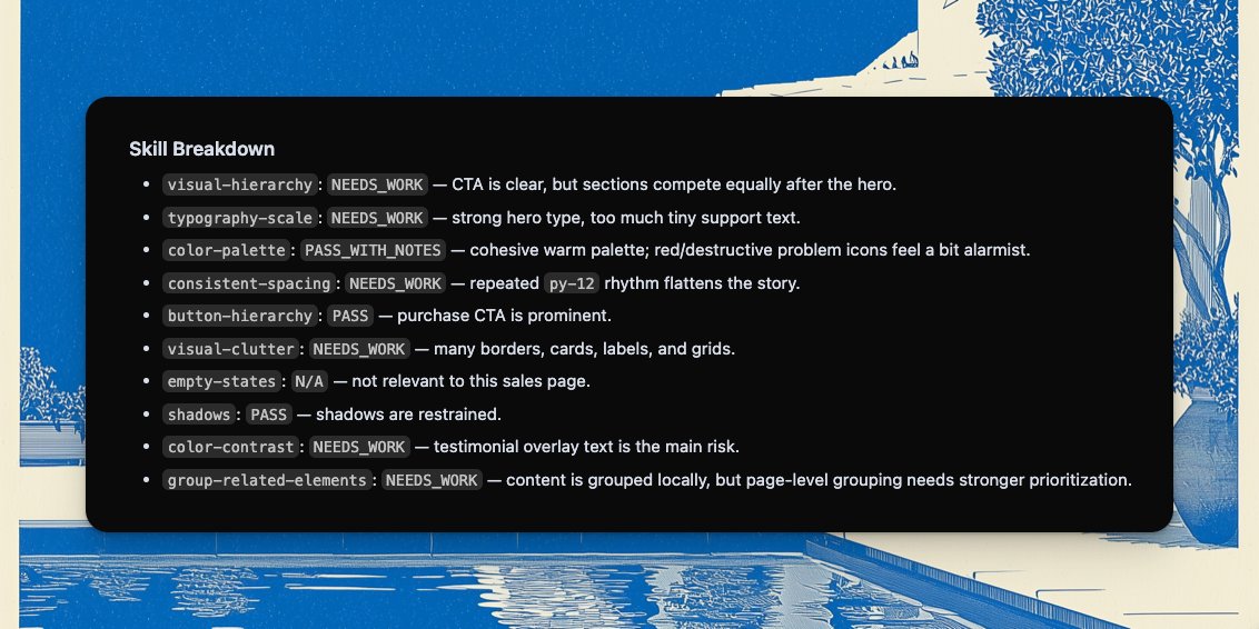
trained Claude Code on Refactoring UI principles, maybe it'll be useful for someone It can now review your UI for: ▎ — visual hierarchy (what draws the eye first) ▎ — typography that creates structure, not noise ▎ — color palettes that don't fight themselves ▎ — spacing that looks intentional ▎ — buttons that clearly rank by importance ▎ — empty states that aren't lazy https://t.co/RUdURi7WFZ

@raphaelschaad ·
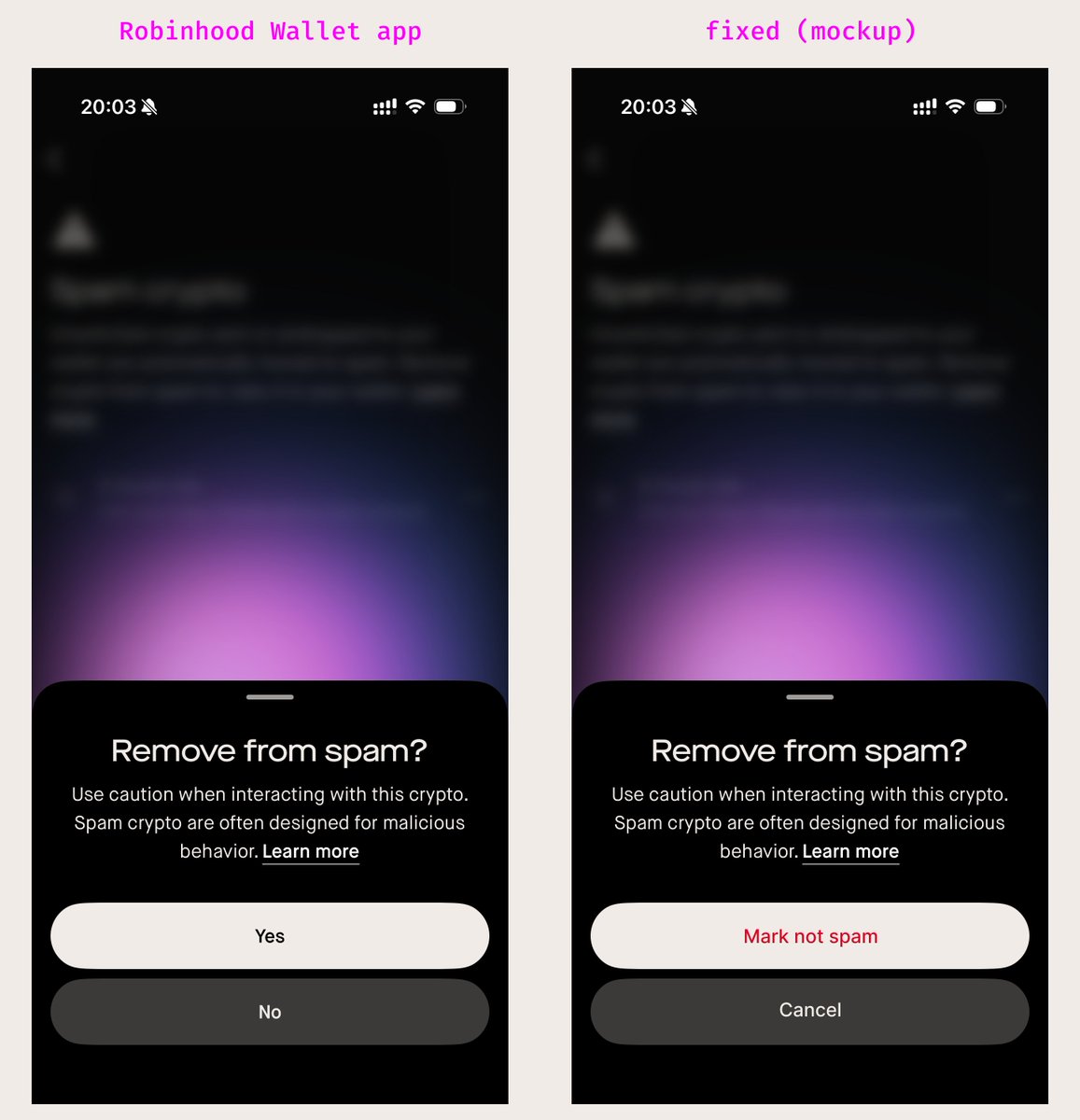
Man, good UX design is such a lost art: Played with the Robinhood wallet app. 30 seconds in, I see simple dialog design principles violated (left) that could easily be fixed (right). It's the cumulation of 1,000 paper cuts like this that get us macOS Tahoe — and it stinks!
@0xDesigner ·
working theory for a prompt to define design success and create a long running design loop (copy and paste)👇 spawn 12 subagents to each act as their own user persona, with human cognitive limits, and with their own psychographics, motivations, and frictions. allow each each computer use to complete [insert job to be done]. measure and report the following: clarity in 3 seconds: in a 5-second test, ≥80% of subagents can answer "what is this screen for?" correctly. one obvious next action: ≥70% first clicks go to the intended primary action. — before spawning for the user tests, spawn a separate subagent to explicitly audit for: clean hierarchy: primary element gets highest visual saliency score on the screen (no competing CTA). consistent type scale + spacing system across all core screens (no ad-hoc styles). intentional states: empty/loading/error/ success all exist, and each includes a next step. recoverable errors: every error message includes cause + action ("what happened" + "what to do"). mobile friendly: 100% tap targets ≥44px, no horizontal scroll, body text ≥16px. — if after completion of any design task any of these criteria is not met, continue iterating, running synthetic user testing, and auditing for the criteria mentioned above. discern with cynicism and avoid any bias when interpreting any of these criteria.

@joulee ·
If you spend any amount of time in design, you know @soleio. I maintain he has one of the sharpest eyes for spotting design talent out of anyone I have seen. He has mentored and hired some of the best at @Meta, @Dropbox, and across dozens of the companies he's invested in. We sat down for a conversation where I asked him: what do you see that others don't? Some of the things that stuck with me: 1. Great portfolios don't document work like a museum. They work like a movie trailer. Within one scroll, you know what this person cares about and why you'd want to work with them. 2. In interviews, polished stories are a red flag. Excellent designers remember the mess. 3. The Facebook Share Bar team spent months perfecting a feature users hated on arrival. The best designers don't just ask "how do we make this a better experience?" They ask "should this exist at all?" 4. When I asked about the line between design and strategy, Soleio was blunt: designers who delegate impact and strategy to PMs "cannot ask for the title of excellent." Full conversation + article below.


@rsuyoy ·
My design principles for human-machine interactions: - The human needs to execute an action on the machine. - The human has an intent. (you can reverse the order of these first two propositions.) - Crudely, the intent is just what the human wants the machine to do. e.g: “I want this link to be pasted in this specific note.” So, the end goal. - Traditionally, tho, we think of the intent in the separate steps it takes to actually fulfill it; I need to open the notes app, find the right note, open it and paste my link. This is a flaw of modern UX, because we increase the friction between the intent and its expression. (the different steps = friction.) - My principle is: the fewer the steps between the intent and its expression, the better the UX. (usually, the number of screen taps is a good proxy for how frictionless the expression is.) UX has mostly operated under the assumption that though we cannot directly inject intent into a user’s mind, we can shape what they think is possible. It’s been about nudging user intent towards what is doable within the scope of our interface, and subsequently make it obvious how to do it. Of course, this is a sound approach because it tackles the fundamental issue of this traditional framework: when the user has an intent that the application does not accommodate (i.e, the user wants to pin all the tasks that are scheduled for the weekend), a design failure occurs. (they will have to locate all these tasks and pin them one by one...) I, nonetheless, wish to offer a model that mitigates this structural shortcoming of traditional UIs. In the age of LLMs, I think it's big time for it. The new paradigm demoed below, which I call “Language Augmented GUIs,” offers, in my view, a wonderful frictionless ‘intent to action’ model. (action = intent expression.) It broadens the scope of possible actions, renders the case of “intent that isn’t catered by the app” extremely rare, and widely eliminates friction. (number of taps excluding typing on the keyboard = very low.) This will ship in the next update of my app. Other examples in the replies below.
 Watch video
@sukh_saroy ·
🚨Drop one markdown file into your project. tell your AI agent "build me a page that looks like this." get consistent UI that actually matches the design system. it's called awesome-design-md -- a collection of DESIGN.md files extracted from 31 real websites. DESIGN.md is a new concept from Google Stitch. same idea as AGENTS.md or CLAUDE.md, but for design: a plain-text file that tells coding agents how your UI should look and feel. no figma exports, no json schemas, no special tooling. just markdown. here's what each file captures: → visual theme and atmosphere -- mood, density, design philosophy → full color palette with semantic names, hex values, and functional roles → typography rules -- font families, size scale, hierarchy table → component stylings -- buttons, cards, inputs, navigation with all states → spacing scale, grid, whitespace philosophy → shadow system and surface hierarchy → dos and don'ts -- design guardrails and anti-patterns → responsive behavior -- breakpoints, touch targets, collapsing strategy → agent prompt guide -- ready-to-use prompts referencing the design tokens 31 sites already in the collection: Stripe (signature purple gradients, weight-300 elegance) · Vercel (black and white precision, Geist font) · Linear (ultra-minimal, purple accent) · Supabase (dark emerald, code-first) · Apple (SF Pro, premium white space) · Notion (warm minimalism, serif headings) · Figma (vibrant multi-color) · Cursor · Sentry · IBM Carbon · NVIDIA · Uber · Claude · Mistral · Ollama · RunwayML · and more. each entry includes the DESIGN.md, a light mode preview, and a dark mode preview. 100% open source. MIT license. (link in the comments)

@sunalsood ·
AI slop outputs didn’t feel good and the real blocker wasn’t models, it was older datasets There’s no high-quality, open source dataset for UI design decisions. No structure, no intent, no layers of why things work. That gap changes the strategy: Instead of tweaking models, we’re building a foundational design dataset from scratch; open, structured, and purpose-built. So currently working with - 2M UI screens - 25M UI elements - iOS, Android, Web What started as experimentation has turned into a deeper bet! Whoever owns the best design data will define the quality ceiling of design AI
 Watch video
@UiSavior ·
100 Must-Have Figma Plugins for UI/UX Designers 🚀 1. Workflow & Efficiency Autoflow Autoname Breakpoints Better Font Picker Design Lint Downsize Quick Look Time Machine Artboard Studio Smart Layers 2. Visual Enhancements Beautiful Shadows Color Shades Contrast Stark Color Blind SVG Motion Gradient Maker Blur for Effect Pattern Hero Gradient Mirror 3. Content & Mockups Content Reel MagiCopy Map Maker Mockup Avatars Storyset Lorem Ipsum Figma Tokens Data Populator Placez 4. Icons & Illustrations Iconify Icon Resizer Icons8 Lottifiles Image Tracer Feather Icons Phosphor Icons Heroicons Illustration Kit Vector Icons 5. Development & Handoff Locofy UIHUT To Path Wireframes Color Styleguide Storybook Connect Code Inspector CSS Grid Layout Hex Color Reader Variable Colors 6. Backgrounds & Removals Remove BG Lazy Load Unsplash Pexels Free Stock Photos Image Compressor TinyImage Compressor Blobs Background Magic Photoslurp 7. Animation & Interactivity Figmotion Animate Me Motion by Icons8 Rive ProtoPie Flow Plugin Click & Drag Flip Book Animation Frame-by-Frame Transitions 8. Layout & Grid Guide Mate Golden Ratio Grid Generator Columns & Rows Spacing 8px Grid Baseline Grid Responsive Resize Shape Divider Auto Grid 9. Prototyping & Testing ProtoPie Plugin Maze Overflow UXPin Merge Userback Balsamiq Wireframes Zeroheight MockRocket Protopie Connector User Testing Plugin 10. Accessibility & Quality Assurance Axe DevTools Color Contrast Checker WCAG Color Checker Focus Order Checker Usability Hub Contrast Figma Accessibility Inspector High Contrast Mode Accessible Color Generator Design QA

@averycode ·
UX matters just as much as features I signed up for a saas that I needed But didn’t end up subscribing bc the interactions were confusing. As a user I didn’t care that it had 10+ features, I needed the core feature to be super easy to learn I don’t have any UX experience so my best reference is getting on a screenshare to watch users use my app It’s rare, but when they agree to this it’s so valuable
@rsuyoy ·
Little UX experiment I made for Cift. The rationale is: when you enter a dragging state, only so many interactions are available to you, so I might as well morph existing UI into drop targets, allowing for more interactions through drag and drop.
 Watch video
@HiTw93 ·
I’m sharing a few posts on how some of the more interesting skills in Waza are built. This one is about the thinking behind /design. The starting point was simple: I really dislike the kind of AI-generated websites that all look the same, usually with emojis, blue-purple gradients, and a generic polished look that is technically usable but visually forgettable. So I took the UI work I’ve made recently and had Claude Code study the way I prompt, refine, and correct design output. That became a base layer of design best practices and anti-patterns. On top of that, I pulled in the useful parts of Claude’s frontend design skill, which gave the whole thing a stronger foundation. For more specific rules, I learned a lot from pbakaus/impeccable. It contributed many of the concrete constraints: banned font lists, color system guidance, theme direction, CSS anti-patterns, animation rules, and other details that help the model build a more reliable sense of visual taste. I also borrowed part of the structure from getdesign, especially its simplified adaptation of Google Stitch’s nine-part scaffold. That gave /design a clearer knowledge framework instead of just a loose collection of tips. The last piece is context. Before using this skill, I ask a few questions first: who the page is for, what aesthetic direction you want, what you want users to remember, what you definitely do not want, and what kind of micro-interactions should define the experience. Once Claude Code has that context along with /design, the results are usually much better, with far less iteration. If you have strong design ideas, better rules, or useful references, feel free to contribute to Waza. PRs are welcome. Let’s build the most useful skill library for engineers together. https://t.co/auohUmNTXO


@DivyanshT91162 ·
I think DESIGN.md is the most underrated file in AI right now. Not prompts. Not workflows. Not model selection. DESIGN.md. Because the difference between an agent that ships generic slop and one that produces polished, coherent interfaces is usually written down long before the first prompt runs. A strong DESIGN.md gives the agent enough context to reconstruct the product from first principles: • Design philosophy • Visual hierarchy • Component system • Spacing rules • Typography standards • Interaction patterns • UX constraints Without it, every generation becomes a guess. With it, the agent starts making design decisions that actually feel intentional. The AGNT DESIGN.md is a great example of this 👇
 Watch video
@designcoursecom ·
Working on some fun UI experiments with @hiunicornstudio Super fun to experiment with different visuals when all you have to do is make your GUI adjustments in Unicorn, and hit "publish"
 Watch video
@RoundtableSpace ·
10 MODERN UI COMPONENT LIBRARIES WORTH BOOKMARKING: Aceternity UI — Premium-looking components https://t.co/CcmvVz2bnD Watermelon — Modern, minimal UI https://t.co/jZbVZLkyqD https://t.co/dGfdEwi99Y — Massive community component library https://t.co/dGfdEwi99Y Shadcn Studio — 800+ shadcn blocks https://t.co/bpNCsd6Rme React Bits — Animated React components https://t.co/gYbq8zFVhz Motion Primitives — UI motion components https://t.co/qT81WGZdMb Fancy Components — Creative and experimental components https://t.co/rbX5Fqm7Hw UI Layouts — Complete UI layouts https://t.co/8R0vrzLE6I Number Flow — Animated numbers https://t.co/FVqK5bw69D Component Gallery — Patterns from 95 design systems https://t.co/Xo5vfWi2NR

@michalmalewicz ·
I tested Opus 4.8 on professional UX design workflows. (not UI) for a real client project. In parallel, I did all the required work manually, then compared. Negatives: • It got about 20% of the general structure right. • Every single flow node had errors or logical gaps (mostly the latter) • It created at least 30% more screens than were necessary, split simple functionalities into multi-step patterns • The generated low-fidelity prototype was missing crucial parts (huge logic gaps) Positives: • It created around 10 edge-case nodes (and lo-fi renders) for which a normal design process usually doesn't have the time/budget. They required manual fixes. • It did everything within 2 hours instead of 2-3 days. The models are "smart" and capable. So why was the result not that good? A couple of reasons: 1. The project was non-typical and complex 2. Most publicly available case studies of actual UX flows are not detailed enough. AI learns on Dribbble, Case studies from juniors and extrapolates an average Was this exercise useful? Kind of. I do see AI in flow generation but nowhere near automatic. It does make sense in case of flow diagrams and lo-fi prototypes to create your own database of JSON files and always have a built-in tool to manually fix every step of the way. If you get complacent or lazy during this process, you end up with a bad design EVERY SINGLE TIME. I plan to write a more detailed breakdown of this and how I'm trying to bend it to work in a truly beneficial way, beyond some extra edge case flows.
@raphaelschaad ·
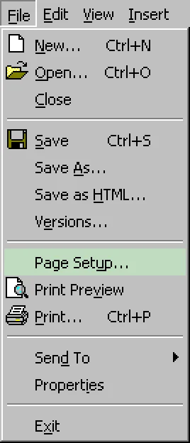
This morning I read one of the best (saddest) posts on UI design in a while: https://t.co/KB5V6XkwYd (via @daringfireball @jasonfried @josephhhhz) Also a reminder that Win95 was completely goated (the underlined letters where you could ALT+ shortcut … chef's kiss):
@sunalsood ·
UI isn't just evolving. it's dissolving. And the designers who only know how to design screens are going to wake up one day wondering where the screen went. Keyboard → Touch → Voice → Context Every few years the way we talk to technology gets simpler. we went from typing commands to tapping screens to just talking. Now tools like Wisprflow, Spokenly and Neosapien ( Wearable tech) are taking it even further you just speak your thought out loud and the system figures out the rest. no typing. no tapping. Just Intent. But the bigger shift isn't about input at all. it's about output. systems are getting smart enough to understand what you need before you even ask. Think about it your phone already knows your morning routine, your calendar already suggests your next meeting, your email already drafts replies. we're slowly moving from "I tell the computer what to do" to "the computer already knows what I need." So what does this mean if you design apps for a living? it means the buttons, forms, and screens we spend all day perfecting might matter less and less, because if the system already knows what you want, why would you need to tap anything at all? The job of a designer is shifting; less "make this screen pretty " more " understand what the person actually needs and deliver it before they go looking for it. Context + understanding intention
@designcoursecom ·
It's harder to become a great UI designer than a UX designer. UX design is predominantly: Is this obvious, easy, and logical? UI design is understanding colors, how they work woth each other, alignment, white space, viz. hierarchy, what is achievable and when, typography, and tooling.

@anjalisinggh12 ·
UI/UX Design Principles 2 Today we're covering White Space. White space isn't empty space it's intentional space. It improves readability, creates focus, groups related content, and makes interfaces feel clean and effortless to use. One of the simplest design principles that can completely change the user experience. What's your biggest takeaway from this one? #UIDesign #UXDesign #WhiteSpace #DesignPrinciples #Figma #ProductDesign #LearningInPublic


@Hormowunmi22 ·
Have you ever finished a design... looked at it proudly... and then heard, "This looks great... but how does it help the business?" That question catches many designers off guard. Not because they're bad designers. Because no one taught them to think beyond the screen. Here's the misconception: Many designers believe their job ends when the interface looks good. Product Designers know that's where the bigger conversation begins. Every feature you design costs time, money, and engineering effort. If it doesn't create value for users and the business, it's difficult to justify. That's why understanding a few business metrics can completely change how people see you. Here are 5 business metrics every designer should understand 👇 1. Conversion Rate This answers one simple question: Are users completing the action we want? For example: If 1,000 people visit a sign-up page and only 80 create an account, your design may have friction. A better onboarding flow could improve that number. Good design should help people move forward. 2. User Retention Getting users is one thing. Getting them to come back is another. Ask yourself: "Would someone want to use this product again tomorrow?" Retention is often a stronger sign of good UX than downloads. 3. Task Success Rate Can users actually complete what they came to do? Can they book a ride? Transfer money? Find a product? A beautiful interface means very little if users can't finish their task. 4. Customer Satisfaction Do users leave feeling confident... or frustrated? Whether it's surveys, reviews, or usability tests, understanding how people feel helps you improve future decisions. Happy users are more likely to recommend your product. 5. Drop-Off Rate Where are people giving up? If users abandon checkout, onboarding, or payment halfway through, that's valuable information. Instead of redesigning everything, investigate where people leave and why. That's where your biggest design opportunities often hide. Here's what changed when I started thinking this way. I stopped asking, "Does this screen look clean?" I started asking, "What business result should this screen improve?" That one question changed how I approached every project. Because companies don't invest in design to make products prettier. They invest in design to help users succeed and help the business grow. When you understand both sides, you stop looking like someone who only designs interfaces. You become someone who helps products succeed. 💬 Let me ask you: Which business metric do you think more designers should pay attention to... and why? Happy Weekend 💜


@Tegadesigns ·
✨ 6 Websites Every UI/UX Designer Should Use for Design Inspiration ✨ Whether you're just starting out or a seasoned pro, these resources will level up your design process 1️⃣ Mobbin – https://t.co/WAPh4BQB6s Best known for: The largest library of real-world mobile & web app screens and user flows. Perfect for studying proven UI patterns, components, and interactions from top apps (think Netflix, Airbnb, Uber). 2️⃣ Lapa Ninja – https://t.co/3gAfHHl4up Best known for: Curated landing page inspiration. Thousands of high-quality full-page screenshots and videos of the best converting and visually stunning landing pages, updated daily. 3️⃣ Page Flows – https://t.co/YCUIeAZssz Best known for: User flow inspiration. It shows step-by-step screenshots and videos of actual UX journeys (onboarding, checkout, login, etc.) 4️⃣ Behance – https://t.co/3nJa5ovSj5 Best known for: In-depth creative case studies and portfolios. Designers showcase full UI/UX projects with process, wireframes, and final designs. Great for seeing polished end-to-end work and finding inspiration for presentations or job applications. 5️⃣ Awwwards – https://t.co/GGXAkKpSxt Best known for: Award-winning website design. Features the most innovative, high-production web experiences with jury scores and trends. Perfect for discovering cutting-edge animations, interactions, and experimental web design that pushes boundaries. 6️⃣ Dribbble – https://t.co/lt8y15DNZN Best known for: High-quality UI shots and visual concepts. It's the go-to community for designers to share polished app interfaces, icons, illustrations, and micro-interactions. Amazing for quick aesthetic inspiration and discovering trending styles. 💾Repost and save this for later.

@BigHuman ·
Great UX used to be filed under "make it pretty" but it's really a revenue conversation. Better interactions = higher conversion. Clearer flows = fewer abandoned carts. Intuitive design = lower support costs. Every pixel either makes you money or costs you money.

@HotAisle ·
I spent Saturday doing a major UX redesign of https://t.co/SoBzRgGVAI. The goal was to make it as minimalist and brutalist as possible: light and dark modes, fewer separators, less visual weight, a cleaner presentation of dense data, and device responsive. Colors are standards based. AI was a huge help, but you still need to direct it and know what you want. Its real advantage is making refactoring and exploring new ideas nearly painless, it's an endlessly patient design partner. RideControl is quickly becoming the bike-trainer workout app I've always wanted. It has sped up my own recovery, and if you want to build fitness quickly, this is it. It's amazing that we can now build things almost entirely with words and screenshots. Free and open source. Runs entirely in Chrome browser. No tracking, account, or login. https://t.co/2I34eAbtag


@lottsnomad ·
a design principle you should follow: one screen = one action users won’t always tell you what’s wrong their behavior will where they tap where they drop what they ignore behavior is the real user interview
 Watch video
@osi_fav ·
User research does not replace taste. It sharpens it. Research tells you what users struggle with. Taste decides how to solve it. You can collect interviews, surveys, and usability tests. But turning those insights into a simple, elegant product still requires judgment. Because users will show you the pain. They will not design the solution. Great product teams use research as a compass, not a crutch. Research reveals patterns. Taste turns those patterns into clear decisions. Without research, you are guessing. Without taste, you are just documenting problems. The real advantage is knowing when to listen to the data and when to shape it into something better. For designers and founders here: What insight from user research completely changed how you designed a feature?


@feifei_qiu ·
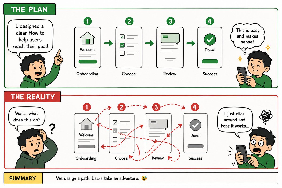
UX designer: OMG, my user gonna love this: simple and guided flow to get task done Users in real world: what's this? what's that? where should I click? why the app so difficult to navigate 🤯 Every user is taking their own adventure in your product 😅

@TheRobertAvram ·
I designed 20+ product screens in 10 minutes with Claude using raw business research. Here's what I did: I fed Claude our entire research for a project. Market data. Audience profiles. User types. Core actions. Business goals. Then I told it what information we should have on each screen. Then I asked it to generate an HTML wireframe. What came back was genuinely useful. And I am not talking about design. That is bad even though it had previous designs reference, full brand and access to the Figma file. But the information architecture? How the product could be structured. Screens. Flows. Hierarchy. Relationships between sections. That was really good. And it made it in minutes. Here's what most people get wrong about using AI in design: They try to use it to REPLACE the "$10k designer". We use it to ACCELERATE the thinking. The research still has to be done by humans. The strategy still needs real conversations. The decisions still need judgment. The end design still needs to be done by a senior designer. But the translation from research → structure? AI is exceptional at that. It sees patterns in the data. It organizes information logically. It gives you something to react to instead of a blank canvas. We don't start with this output. We start the conversation with it. "This is what the data suggests. Now let's challenge it." That's the difference between using AI as a shortcut and using it as a thinking partner.
 Watch video
@DenisJeliazkov ·
Your design taste doesn’t arrive magically you have tk buildit What worked for me and for countless others • Rebuild UIs you like, pixel for pixel an hour a day min • Every time something feels off, write down why • Screenshot everything no matter how good or bad, I pref the bad ones as they give more value Give it a few months and you start noticing the rules nobody wrote down. Spacing that’s doing work. A button that’s lying about what it does and it’s the most boring work out there, but this is why it works!

@jshguo ·
I have a feeling AI will fundamentally reshape software and interaction design. At the same time, “just add a chat box” doesn’t feel like the real answer, which is more like an early, rough phase. As for what it turns into…I genuinely don’t know yet.

@did0f ·
Day 76 #BuildInPublic I never thought I’d enjoy UI/UX design this much. The best way to solve usability problems? Recreate what people are already used to. Basically like Final Cut Pro, but simplified. What do you think?

@timothylindblom ·
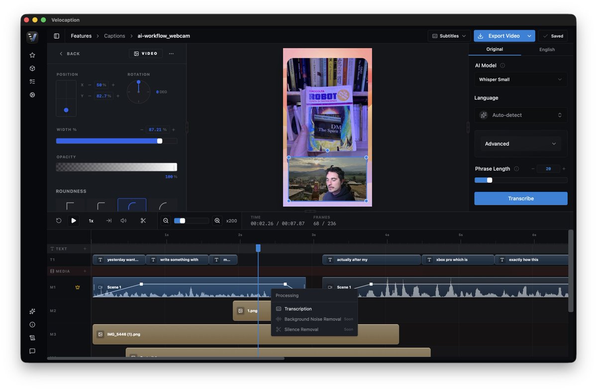
How to ship a badass UI in 4 steps: 1. Design system. - Pick your colors, spacing, and type before touching screen. 2. Use real data. - Build core screen with real content. - Lorem Ipsum is a lazy way to run your testing. 3. Build intentional flows. - Create detailed views that expand naturally. - Each tap serves a purpose. 4. Add micro animations. - Layer in micro interactions. - The small details create the best apps. In 2026, you need to be shipping FAST without quality sacrifice.

@TheJobfather__ ·
One thing I respect about jobs like UX research is that they require a certain amount of backbone. You are going to have moments where the whole room is leaning one way and you have to be the person saying, “No, this is a bad call and here’s why.”
@RoundtableSpace ·
SOMEONE TURNED THE IPHONE DYNAMIC ISLAND INTO A WORKING POLAROID CAMERA AND THE WHOLE THING LIVES INSIDE THE ISLAND ITSELF It's called Pico Cam and the interaction design is pure skeuomorphism done right. → Drag the island down to open the camera → Tap to snap, then the photo morphs and ejects out of the slot → The picture slowly develops like a real polaroid, and shaking your phone speeds it up → Every sound and interaction is mapped to haptics so you feel each step → Fully native Swift, kept under 5mb after a month of work Built entirely with Codex and it shows what's actually possible with AI coding tools right now.
 Watch video
@ixdf_org ·
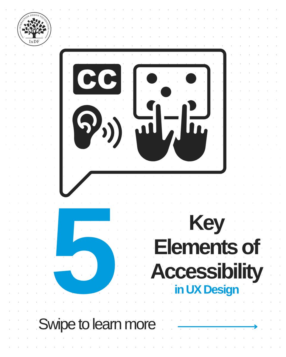
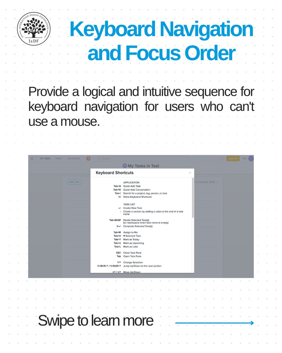
Do you watch videos with closed captions in loud places? 🔊 Or enjoy using your favorite app seamlessly on both your computer and your phone? 💻📱 That’s accessibility design. Accessibility features don’t only support people with disabilities. They make products and services easier for everyone to use. Swipe through to learn the 5 key elements of accessibility in UX design: ✔ Color and contrast ✔ Keyboard navigation and focus order ✔ Screen reader compatibility ✔ Alternative media and captions ✔ Responsive and scalable design Accessibility is about creating products that are easier to use, more inclusive, and more human-centered. 👉 Explore our open-access resource to learn more about accessibility audits and inclusive UX design: 🔗 https://t.co/LS2tvG8bAc #GAAD #InclusiveDesign #UXDesign #DesignForAll



@thelifeofrishi ·
as a designer building a design tool 🎨 i've spent a lot of time using little interactions to improve UX while keeping whole experience look smooth and beautiful here are some tiny details I've designed(with love) in Orshot Studio 🙂 1) the save interaction, clearly notifying autosaves
 Watch video
@ixdf_org ·
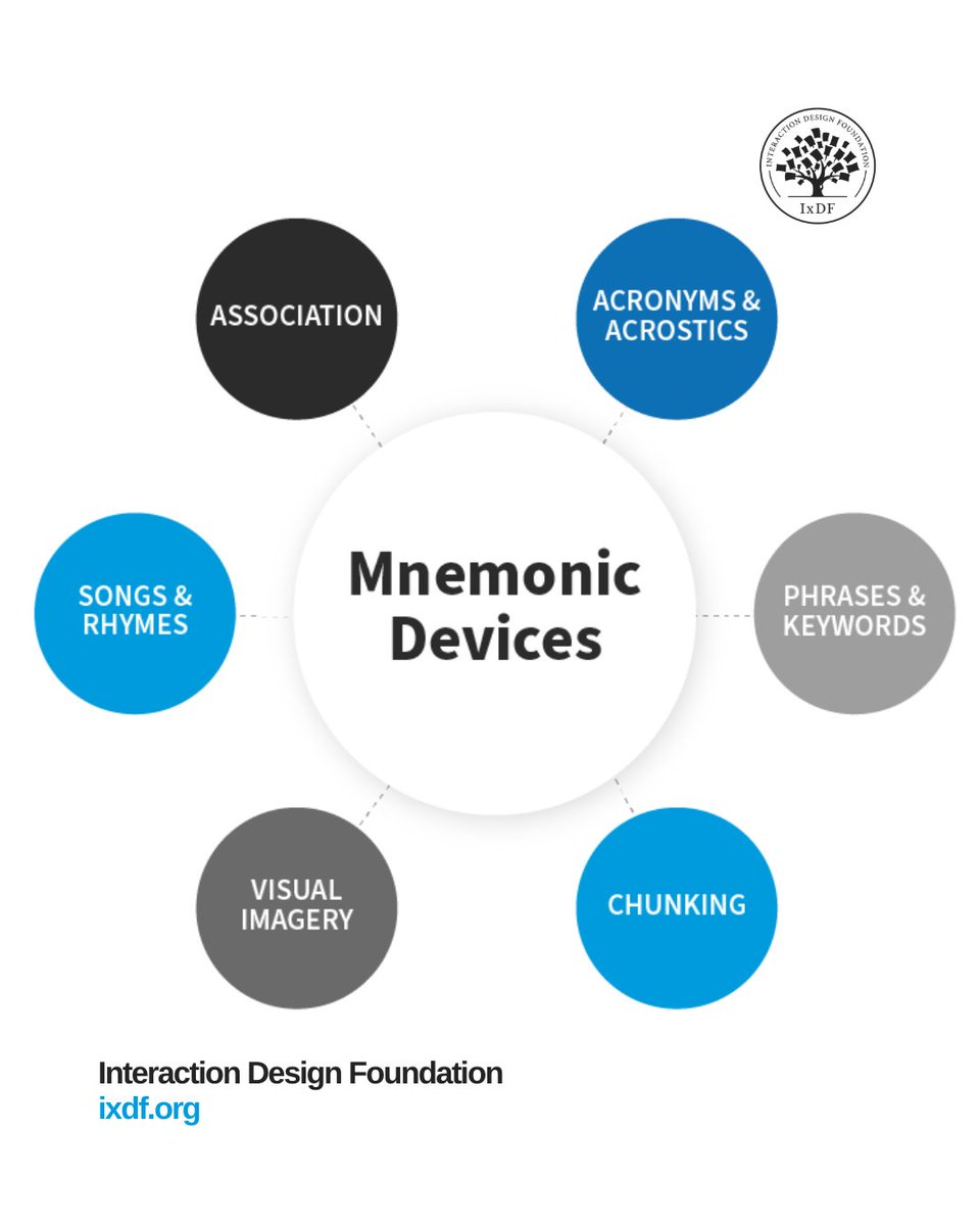
Want to make your design easier to remember? People don’t remember abstract information. They remember stories, visuals, and spaces. That’s why mnemonic devices work. They help you turn complex ideas into something users can recognize and recall. ✅ Recognize patterns faster ✅ Navigate interfaces more easily ✅ Know what to do next without hesitation Good design works with how memory actually functions. 👉 Learn more: https://t.co/MjCpTFNehm #UXUI #ixdf

@bmykhaylivvv ·
it is sad I was playing out with 3 design tools on weekends to sketch the design of some of the new concepts for aisdr Magic Patterns, banani(.)co, Stitch by Google just look at these 3 example pages generated by each tool they are super similar it makes me super sad this design is very generic, each single prompt vibe-coded tool has this design another more important thing is that it is "prompt to image (web components mostly)", but these tools do not think on "what would be the best ux solution here" I believe that such tools must have much more reasoning on top of the components generation it is so easy for not to tell "generate react component from %USER PROMPT% and display it to user" -- almost any llm can do it but true product design approach will be super useful here -- make llm care about user, about user flow and ux

Best UI/UX Design tweets
Xholic studies what works in your niche, drafts posts in your voice and schedules them for the hours your audience is online.
$0 today · Cancel anytime
Browse all tweet collectionsKeep exploring