Most people compare two X accounts by looking at their follower counts. That is the number X shows first, and it tells you the least. Followers pile up over years, many of them stop reading, and a big account can reach a smaller share of its audience per post than an account a tenth its size.
A useful comparison asks a different question: what does a typical post from each account achieve right now, and how efficiently? That means comparing recent posts on views, engagement relative to those views, and posting pace, and only then looking at audience size.
This guide uses Xholic’s free Compare Twitter Accounts tool to do that, explains how each metric is normalised, and walks through a real competitor benchmark.
What the comparison is built from
For each handle, the tool reads the profile plus its most recent original posts, up to 30. Replies and reposts are left out, so you compare what each account chose to publish.
Each side gets a sample label under its profile:
| Original posts in the sample | Confidence label |
|---|---|
| 20 or more | High |
| 8 to 19 | Medium |
| Fewer than 8 | Low |
A comparison is only as reliable as the smaller sample. Everything comes from public data: the tool can’t see private impressions, profile visits, link clicks or follower sources.
The nine metrics and how each one is normalised
| Metric | How it’s calculated | Normalised by |
|---|---|---|
| Followers | The profile’s current follower count | Nothing (raw size) |
| Median views | The middle view count across sampled posts that show views | Per post |
| Average views | Mean view count across the same posts | Per post |
| Average engagements | Likes + replies + reposts + quotes, averaged | Per post |
| Engagement rate | Total engagements ÷ total views, across posts with view counts | Per view |
| Grade | Engagement rate graded A to D against accounts of the same follower tier | Per view, then by size |
| Profile score | Mean of five 0–100 checks on the profile and recent activity | Fixed 0–100 scale |
| Posts per week | Sampled posts ÷ days from the oldest one to the scan × 7 | Per week |
| Est. monthly rewards (rough) | Average views × posts per week, projected to 30 days, at an assumed $5–$12 per million views (the assumption is printed under the table) | Per month |
- Median views is the headline. The summary sentence compares median views first, because the median is the best guess at what the next post will reach. One viral post can double an average but barely moves a median.
- Engagement rate is by views, not followers, so it measures how people who actually saw a post responded. Bookmarks aren’t counted.
- The grade adjusts for size. Engagement rates fall as accounts grow, so the same rate earns a different grade per follower tier:
| Follower tier | A | B | C |
|---|---|---|---|
| Under 1K | 8%+ | 4%+ | 2%+ |
| 1K–10K | 6%+ | 3%+ | 1.5%+ |
| 10K–100K | 4%+ | 2%+ | 1%+ |
| 100K–1M | 2.5%+ | 1.25%+ | 0.6%+ |
| 1M+ | 1.5%+ | 0.75%+ | 0.3%+ |
Below C is D. A grade needs at least 3 original posts with public view counts.
The profile score (completeness, follower-to-following balance, engagement, consistency, bio clarity) is a profile health check, not a performance number. Earnings are a projection of X’s Original Content Rewards from views and pace, not a payout, and they ignore whether an account is enrolled. Skip that row for brands; the X Monetization Calculator guide covers what drives creator income.
How the margins are written
The “Who’s ahead” column names the leader on every row and the size of the gap:
- Under 2x apart: a percentage, such as 85% more.
- From 2x to under 10x: a multiple, such as 4.5x more.
- 10x or more apart: the absolute difference, such as 928.4K more, because “33x more” reads as noise.
- Engagement rate: percentage points, such as +0.20 pts. Profile score: points. Grade: grade steps.
- Values within 2% of each other read Even. A row where either side lacks data reads Not enough data instead of showing a zero.
How to compare two accounts, step by step

Step 1: Enter both handles
Put your account in Your account and the one to measure against in Compare with (1). Each field takes an @handle, a username or an x.com profile link. Press Compare accounts; it takes a few seconds.
Step 2: Check each sample before anything else
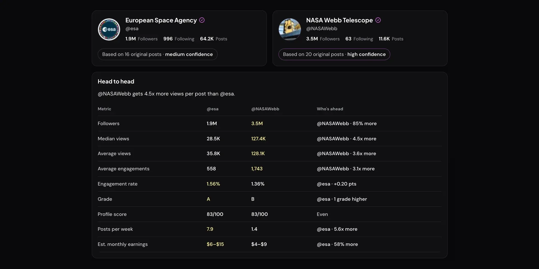
Under each profile (2) is the number of original posts analysed and the confidence label: 16 (medium) for @esa and 20 (high) for @NASAWebb here. If one side is low, treat its margins as a direction, not a verdict.
Step 3: Read the head-to-head table from the top down
Start with the summary sentence and median views (3), then engagement rate and grade: how far a typical post travels and how well it lands. Followers, profile score and earnings are context.
Step 4: Use the “Who’s ahead” column
The last column (4) gives a quotable line per row, like “@NASAWebb · 4.5x more”. The leading value is also highlighted.
Step 5: Read where each account wins

The “Where @x wins” panels (5) list up to four rows each account leads, in table order. They’re a summary, not a ranking: “posts more often” counts as a win even when it isn’t one.
Step 6: Compare timing, format and best post
Next (6) come each account’s three best posting times in your timezone, a content-mix table and each account’s top recent post, with its engagements as a multiple of that account’s average. Under 10 sampled posts, posting times lean on general X activity patterns.
Step 7: Save or share the result
Copy summary (7) copies a plain-text version with every row, both win lists and a link. Download comparison (PNG) saves an image. Share link shares or copies a URL that reruns the same two handles on fresh data.
Step 8: Go deeper on one account
The links under the result (8) open a full X Profile Analytics report for either account, explained in the X Profile Analytics guide.
Why raw follower counts mislead
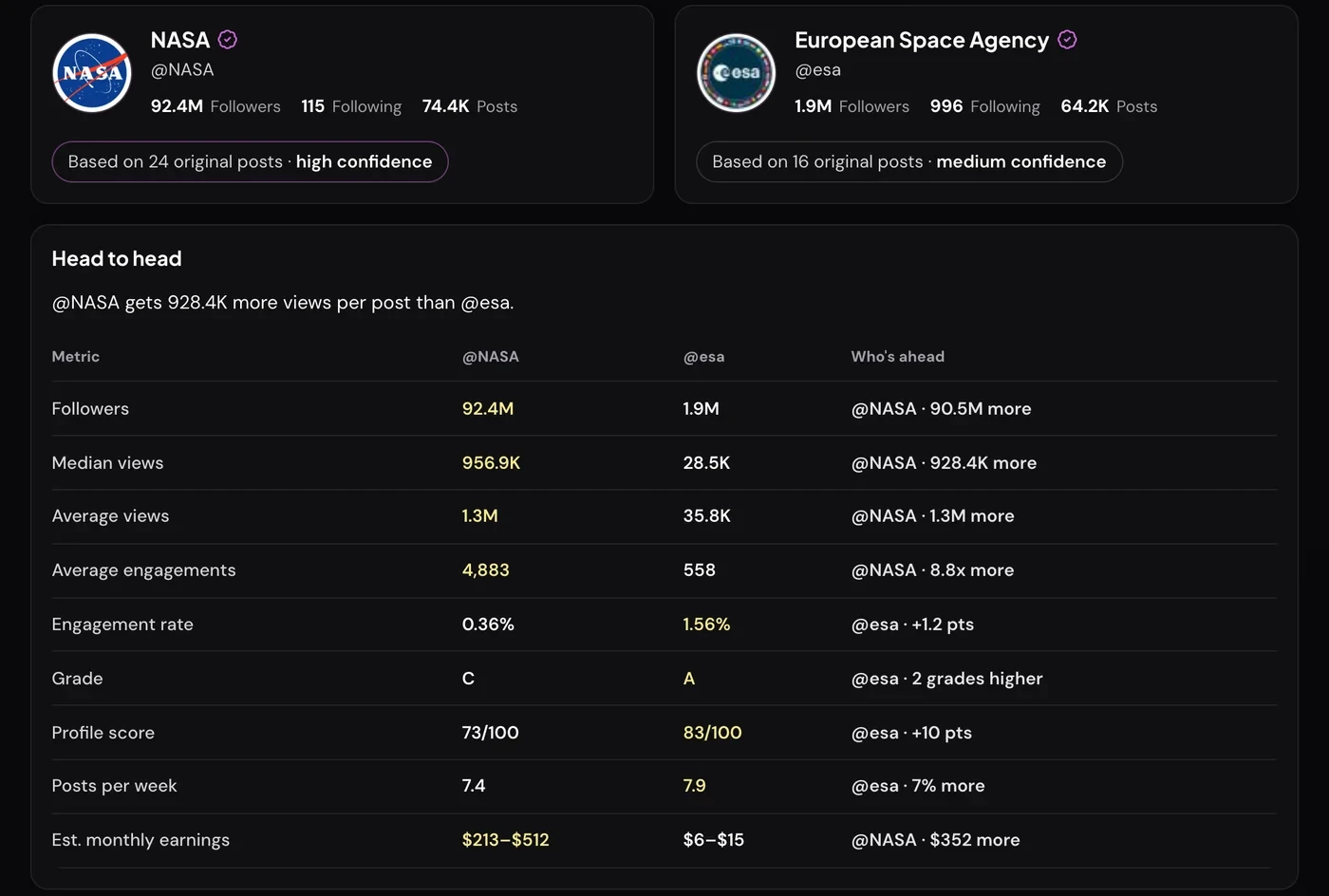
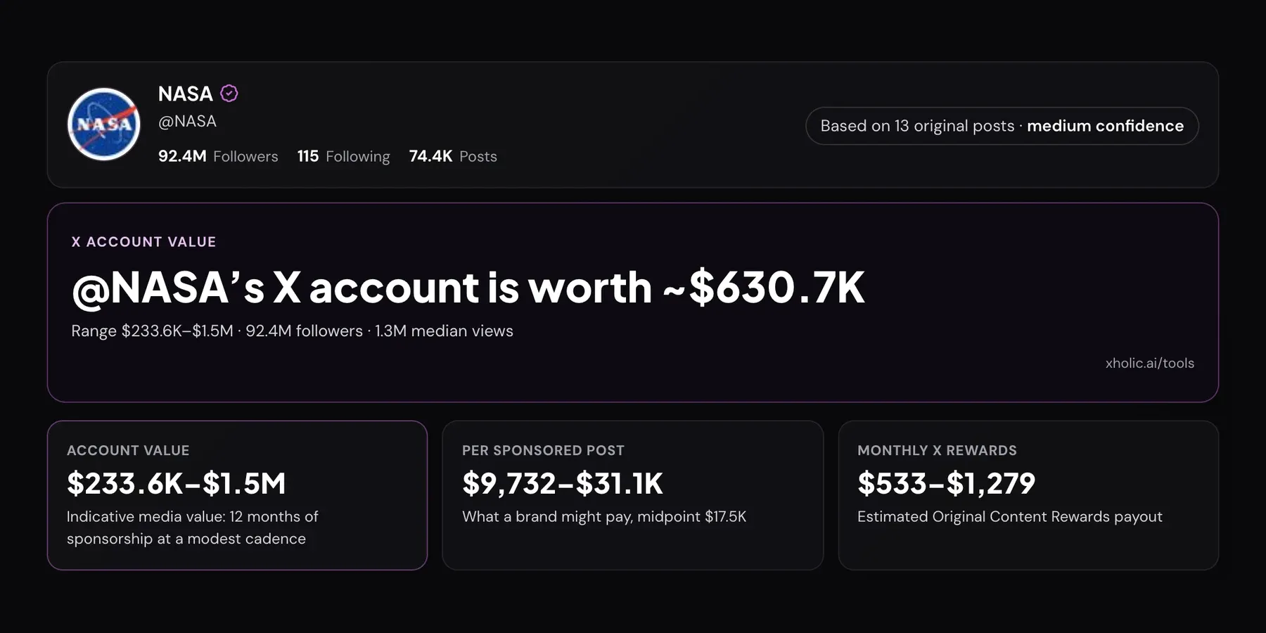
Compare @NASA with the European Space Agency (@esa) and NASA leads followers by 90.5M and median views by 928.4K a post. With about 48 times the followers, of course it gets more views. That tells ESA nothing it can use.
Normalise and the picture changes:
- Reach per follower. Divide median views by followers yourself. NASA’s typical post reaches about 1.0% of its follower count (956.9K ÷ 92.4M). ESA’s reaches about 1.5% (28.5K ÷ 1.9M). The smaller account reaches a larger share of its audience.
- Engagement per view. ESA’s engagement rate is 1.56% against NASA’s 0.36%. People who see an ESA post are about four times as likely to like, reply, repost or quote it.
- Size-adjusted grade. Both accounts sit in the 1M+ tier, where 0.3% is a C and 1.5% is an A. ESA grades A; NASA grades C.
None of this means ESA “beats” NASA. It means a follower count can’t tell you whether content is working. Very large accounts tend to have lower engagement rates, because their posts reach many casual viewers beyond their core fans. Our article on good engagement rates by follower count covers why rates compress as accounts grow.
The practical rule: use followers for context, median views for reach, and engagement rate plus grade for content quality. When accounts are 10x or more apart, absolute margins always favour the bigger one.
How to pick a fair comparison set
A benchmark is only useful if the accounts could realistically swap places. Before you compare, check that they share:
- Size band. Stay within the same follower tier where you can, or at most one tier apart. The grade adjusts for tier, but views and engagements don’t.
- Audience and topic. Two accounts posting to the same people about the same subject. A space agency against a sports brand tells you nothing.
- Account type. Brand against brand, founder against founder. Personal accounts often draw more replies than brand accounts.
- Enough recent posts. Both sides should reach at least medium confidence. An account that posted twice in three months can’t be benchmarked on pace or a typical post.
Then build a small set rather than one rival: two or three peers of similar size, plus one account a tier above that shows what’s possible. The tool compares two accounts at a time, so run your account against each one and note the rows that recur. For choosing who belongs in that set and what to watch beyond the numbers, see our Twitter competitor analysis playbook.
A worked competitor benchmark: @esa vs @NASAWebb
ESA and NASA’s Webb telescope account are a fair pair: both are space-science accounts in the 1M+ tier, posting mostly images and links to a similar audience. Here’s how to read the comparison in the screenshots above.
1. Check the samples. 16 posts for ESA (medium) and 20 for Webb (high). Good enough to compare, with a little caution on ESA’s side.
2. Reach. Webb has 85% more followers (3.5M against 1.9M) but 4.5x the median views (127.4K against 28.5K). Normalised, Webb’s typical post reaches about 3.6% of its follower count; ESA’s reaches about 1.5%. Each Webb post reaches a much larger share of its audience.
3. Consistency. Webb’s average (128.1K) and median (127.4K) are almost identical, so its views are steady. ESA’s average (35.8K) sits above its median (28.5K), so a few posts outperform the rest.
4. Response quality. ESA wins engagement rate by +0.20 pts (1.56% against 1.36%), which is enough to cross the A line for its tier, while Webb grades B. Viewers respond slightly more to ESA’s posts, even though fewer people see them.
5. Pace. ESA posts 7.9 times a week to Webb’s 1.4, or 5.6x more often. This is the biggest strategic difference. Webb publishes rarely, mostly image releases. ESA posts near-daily mission updates.
6. Format.
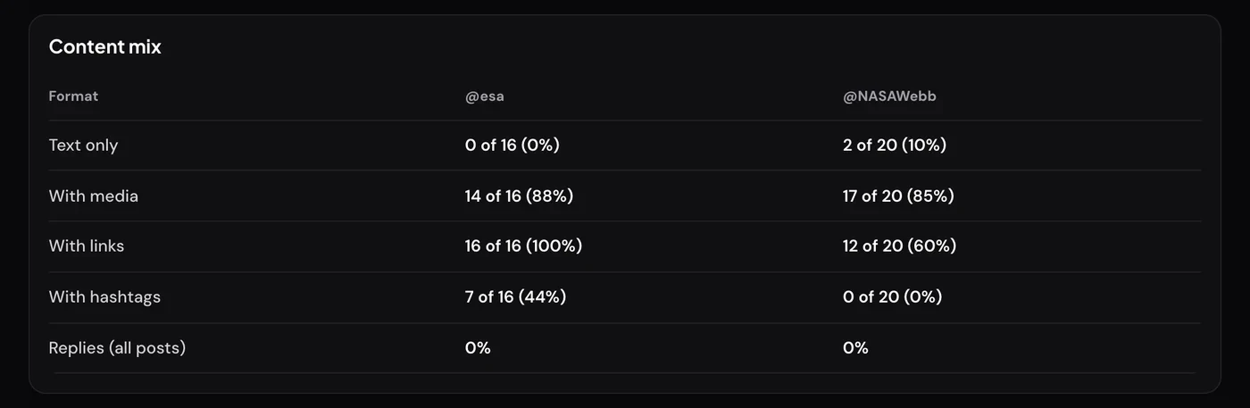
Both accounts put media on most posts. ESA links out on every post and uses hashtags on 44% of them; Webb links out on 60% and never uses hashtags.
7. What ESA would take from this. These are hypotheses to test, not conclusions:
- Fewer, stronger posts may lift median views. Test whether a lower cadence of flagship image posts raises reach per post without losing the engagement-rate lead.
- Try some posts without a link or hashtags and compare their views with the linked ones.
- Study the posts that pull ESA’s average above its median and make more in that format.
Ignore the earnings row: ESA leads it only because it posts more.
8. Repeat it. Save the share link and rerun it monthly with the same pair. Tracking the same rows over time shows whether a change worked. Our guide to tracking a competitor’s X analytics covers building that into a monthly report.
Troubleshooting
- “Both fields have the same account. Enter a different handle to compare with.” The two fields resolve to the same handle, ignoring capitals.
- “X handles use 1–15 letters, numbers, or underscores. Check the spelling.” The text isn’t a valid handle or x.com profile link.
- “We couldn’t find that account on X.” The handle is misspelled, or the account is suspended or deleted.
- “This account is protected, so its posts aren’t public.” Protected accounts can’t be compared.
- “You’ve run a lot of checks in a short time.” Wait a few minutes and try again.
- A row says “Not enough data”. That account’s sample has no posts with view counts, or too few original posts. It is not a zero.
Frequently asked questions
Is the Compare Twitter Accounts tool free?
Yes. It needs no login and no X account connection, and it only reads public profile and post data.
Can I compare more than two accounts at once?
No, it compares two at a time. To benchmark against several competitors, run your account against each one and track the rows that keep coming up.
Will the other account know I compared them?
No. The tool reads public data and doesn’t post, follow or notify anyone on X.
Why does the tool use engagement rate by views instead of by followers?
Because views show how many people actually saw the posts. A rate by followers punishes large accounts with many inactive followers and can’t separate weak content from low reach. You can still work out reach per follower by dividing median views by followers.
Does the earnings row show what an account actually earns?
No. It’s a rough projection from views and posting pace, assuming $5–$12 per million views for X’s Original Content Rewards, based on reported creator payouts. X publishes no rate, and only impressions from Premium viewers count, so real payouts can be much lower. It doesn’t know whether either account is enrolled or eligible.
Related guides and tools
- Compare Twitter Accounts: run your own head-to-head comparison.
- X Profile Analytics: a full public report for one account.
- Twitter competitor analysis: choose competitors and turn findings into a plan.
- How to track a competitor’s X analytics: a repeatable monthly tracking workflow.
- Twitter Engagement Rate Calculator: grade your own engagement from your own numbers.
- Best Time to Tweet guide: read and use posting-time recommendations.