A thread’s first post gets 12,000 views and its last post gets 3,000. Is that bad? You can’t tell from those two numbers. What you need to know is where the views fell away, because a thread that loses readers slowly and evenly has a different problem from one that falls off a cliff at post 5.
X doesn’t give you a “thread completion rate”. It does show a view count on every post, and if you line those counts up you get a drop-off curve that points at the transition worth rewriting.
This guide shows how to collect those numbers, the exact formulas Xholic’s free Twitter thread retention calculator uses, how to read the curve, and what to change once you’ve found the weak spot. If you want the writing side first (hooks, arcs, formats), start with how to write a viral Twitter thread and come back with a published thread to measure.
What the numbers can and can’t tell you
Each post in a thread has its own view count. Those counts aren’t unique readers: X counts repeat views, your own views, and views of a single post that was quoted, reposted or surfaced on its own. So a ratio such as “post 8 had 28% of post 1’s views” means 28% of the exposure, not “28% of people finished the thread”.
That’s why the calculator calls its outputs exposure proxies and asks you to compare them with your own similar threads, not a universal benchmark. Even with noisy counts, a sudden step down between two neighbouring posts is hard to explain by anything other than people deciding to stop there.
Where to find each post’s views
You need one number per post, from one source for the whole thread. Two options:
- Public view count. Every post shows a view count under it, next to the reply, repost, like and bookmark counts. Open the thread and read the count on each post.
- Post analytics. On your own posts, X’s menu includes an option labelled “View post analytics” (wording at the time of writing), which opens a panel with impressions, engagements, detail expands, profile visits and link clicks. X has changed analytics labels and access several times, so if you can’t find it, the public view count is fine.
Don’t mix them. Using impressions for some posts and public views for others makes the ratios meaningless. Also wait until the thread has settled, usually a few days, so early posts haven’t had a head start that later posts haven’t caught up with. Our Twitter analytics guide covers the dashboard surfaces in more detail.
How to use the calculator, step by step
Step 1: Enter one view count per post
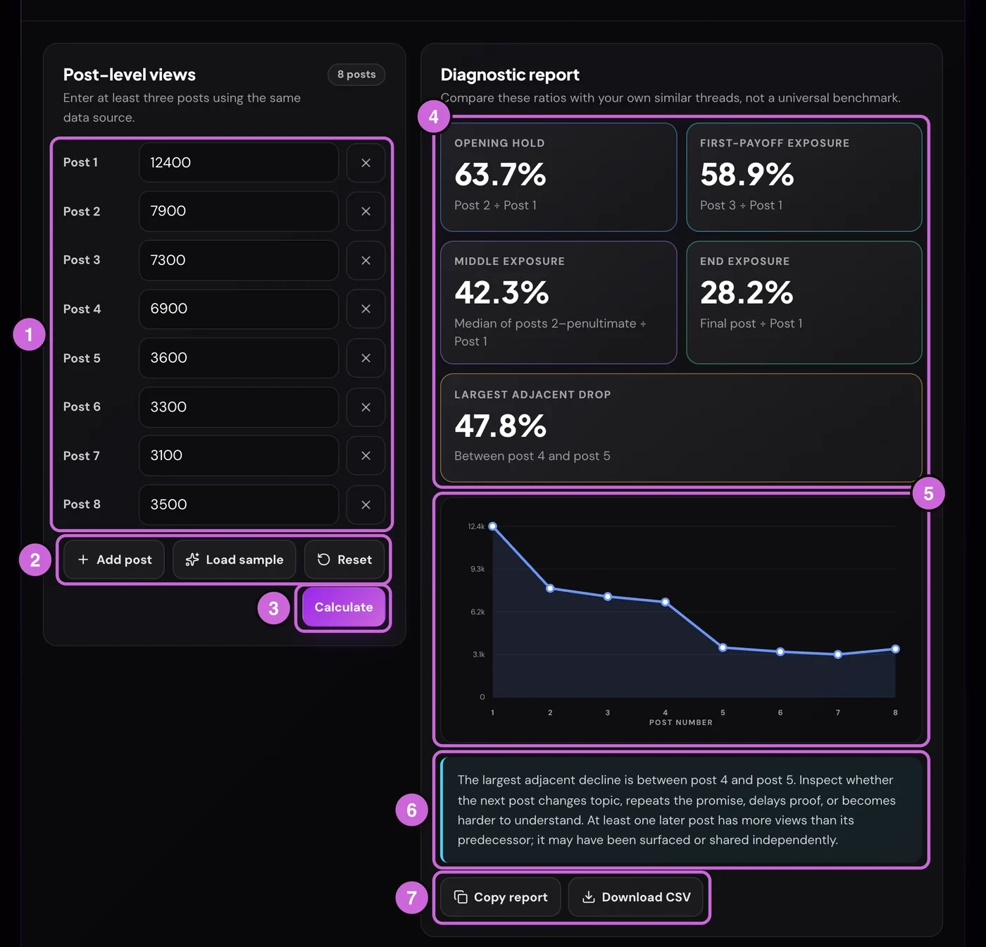
The form starts with seven post fields (1). Type the full number for each post in thread order: 12400, not 12.4K. You need at least three posts and can enter up to 20.
Step 2: Match the number of fields to your thread
Use Add post (2) for longer threads, or the × next to a field to remove it. Load sample fills in a seven-post example and calculates it straight away, which is a quick way to see what a finished report looks like. Reset clears everything back to seven empty fields.
Step 3: Calculate
Press Calculate (3). Changing any number afterwards clears the report, so press it again after every edit.
Step 4: Read the five numbers
The report cards (4) show five ratios, explained in the next section. Start with Largest adjacent drop: it names the exact pair of posts where exposure fell most sharply.
Step 5: Check the shape of the curve
The chart (5) plots each post’s views on a scale from zero to the highest count. If it’s wider than the panel, scroll it sideways to see the last posts. The shape tells you more than any single ratio, and the next sections show how to read it.
Step 6: Read the note, then save the result
The interpretation note (6) points you at the transition to inspect and adds a warning when a later post has more views than the one before it. Copy report (7) puts a plain-text summary on your clipboard, with every count, all five ratios and the caveat that views aren’t unique. Download CSV saves a file called twitter-thread-view-counts.csv with post and views columns, for your own tracking sheet.
Everything runs in your browser. The calculator doesn’t upload your view counts; usage analytics record things like how many posts you entered, never the counts themselves.
The five formulas
These are the exact calculations in the tool. “Post 1” is the hook.
| Metric | Formula | What it asks |
|---|---|---|
| Opening hold | post 2 ÷ post 1 | Did the hook earn the click into the thread? |
| First-payoff exposure | post 3 ÷ post 1 | Was the first useful point still reaching people? |
| Middle exposure | median of post 2 to the second-to-last post ÷ post 1 | How much exposure did the body hold? |
| End exposure | last post ÷ post 1 | How much exposure reached the close or CTA? |
| Largest adjacent drop | biggest (previous − next) ÷ previous | Where did the curve fall hardest? |
A few details matter when you read them:
- Middle exposure uses the median, not the average, so one post that got shared on its own can’t drag the figure up. In a three-post thread the “middle” is only post 2, so middle exposure equals opening hold. It becomes informative from about five posts.
- The largest drop only counts falls. If a post has more views than the one before it, that step is ignored. If no post falls, the card says “No decline”.
- Ratios can go above 100%. A later post that got quoted or reposted on its own can out-view the hook.
- The extra post-2 warning. If opening hold is below 50%, the note adds a line telling you to check whether post 2 confirms the hook quickly enough, even if the largest drop is elsewhere.
The complete Twitter threads guide explains where this framework comes from and how to normalise replies, profile clicks and follows per 1,000 hook views.
Worked example: an eight-post thread
These numbers are illustrative, not from a real account. Say you published an eight-post tutorial and, three days later, read these public view counts:
| Post | Views | Change from previous post |
|---|---|---|
| 1 | 12,400 | |
| 2 | 7,900 | −36.3% |
| 3 | 7,300 | −7.6% |
| 4 | 6,900 | −5.5% |
| 5 | 3,600 | −47.8% |
| 6 | 3,300 | −8.3% |
| 7 | 3,100 | −6.1% |
| 8 | 3,500 | +12.9% |
The calculator returns:
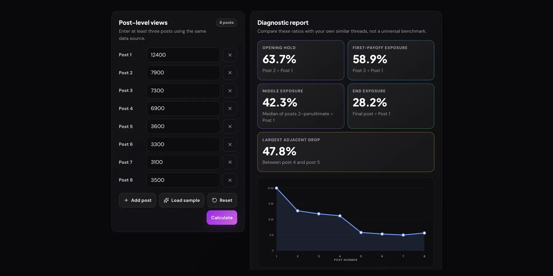
- Opening hold: 7,900 ÷ 12,400 = 63.7%
- First-payoff exposure: 7,300 ÷ 12,400 = 58.9%
- Middle exposure: the median of posts 2 to 7 is 5,250 (halfway between 3,600 and 6,900), and 5,250 ÷ 12,400 = 42.3%
- End exposure: 3,500 ÷ 12,400 = 28.2%
- Largest adjacent drop: 47.8%, between post 4 and post 5
The hook did its job: nearly two-thirds of its exposure carried into post 2, and posts 2 to 4 lost only a few percent each. Then almost half the remaining exposure vanished in one step. Whatever post 5 says, or whatever post 4 failed to set up, is the problem. Post 8 rising above post 7 is a separate effect: the final post probably got reposted or shared on its own, which is why the note warns about it. It doesn’t mean readers came back.
Normal decay vs a problem post
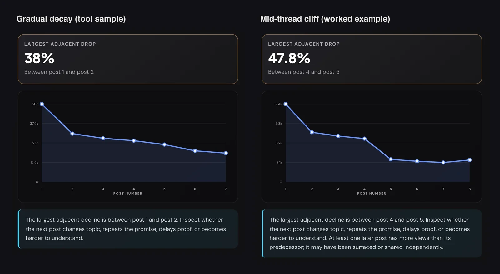
Normal decay looks like the left curve. The steepest step is usually post 1 to post 2, because the hook is shown in timelines to many people who never open the thread. After that, each post loses a small, similar share. A steady slope means the thread kept its promise and people left at their own pace.
A problem post looks like the right curve: a flat section, then a sudden step down well after the hook. The size of the drop matters less than how it compares with the steps around it. A 15% fall between posts that usually lose 5% is worth inspecting; a 38% fall right after the hook may be normal for your account.
Other shapes to recognise:
- A very steep 1→2 drop with a flat tail. The hook reached widely but attracted people who didn’t want what post 2 offered, or post 2 was slow to start. The readers who stayed were committed.
- A steady slide with no single cliff. No one post is broken; the thread is probably too long for the idea. Try cutting it.
- One middle post that spikes above its neighbours. That post was likely shared on its own. It may be worth expanding into its own post.
Compare against your own threads of similar length, topic and audience. Three or four measured threads will tell you what “normal” means for you better than any benchmark.
How to fix the weak spot
The calculator tells you where; it can’t tell you why. Read the post after the largest drop, and the one before it, and look for these causes.
The hook (low opening hold)
If post 2 holds much less of the hook’s exposure than your other threads do, either the hook promised something the thread doesn’t deliver, or it attracted a different audience. Make the hook specific about what the reader gets and for whom. Our thread hook formulas cover this in depth, so we won’t repeat them here.
Post 2 (the drop right after the hook)
Post 2 has one job: confirm the promise immediately. Common failures are a long backstory (“A bit of context first…”), restating the hook in different words, or a wall of text. Move the first concrete point up into post 2 and push context later, or cut it.
Mid-thread cliffs
A sharp drop in the middle usually comes from one of four things, the same ones the tool’s note lists:
- A topic change. The thread switches from the promised “how” to a tangent about your story or your product.
- A repeated promise. The post says “here’s the important part” without delivering it yet.
- Delayed proof. Claims pile up without an example, screenshot or number.
- A harder post. Jargon, a dense list, or a post that only makes sense if you remember three posts back.
Fix the post after the drop first, then check the post before it ends on a reason to keep going. The Twitter thread templates and thread strategies show structures that keep each post moving the idea forward.
Measure the next thread, not the same one
A live thread’s views are already counted, so edits won’t give a clean before-and-after. Apply the fix to your next similar thread and measure it the same way.
Troubleshooting
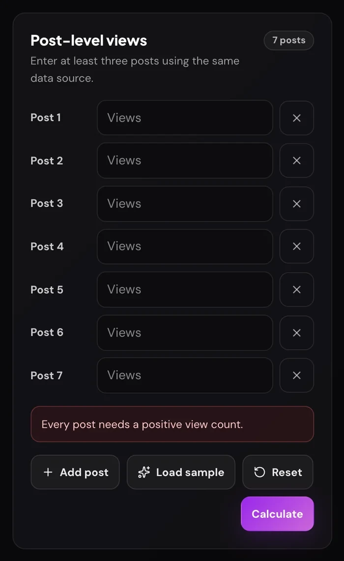
- “Every post needs a positive view count.” A field is empty, zero or negative. Fill it in or remove the row with ×.
- “Use whole-number view counts.” You typed a decimal such as
12.4. Enter the full count,12400. - The report disappeared. You changed a number. Press Calculate again.
- The × button is greyed out. Three posts is the minimum, so the last three fields can’t be removed.
- A ratio is over 100%. A later post out-viewed the hook, usually because it was shared on its own. This is expected, not an error.
- “Clipboard access was blocked.” Your browser blocked Copy report. Allow clipboard access for the site or use Download CSV instead.
Frequently asked questions
How do I see which tweet in my thread loses readers?
Write down the view count on every post in the thread, from the same source, and compare each post with the one before it. The biggest percentage fall marks the post where most people stopped. The free Twitter Thread Retention Calculator does this for up to 20 posts and names the pair of posts with the largest drop.
Does X show thread analytics or a completion rate?
Not for ordinary text threads. X shows views on each post and, for your own posts, per-post analytics such as impressions and engagements. There’s no built-in metric for how many people read a thread to the end, so post-to-post ratios are the closest substitute.
What is a good thread retention rate?
There isn’t a reliable universal number, because view counts include repeat views and posts surfaced on their own. Compare your opening hold, middle exposure and end exposure with your own threads of similar length and topic. A drop that’s much larger than your usual step between posts is the signal to act on.
Why does post 2 always have far fewer views than post 1?
The first post is shown in timelines on its own, so many people see it without opening the thread. Only those who open the thread see post 2 and beyond. A large first step is normal; it’s a problem only if it’s much larger than in your other threads.
Why does my last post have more views than the one before it?
The final post was probably quoted, reposted or surfaced on its own, often because it contains the summary or a link. It doesn’t mean readers came back to the thread. The calculator flags this in its note.
Can I use the calculator on someone else’s thread?
Yes. Public view counts are visible on any public post, so you can study a thread you admire and see where its exposure held.
Are my numbers saved or uploaded?
No. The calculations, chart, copied report and CSV are all created in your browser.
Related guides and tools
- How to write a viral Twitter thread: hooks, arcs and formats to apply after you’ve found the weak spot.
- The complete guide to Twitter threads: the retention framework, the opening three posts and CTA continuity.
- Twitter thread templates: eight structures you can reuse.
- Twitter Engagement Rate Calculator: pair exposure with replies, reposts and likes per view.
- What Twitter impressions measure: why impressions and views aren’t unique readers.