The correct Twitter profile picture size is 400 × 400 pixels, with a 1:1 aspect ratio and a 2 MB maximum file size. That source size matters because X shows the same avatar in tiny timeline and notification placements, then scales it again on profile surfaces, so the file has to stay sharp after heavy downscaling. To crop and export a photo at the right size in your browser, use our free Twitter image size tool, which also lists header and post image sizes.
If you’ve ever uploaded a logo or headshot that looked fine in the preview, then turned fuzzy, clipped, or oddly cropped once it hit the feed, that’s the core problem this guide solves. On X (formerly Twitter), the avatar isn’t just a square file, it’s a circular identity asset that has to survive multiple surfaces, different sizes, and a lot less room than people assume.
The Current Twitter Profile Picture Size at a Glance
| Attribute | Value |
|---|---|
| Recommended source size | 400 × 400 pixels |
| Aspect ratio | 1:1 square |
| Maximum file size | 2 MB |
| Display shape | Circle |
| Common file types | JPEG, PNG, GIF, WebP |
X’s official profile photo guidance still centers on 400 × 400 pixels because the platform renders the avatar at much smaller sizes across the interface, so the uploaded file needs enough detail to survive rescaling. A square source also gives the crop the most predictable starting point before X masks it into a circle. The practical rule is simple, build the asset for clarity first, then let X shrink it.
That’s why a profile photo can’t be treated like a tiny icon. On the surface, it looks small, but the same file is reused in timelines, replies, notifications, and profile views, which means the source image needs to hold up in all of those contexts. A clean 400 px master gives you more headroom than a smaller upload and lowers the chance of blur, aliasing, or chopped edges when the platform resizes it.
If you’re also optimizing other social profiles, the same logic applies elsewhere. A useful comparison is the taap.bio TikTok guide, because it shows how one visual asset often has to work across several placements instead of a single static preview.
Core Specs for an X Profile Photo
| Spec | Requirement | Notes |
|---|---|---|
| Source dimensions | 400 × 400 pixels | Practical modern standard for X profile photos |
| Aspect ratio | 1:1 | Keeps the image stable inside the circular mask |
| Legacy minimum | 200 × 200 pixels | Older workflows may still mention this, but it’s not the ideal export target |
| File size cap | 2 MB | Stay under the limit to avoid upload friction |
| Supported formats | JPEG, PNG, WebP, non-animated GIF | Animated GIFs aren’t supported as profile photos |
| iOS behavior | HEIC may be rejected | Convert before uploading if the file doesn’t go through |
| Transparency | Preserved in PNG and WebP | JPEG flattens transparency |
The safest working assumption is that X recompresses every upload, so the file you send should already be clean, sharp, and correctly framed. For logos and type, a 400 px PNG is usually the practical floor because it keeps edges crisper than a heavily compressed export. If your avatar relies on transparency, PNG or WebP is the better route, while JPEG is fine for photography-heavy headshots where a flattened background doesn’t hurt readability.
Practical rule: if the avatar needs to survive both a tiny timeline badge and a larger profile view, design the source as a brand asset, not as a decorative thumbnail.
For a quick export workflow reference, the Donivo guide for optimizing X images for scheduling is helpful when you’re preparing assets for a publishing calendar instead of editing one file at a time.
Where X Actually Shows Your Avatar
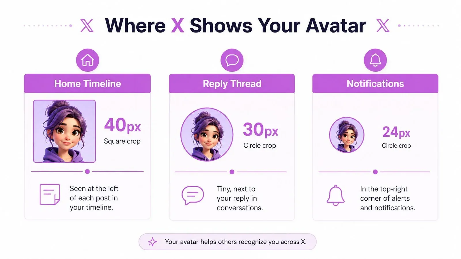
X doesn’t show your avatar in one fixed size. The same file gets reused in the home timeline, reply threads, notifications, profile pages, suggestion modules, and the web sidebar, and each surface treats the image a little differently. That’s why a photo that looks polished on the profile page can still feel cramped or unreadable beside a post.
The design problem is scaling, not upload size
Independent size guides note that X typically renders avatars at about 40 px in the home timeline, around 48 px in reply contexts, 64 px in notifications, and roughly 134 px to 200 px on profile pages, even though the uploaded source stays at 400 × 400 px. That spread is exactly why thin text, tiny logos, and edge-heavy compositions break down so quickly. A design that reads at profile size can become a blur at reply size.
The best response is not to overdesign the file. It’s to keep the composition simple enough that the focal point still works when the avatar is shrunk to a small circle. Centered faces, bold marks, and uncluttered backgrounds travel much better than detailed illustrations or wordmarks that depend on every letter being visible.
Why a larger source file still matters
Think of the avatar as a master image that gets sampled repeatedly. If the source is too small, the platform has less information to work with, and the result can look soft or jagged. A 400 px square is the minimum practical starting point because it gives X enough data to scale down cleanly across surfaces.
For broader profile presentation work, the Xholic banner maker guide is a useful companion, because the profile photo and banner need to work as one visual system.
Circle Crop and the Safe Zone
X uses a circular mask for avatars, not a rounded square. Corners disappear, and anything placed too close to the edge can be clipped, softened, or lost inside the crop. Treat the avatar as a master image sampled across surfaces, so the center has to carry the design.
Build for the center, not the frame
Keep the main subject inside the center 80 percent of a 400 × 400 source. That leaves room for the circle crop and the slight edge softening that happens when the image is rendered. If you want a simpler working guide, hold the face, logo, or wordmark inside an inner 320 × 320 area.
The border is where avatars usually fail. Thin outlines, hair strands, and small text near the edge can blur when X rasterizes the file, and the loss is easier to see on light or transparent backgrounds. Darker or busier backgrounds can hide some of that clipping, but they do not fix the crop itself.
Keep the important part centered. If the composition only works when you zoom in, it will not work as an avatar.
What belongs in the safe zone
- Faces: Keep the eyes, nose, and mouth centered, not pushed high or low.
- Logos: Use the full mark, but leave padding around the outside.
- Wordmarks: Short words only, and only if they stay readable at tiny sizes.
- Backgrounds: Let them support the subject, not compete with the crop.
That rule matters for founders and brands that want the profile photo to act as a fast trust signal. On X, the avatar often appears before people read the bio or open the profile, so the crop has to communicate quickly and cleanly.
How to Upload or Change Your Profile Picture on X
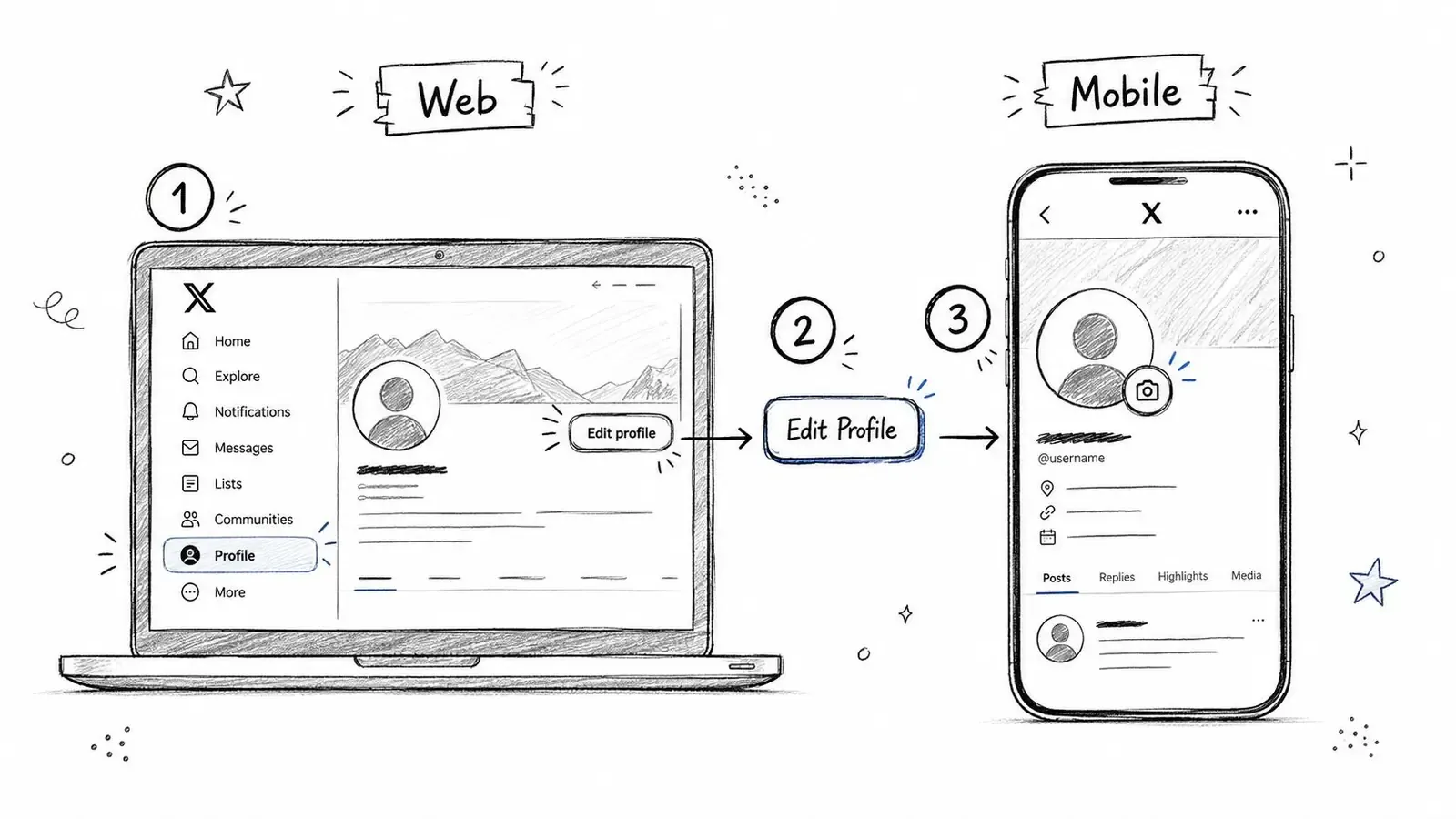
Changing the avatar is simple, but the web and mobile flows aren’t identical. The important part is not just replacing the file, it’s checking the crop inside the circular preview before you save.
On web
- Open your profile picture area from the left sidebar.
- Click Edit profile.
- Select the camera icon on the current avatar.
- Choose Upload photo.
- Pick a 400 × 400 image under 2 MB.
- Drag the image to recenter it inside the circle preview.
- Click Apply, then Save.
On iOS or Android
- Tap your profile icon from the top-left or bottom tab.
- Open Edit profile.
- Tap the avatar.
- Choose Choose photo or Take photo.
- Adjust the crop in the circle guide.
- Confirm and save.
X doesn’t give you a full preview of how the image will look in timeline or reply contexts before you commit, so it helps to test the crop in another app first. I usually check the source image at full size and zoom out until the face or logo still reads instantly. That catches issues the in-app cropper won’t warn you about.
If you need to pull an old profile image out of a live post or asset folder, the Xholic image downloader can help you recover the source quickly instead of hunting through screenshots.
Retina, High-DPI, and Export Best Practices
A 400 × 400 file is the upload target, not necessarily the file you should design from. On modern high-DPI screens, the avatar can be displayed with more visual sharpness if the master art starts larger, then gets downsampled cleanly for upload. That matters most when your avatar uses fine linework, a small logo, or a headshot with crisp edges.
Export bigger, then compress once
For serious brand work, build the master at 800 × 800 or 1600 × 1600, keep the 1:1 ratio, and export a clean upload from that source. A high-res master gives you room to refine the crop, then re-export without losing quality every time the design changes. Don’t keep re-saving the already compressed upload, because that just adds artifacts.
| Use Case | Export Size | Format | Quality / Notes |
|---|---|---|---|
| Simple logo avatar | 800 × 800 | PNG | Use transparency if needed |
| Photo-based headshot | 800 × 800 | JPG | Keep quality high and avoid re-compression |
| Detailed brand mark | 1600 × 1600 | PNG or WebP | Best when the source has fine edges |
| Ongoing updates | Working master in PSD or SVG-derived export | Layered source | Re-export from the master, not the upload |
PNG is usually the better choice for graphics, while JPG makes more sense for photography. If you use JPG, avoid stacking compression on top of compression. If you use PNG, keep the file clean so X doesn’t have to fight a noisy source.
Common Mistakes That Ruin an X Avatar
The most common mistakes are usually the quiet ones. They don’t always fail on upload, but they make the profile look less trustworthy once the image is live in the feed.
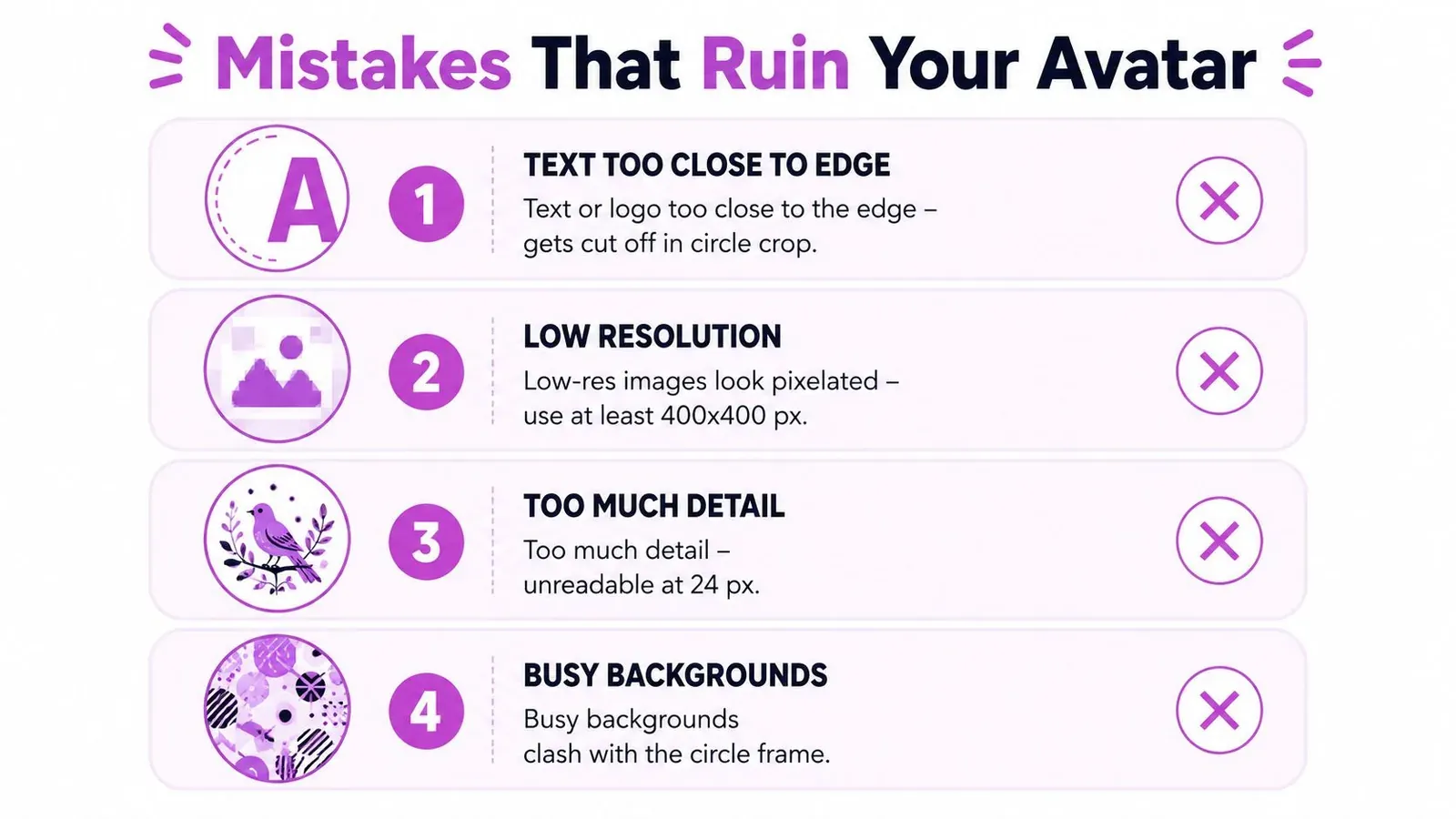
The four failures that show up most often
- Text too close to the edge: The circle crop cuts off letters, especially in tiny timeline thumbnails.
- Upscaled tiny images: A file starting at 128 px or smaller can look mushy on profile pages and worse on high-density screens.
- Non-square artwork: X forces the crop, which can stretch or crop the composition in awkward ways.
- Wrong file type: TIFF and BMP aren’t practical here, and animated GIF or animated WebP won’t behave like a clean profile photo.
Each mistake affects a different surface. Edge text hurts legibility in the timeline. Low-resolution uploads look muddy on the profile page. Wrong aspect ratio creates unpredictable crop pressure. Unsupported or awkward formats can fail on mobile, which is especially frustrating because the app may not explain what went wrong.
The fix is always the same, return to the 400 × 400 square, keep the focal point centered, and use a format X handles cleanly. If the design still depends on tiny peripheral details, it’s probably too busy for an avatar.
Optimization Tips for Creators and Brands
A profile photo works best when it behaves like a brand mark, not a personal snapshot. The strongest avatars usually share two traits, a clear silhouette and enough contrast to stay readable against both light and dark interface themes.
Design for recognition at tiny sizes
Start by checking the image at the sizes X uses, especially 24 px, 32 px, 48 px, and 64 px. If the subject disappears at those sizes, the design needs simplification. That usually means reducing background noise, enlarging the face or logo, and removing anything that competes with the main shape.
Consistency matters too. The profile photo should feel aligned with the banner, pinned post, and overall color story, so the account reads as one system. A strong avatar plus a mismatched header often makes the profile feel patched together instead of deliberate.
If you want a broader resizing workflow for social assets, the File Studio guide to resizing images for social is a solid companion, especially when you’re preparing a batch of platform-specific exports.
Brand rule: if the avatar changes, the rest of the profile should still feel like the same account.
For teams that audit X profiles regularly, Xholic AI’s twitter profile optimization guide is one place to compare the avatar against the rest of the profile setup without guessing what to fix first.
Quick Reference Card for the Twitter Profile Picture Size
| Attribute | Value |
|---|---|
| Recommended size | 400 × 400 pixels |
| Aspect ratio | 1:1 |
| File types | PNG, JPG, GIF, WebP |
| File size | Under 2 MB |
| Display behavior | Circle crop across the platform |
| Typical visible size | As small as 24 px, up to about 200 px |
| Safe zone | Keep critical content inside the inner 80 percent circle |
| Export recommendation | 800 × 800 or 1200 × 1200 for retina headroom |
The simplest way to remember the spec is this. Upload a square 400 × 400 source, keep the subject centered, and make sure the design still reads when it’s tiny. If the profile picture works at 24 px and still looks sharp on the profile page, you’ve probably nailed it.
Profile Picture Checklist Before You Upload
Before you save the new avatar, run a fast check against the live use case, not just the file properties. A profile picture that passes the checklist is much more likely to survive X’s circular crop and multi-surface rendering without surprises.
- Canvas checked: The source file is 400 × 400 pixels and 1:1.
- Export quality checked: The master was exported at 2x or 4x before downscaling.
- Safe zone checked: The face, logo, or wordmark stays inside the inner 80 percent circle.
- File type checked: The upload is JPEG or PNG, and it stays under the 2 MB limit.
- Visibility checked: The subject still reads at timeline, reply, and profile sizes.
- Theme checked: Contrast holds up in both light and dark X interfaces.
- Brand check: The silhouette still matches the banner and the rest of the profile.
If your profile system is due for a refresh, Xholic AI’s X profile audit guide is a practical next step for checking whether the avatar, bio, and header still work together as one identity.
If you want a faster way to audit your X presence, Xholic AI can help you review profile details, spot weak visual choices, and keep your brand consistent without doing every check manually. Visit Xholic AI to see how its profile and growth tools can fit into your X workflow.