You’ve exported X analytics, opened a spreadsheet, and still can’t answer the only question that matters: what should you do differently next week? A useful Twitter analytics case study turns impressions, engagement, replies, clicks, and audience data into decisions. On X, formerly Twitter, that means identifying which formats attract meaningful attention, which conversations create authority, and whether apparent growth reaches the people you want to influence.
The process below treats analytics as an operating loop, not a collection of dashboard screenshots. You’ll define an objective, build a clean dataset, compare formats with median benchmarks, test a hypothesis, and evaluate distribution quality, meaning who engages and whether those people matter to your growth strategy.
Why Most Twitter Analytics Case Studies Miss the Point
Most X analytics breakdowns stop at impressions, engagement rate, and a recommendation to post more video. Those metrics describe what happened, but they rarely tell a founder, creator, or social media manager what to publish, who to engage with, or which content pattern deserves another test.
The problem isn’t a shortage of data. X reporting exposes impressions, results, engagement rate, and cost per result, making impression-based engagement a useful foundation for evaluating earned attention. The problem is that dashboards often produce observations without decisions. A post performed well becomes “do more of that,” even when nobody has defined what “that” means.
A stronger case study separates four questions:
- What was the objective?
- What data can answer it?
- What pattern survives segmentation?
- What action follows from the pattern?
Generic benchmarks also hide meaningful differences between accounts. A widely cited study of Australian organizations found that the share of tweets eliciting user engagement varied substantially across organizational samples, reaching 61.87%, 86.85%, and 83.77% in the samples reported by the study (the organizational engagement case study). Its broader conclusion is practical: sector and organizational type affect content performance, so a benchmark from another niche shouldn’t automatically become your target.
Description versus decision
“Image posts received more engagement” is a description. “Use image posts when explaining a product workflow, then measure qualified replies rather than likes” is a decision.
That distinction matters because format alone doesn’t explain performance. Topic, audience fit, timing, author authority, and the presence of an external link can all change the result. A 2021 analysis of Hootsuite’s Twitter publishing behavior examined 269 original tweets over a 15-week period and found that roughly 88% contained links, while linkless posts accounted for only about 12%. Yet more than half of the account’s most engaged tweets were linkless, and linkless posts represented 75% of its most-liked tweets when a reply was included (the Hootsuite Twitter publishing analysis).
Practical rule: A case study earns its keep only when every major finding changes a publishing, replying, positioning, or measurement decision.
Use this guide to Twitter analytics metrics when you need definitions, but don’t let definitions become the final output. Your finished analysis should tell a reader what to repeat, what to stop, and what still needs testing.
Defining Clear Objectives Before You Touch the Data
A Twitter analytics case study should read like a sequence of decisions, not a sequence of charts. Before opening X Analytics, choose the business or audience outcome you’re trying to understand, then select metrics that can support that decision.
Four objectives cover most founder, creator, and marketing audits.
Reach and discovery
Use impressions to understand distribution and track follower change as a supporting signal. The question is: did the account reach more people, and did that reach contribute to a broader audience?
Impressions aren’t unique viewers. A view can come from a timeline, search result, profile visit, repost, or reply, and repeated exposure by the same person counts again, as explained in this breakdown of X impressions. That makes impressions useful for distribution analysis, but insufficient for claiming that a specific number of people saw a post.
Engagement quality
Likes and reposts show reaction, but replies are often more useful when your goal is conversation, trust, or authority. If your account can access saves, profile visits, or other engagement details, use them as secondary checks. The question becomes: did people merely react, or did they invest attention in the idea?
A standard engagement-rate calculation divides engagements by impressions and multiplies by 100, tying performance to delivered reach rather than follower count. X Analytics also exposes an engagement-rate column based on that denominator, as documented in this engagement-rate calculation guide.
Pipeline impact
For a product or newsletter, track link clicks and connect them to downstream actions such as signups, demo requests, or qualified visits. The question is: did the post move someone from attention toward an owned relationship or commercial conversation?
Don’t treat a click as a customer. It’s a transition signal. Tag links consistently so you can distinguish product education, founder commentary, launch content, and direct promotion.
Brand authority
Track mentions and engagement from accounts outside your immediate follower graph. The question is: is the account becoming visible to relevant people who weren’t already paying attention?
| Objective | Primary Metric | Secondary Check | Decision It Informs |
|---|---|---|---|
| Reach | Impressions | Follower change | Which topics and formats deserve broader distribution tests |
| Engagement quality | Replies or engagement rate | Likes, reposts, saves, profile visits | Which posts create active audience response |
| Pipeline impact | Link clicks | Signups, demos, qualified visits | Which messages support demand generation |
| Brand authority | Relevant mentions | New-account engagement and profile relevance | Which ideas expand credibility beyond existing followers |
Choose one primary objective for the analysis. You can monitor the others, but if every metric has equal priority, the report will end with several interesting observations and no clear next move. For demand-focused accounts, this guide to Twitter lead generation can help connect X activity to a measurable acquisition path.
Collecting the Right Data from X Analytics and Engagement Metrics
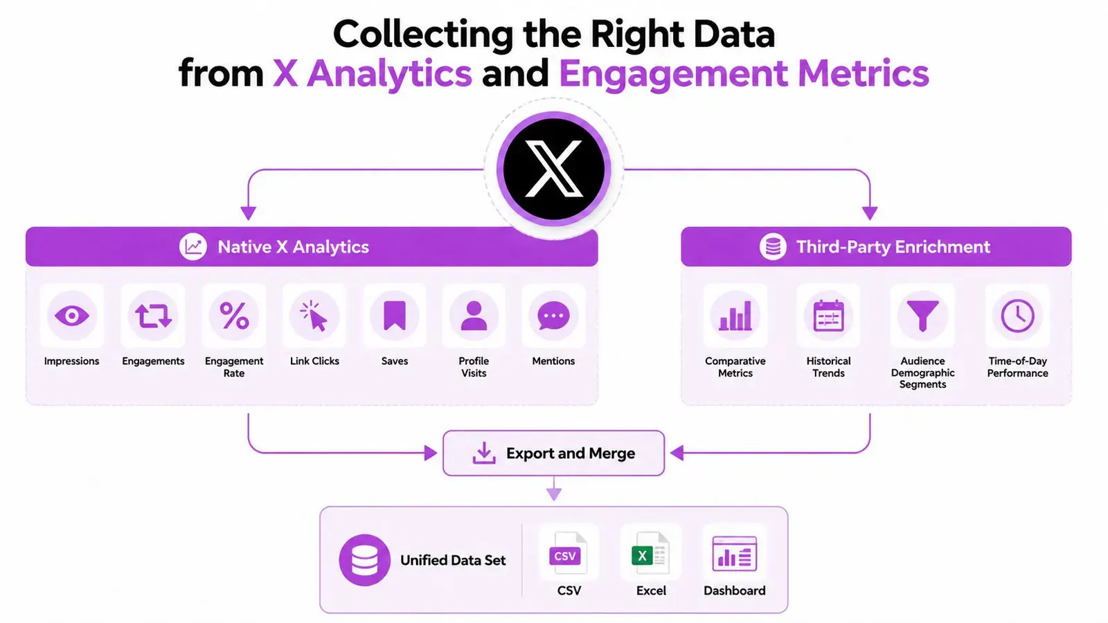
Native X Analytics gives you the starting point. Pull the Tweet Activity export with the fields available to your account, including impressions, engagements, engagement rate, link clicks, profile clicks, detail expands, reposts, replies, and likes. These fields help you distinguish distribution from response and response from intent.
The Followers export adds audience context. Use available growth history, demographic slices, and top locations to understand whether changes in performance coincide with changes in the audience. Treat those audience fields as directional context rather than a complete description of every person who engaged.
Build one analysis sheet
Create one row per post, then add columns that native exports usually don’t provide:
- Format: Text, image, video, poll, thread, reply, quote post, or repost.
- Campaign: Launch, education, founder story, newsletter, product proof, or another consistent label.
- Hook type: Contrarian claim, problem statement, lesson, list, question, or observation.
- Posting window: Use one timezone and convert every timestamp before grouping.
- Destination: No link, product page, newsletter, article, community, or other destination.
- Audience signal: Relevant replies, repeat engagers, topical communities, or off-topic activity.
Keep the native engagement rate, but also calculate a consistent per-post rate when comparing records:
(Likes + replies + reposts + quote posts) / impressions × 100
The median engagement rate is more useful than the mean when breakout posts exist. A 2026 study of 87,528 posts from January 2024 through May 2026 reported an overall median engagement rate of about 0.70% and described anything above 1% as strong (the X engagement data study). Use those figures as orientation, not as a universal target.
Clean before interpreting
Check timezone conversion, duplicate post IDs, deleted-post gaps, and rows with zero impressions. Follower change can also reflect churn, so don’t interpret a positive or negative delta as pure acquisition without checking the surrounding period.
A practical workflow looks like this:
- Export Tweet Activity and Followers data.
- Standardize dates and timezone.
- Remove duplicates and flag missing or deleted records.
- Add format, campaign, hook, topic, and posting-window tags.
- Calculate the same per-post engagement formula for every comparable row.
- Save the raw exports separately from the cleaned analysis sheet.
If scheduling affects your tags or publishing windows, use a practical Twitter scheduling guide to document the process consistently. For tool discovery and additional reporting options, compare the workflow against these free Twitter analytics tools.
Analyzing Engagement by Format Using Median Benchmarks
The fastest way to misread an X account is to compare one blended engagement rate across every post. A thread, a reply, a quote post, a video, and a link post perform different jobs, so separate them before deciding what “good” looks like.
Start with format buckets such as single text posts, threads, replies, quote posts, and reposts. Then calculate the median engagement rate inside each bucket. The median identifies the middle post in the group, so a handful of unusually large posts won’t pull the result upward as they would with an average.
A format-specific median also gives your system a better learning signal. For Xholic AI, the useful application is to score each user’s posts against the median for that format, then use the signal in reply recommendations, remix suggestions, and content planning. The system can learn what good means for that user’s niche instead of treating every account and every format equally.
Use benchmarks as a ruler, not a verdict
Independent 2026 guidance places reply-rate-by-impressions below 0.05% in the weak range, 0.05% to 0.15% as healthy, 0.15% to 0.35% as strong, and above 0.35% as standout (the reply-rate benchmark guidance). Reply rate deserves its own column because replies indicate conversation utility more directly than likes alone.
Your comparison table should make the evidence visible:
| Format | Median Engagement Rate | Benchmark Range | Sample Size | Read |
|---|---|---|---|---|
| Text posts | Your median | Use your selected benchmark | Count posts | Keep, revise, or test the hook |
| Threads | Your median | Compare with thread-specific history | Count threads | Check whether depth earns replies |
| Replies | Your median | Reply-rate ranges above | Count replies | Evaluate conversation relevance |
| Quote posts | Your median | Compare with account baseline | Count quotes | Test commentary versus simple reposting |
| Reposts | Your median | Compare with account baseline | Count reposts | Separate curation from original authority |
Don’t fill the table with invented certainty. If a format has only a few observations, mark the comparison as directional. A large difference between two tiny groups may be noise, while a smaller difference repeated across a substantial set of posts can justify a test.
The decision rule is straightforward:
- Below your format median and below the relevant benchmark: change the structure, topic, or audience target.
- Above your format median but weak on replies: the post may attract passive reaction without conversation.
- Above the median with qualified replies: make the format a candidate for repetition.
- High impressions with low engagement: investigate distribution, timing, and topic fit before blaming the format.
Use this Twitter engagement-rate calculator guide to verify the formula, then keep your own dataset as the source of truth.
A 90-Day Twitter Analytics Case Study Walkthrough
A useful case study needs a defined observation window and a record of what changed. The following is a worked framework, not a claim about a verified creator account. It shows how to structure the analysis without pretending that an illustrative result is universal.
Month one establishes the baseline
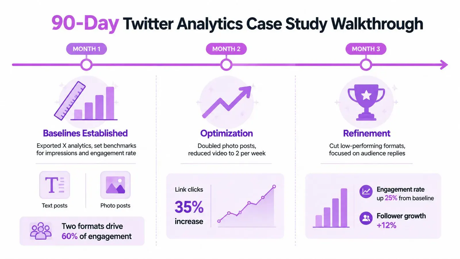
The creator exports Tweet Activity and Followers data, assigns format and topic tags, and separates original posts, replies, threads, quote posts, and reposts. The first month isn’t for aggressive optimization. It’s for finding which formats drive impressions and which formats produce saves, replies, profile interest, or clicks.
The creator notices that two formats account for most visible distribution, but the posts rarely produce sustained conversation or clear downstream intent. That finding doesn’t mean those formats are bad. It means reach and usefulness are diverging, so the next test should target the missing behavior.
The first output is a baseline table with:
- Median engagement rate by format
- Median reply rate by format
- Link clicks and profile clicks by topic
- Top posts by impressions
- Top posts by qualified replies
- Audience notes from follower locations and visible profile relevance
The case study should also record what didn’t move. If impressions rise while replies remain flat, don’t report the period as an unqualified success.
Month two tests one hypothesis
The creator writes a narrow hypothesis: shorter threads with a clearer opening will produce a higher median reply rate than the existing thread pattern. They publish 18 test posts and compare them with a 14-post control group, keeping the comparison rules consistent.
The important detail isn’t the sample count by itself. It’s the discipline of changing one meaningful variable while logging topic, format, posting window, link presence, and audience response. If the test also changes topic, frequency, media, and call to action, the result won’t identify the cause.
The creator then reviews the thread median, reply-rate median, profile clicks, and the quality of responders. A higher engagement rate with no improvement in relevant conversation would weaken the case for scaling the new structure.
For broader marketing applications, these use cases for Twitter data in marketing can help you identify additional questions for historical analysis.
Month three refines the operating model
The third month adds timing and topic tags. Instead of asking which day “wins,” the creator asks which topics create replies from relevant accounts during each posting window. Passive likes remain in the report, but they no longer decide the strategy alone.
The final report should state:
- Which format changed its median performance.
- Which topic generated qualified conversation.
- Which posting windows remain uncertain.
- Which expected improvement did not appear.
- What the next test will isolate.
This format produces an honest case study because it preserves failed expectations. It doesn’t confuse a visible spike with a repeatable mechanism.
Distribution Quality and What Your Engagement Is Really Telling You
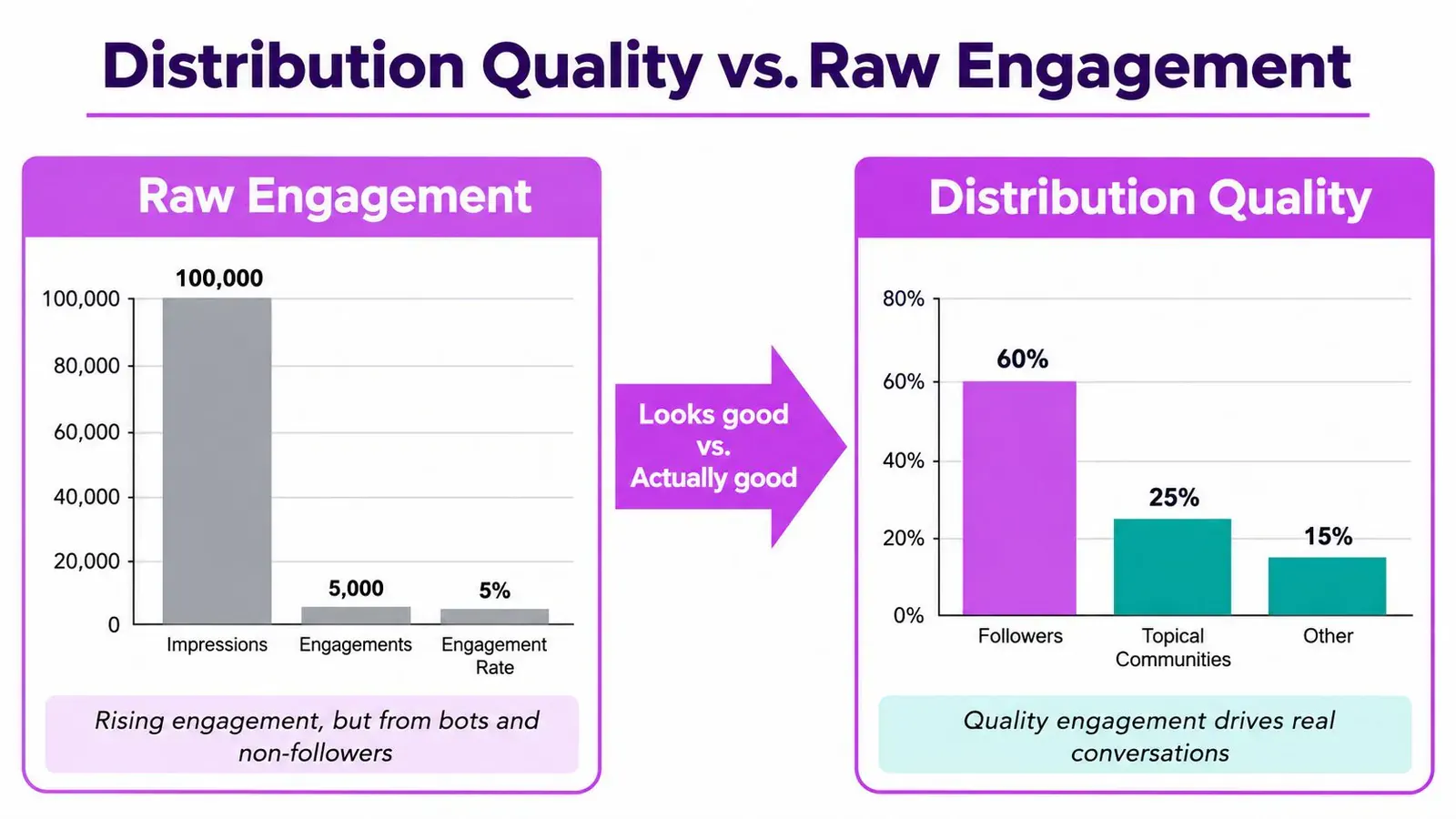
Rising engagement doesn’t automatically mean growing influence. A post can attract reactions from people outside your target market, disconnected accounts, or audiences that respond intensely to a topic without becoming relevant followers, customers, collaborators, or peers.
Distribution quality adds the missing question: who is engaging? Score the audience behind a post using available signals such as follower overlap, bio relevance, topical community membership, repeat engagement, and reply sentiment. These are analytical judgments, not native X labels, so document your scoring rules and apply them consistently.
A simple review can classify responders as:
- Core audience: Followers or clear prospects who match the account’s niche.
- Relevant discovery: Non-followers from connected topical communities.
- Peripheral reaction: People who engage with the topic but have no obvious relationship to the account’s intended audience.
- Low-confidence activity: Off-topic, repetitive, or suspicious-looking responses that require manual review.
Compare loud reach with useful reach
Suppose Post A receives four times the impressions of Post B. Post A attracts a large volume of reactions, but only a small share comes from relevant communities. Post B reaches fewer people yet generates a larger share of replies from target users and repeat engagers.
Post A is louder. Post B may be more useful.
Don’t turn that example into a universal scoring formula. Instead, create a repeatable quality layer beside raw engagement:
| Signal | Question |
|---|---|
| Follower overlap | Are existing followers responding, or is the post reaching new people? |
| Bio relevance | Do responders work in the niche you want to own? |
| Repeat engagement | Are the same relevant people returning across posts? |
| Reply quality | Do responses add context, ask useful questions, or reveal intent? |
| Community spread | Does the post travel through connected topical networks? |
Independent research has noted that X studies lack standard techniques for comparing behavioral and interaction patterns within and across communities, with remaining gaps around visual communication and platform dynamics (the community-analysis research). That gap is precisely why your case study should show more than a top-post screenshot.
For a reader-friendly perspective on creating content that feels relevant to its audience, this ViewsMax article on content that connects offers a useful complement to the quantitative review.
Decision rule: Scale a format only when raw engagement and audience relevance point in the same direction.
Your Reusable Playbook and Next Steps
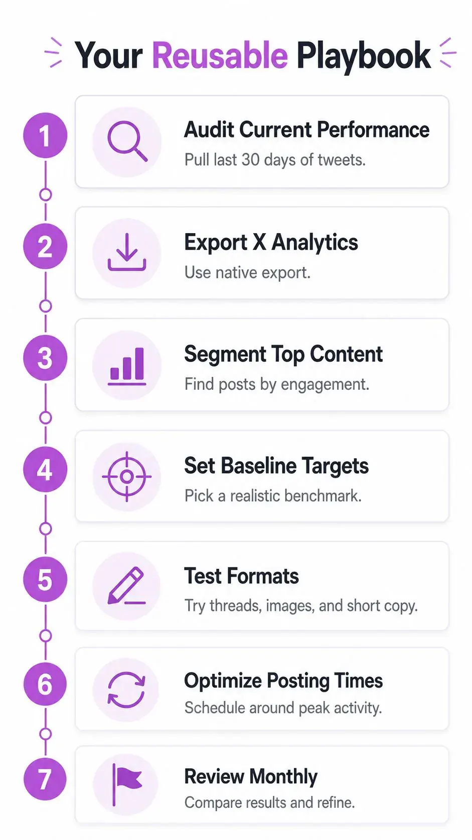
Turn the audit into an operating routine. The following seven-step playbook keeps each action tied to a data source, a decision, and a realistic work block. The time descriptions are workflow estimates, not platform benchmarks.
- Set the objective. Write the primary outcome, supporting metric, and decision threshold in a short goal document. This prevents the export from dictating the question.
- Export native data. Download Tweet Activity and Followers exports from X Analytics. Preserve the original files so later edits don’t erase the audit trail.
- Clean and tag the dataset. Standardize timezone, remove duplicates, flag missing posts, and label format, topic, hook, campaign, link presence, and posting window.
- Calculate format medians. Group comparable posts and calculate median engagement rate and reply rate. Record sample size beside every result.
- Score distribution quality. Review who engaged, how relevant their profiles are, whether they return, and whether replies show genuine conversation.
- Test one hypothesis. Change one major content variable, maintain a control where possible, and log both positive and null results.
- Review every 30 days. Keep formats that repeatedly earn qualified response, revise those with passive reach, and write the next test before the review ends.
Produce these audit artifacts
- Goal document: Objective, primary metric, secondary checks, and next decision.
- Raw export folder: Original Tweet Activity and Followers files.
- Clean dataset: One row per post with consistent tags.
- Format benchmark table: Median engagement, reply rate, sample size, and interpretation.
- Distribution map: Audience relevance, repeat engagers, and community overlap.
- Hypothesis log: Test setup, control, result, and unresolved questions.
- Monthly review template: Keep, change, stop, and test-next decisions.
Put median reply rate by format on the weekly dashboard when conversation and authority matter. It keeps attention on active audience response while preserving the context needed to avoid overreacting to a single breakout post. If the account is primarily conversion-focused, keep link clicks and downstream actions in the main operating report, but don’t let them replace the audience-quality review.
Xholic AI can support this workflow with personalized context, reply recommendations, conversation discovery, content analysis, remixing, collections, and scheduling while keeping publication under the user’s control. Use Xholic AI to organize the audit, identify worthwhile conversations, and turn your findings into a repeatable X growth routine instead of another abandoned spreadsheet.