Most advice about X analytics for business starts in the wrong place. It tells founders and marketers to watch impressions, follower growth, and raw engagement, then calls that progress. In practice, those numbers can look healthy while doing almost nothing for pipeline, demand, or decision-making, especially on a platform where performance is skewed by a few outlier posts and where the question is usually, “What should we do next?” Misleading marketing metrics is a useful reminder of how easy it is to mistake activity for impact.
X (formerly Twitter) analytics should answer a harder set of questions. Which posts moved the audience? Which replies deserved attention? Which topics pulled the right people in? And which actions led to real business outcomes instead of just looking good in a dashboard? The social media analytics market’s growth, from USD 10.23 billion in 2024 to a projected USD 43.25 billion by 2030 in one estimate, shows that buyers increasingly want measurement systems that go beyond vanity stats and into insight, workflow, and attribution.

Why Most X Analytics Dashboards Mislead Business Users
The easiest way to misread X is to treat impressions as proof of business value. Impressions only show that a post appeared on a screen. They do not show whether it reached the right audience, changed behavior, or created revenue. A post can travel widely and still produce no curiosity, no replies, no clicks, and no useful conversations.
Raw engagement can mislead in the same way. X’s scale is real, and that is exactly why sloppy measurement causes trouble. A dashboard filled with likes and reposts can look healthy while hiding the fact that the content is attracting the wrong people or doing nothing for pipeline. The broader market is growing too, with one estimate putting the social media analytics market’s rise from USD 10.23 billion in 2024 to a projected USD 43.25 billion by 2030 in the report from Mordor Intelligence. That growth reflects demand for measurement systems that go beyond vanity stats and into insight, workflow, and attribution.
The fix is a cleaner split between vanity metrics and operational metrics. Vanity metrics describe surface activity. Operational metrics show whether X is helping the company make better decisions. A founder, creator, or marketer does not need a prettier chart. They need a dashboard that shows whether posts create qualified attention, whether replies bring in relevant people, and whether that attention moves toward a measurable business outcome.
Practical rule: If a metric does not change what you publish, who you reply to, or how you allocate effort next week, it is probably not a business KPI.
That means the dashboard should follow the decision, not the other way around. If the goal is awareness, impressions matter. If the goal is demand, reply quality, profile visits, and downstream clicks matter more. If the goal is authority, the mix of topics and the quality of conversation around them matter more than follower count alone. Understanding why dashboards mislead is the first step to building measurement systems that people can use.
Selecting KPIs That Connect to Real Business Outcomes
Choosing KPIs starts with the business goal, not the platform metric. A creator trying to grow authority needs a different dashboard from a startup trying to generate meetings. The mistake is mixing them together, then wondering why the numbers feel noisy.
For X, a useful way to think about metrics is in three layers. Awareness shows whether content is being distributed. Engagement shows whether people care enough to react. Conversion shows whether X is doing work for the business outside the app. That structure keeps the dashboard from becoming a pile of numbers nobody trusts.
| Business Goal | Primary KPIs | Formula or Source | Review Frequency |
|---|---|---|---|
| Audience growth | Impressions, profile visits, follower growth | Native X analytics, account summary | Weekly |
| Thought leadership | Engagement rate, replies, quote posts, bookmark patterns | Engagement rate formula, post-level review | Weekly |
| Demand generation | Profile visits, link clicks, DM conversations | Native analytics and tracked links | Weekly |
| Product marketing | Link clicks, reply quality, conversion follow-through | UTM-tagged links, CRM, manual review | Weekly |
| Community building | Replies, quote posts, conversation depth | Native analytics and reply inspection | Weekly |
The cleanest baseline formula for engagement rate on X is (likes + replies + reposts + quotes) / impressions × 100, which keeps the numerator tied to the engagement set and the denominator tied to distribution. X’s ad documentation uses the same derived logic, and example guidance shows 50 engagements on 2,000 impressions equals a 2.5% engagement rate (X analytics metrics guide). That formula matters because it normalizes for reach, while follower-based rates can make two posts look comparable when they aren’t.
For business users, raw engagement isn’t enough. A post can be chatty and still fail to create interest from the right people. That’s why many teams add a simple reply quality score, which is a qualitative scorecard for relevance, intent, and fit. It isn’t a universal platform metric, so it should be treated as an internal rubric, not a published benchmark.
If you want a broader explanation of metric selection and dashboard design, the internal guide on Twitter analytics metrics is a useful companion. The point is to keep the KPI set narrow enough that someone can review it every week.
Use these metrics by goal
- Awareness goals: Track impressions, profile visits, and follower growth to understand whether your content is being seen and whether it creates curiosity.
- Demand goals: Track link clicks, DM replies, and profile visits to see whether X is moving people toward a conversation or landing page.
- Authority goals: Track engagement rate, quote posts, and thoughtful replies to see whether people are treating your ideas as worth discussing.
- Community goals: Track reply depth, recurring participants, and topic alignment to see whether your account is becoming a place people want to return to.
Configuring Tracking and Building Your Analytics Dashboard
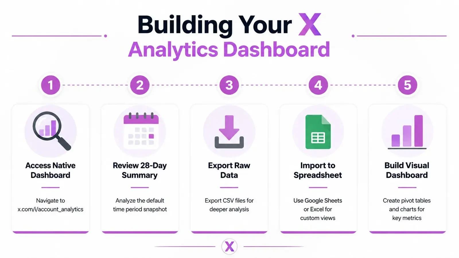
Start with the native dashboard at x.com/i/account_analytics. X’s account home view gives you a 28-day summary of posts, impressions, profile visits, and engagement rate, which is enough for a basic weekly readout if you’re disciplined about exporting and comparing the same fields each time (X analytics dashboard overview). If you’re on mobile, you can also inspect individual posts by tapping the bar-chart icon under a post.
The core workflow is straightforward. Export the last 90 days of posts from native analytics, then calculate one consistent post-level engagement formula across the dataset. That longer window matters because a few strong posts can distort short samples. One expert study recommends using the median rather than the mean so a viral outlier doesn’t become your “normal,” and it suggests comparing the median engagement rate over at least 90 days of data (ordinal engagement data study).
A simple spreadsheet setup
Build a sheet with these columns, then update it weekly:
- Post date and format so you can separate threads, text posts, quote posts, and media posts.
- Impressions so you can see whether distribution is rising or falling.
- Engagement rate so you can compare posts on the same basis.
- Profile visits so you can tell whether the post created curiosity.
- Reply quality notes so you can record whether the conversation was worth anything.
That setup is simple enough for a founder or solo marketer, but it still gives you a real operating picture. If you need more automation, tools that generate automated reporting dashboards can reduce the manual work, especially if you’re reporting to a team each week.
For teams that want to go deeper, the internal guide on Twitter API examples is helpful for understanding how data can be moved into custom workflows. Even then, don’t overbuild too early. Most accounts learn more from a clean weekly spreadsheet than from a complicated system no one uses.
Keep the dashboard boring. If the reporting process takes more than an hour a week, people stop reading it and start guessing again.
Benchmarking Your Performance Against the Right Peers
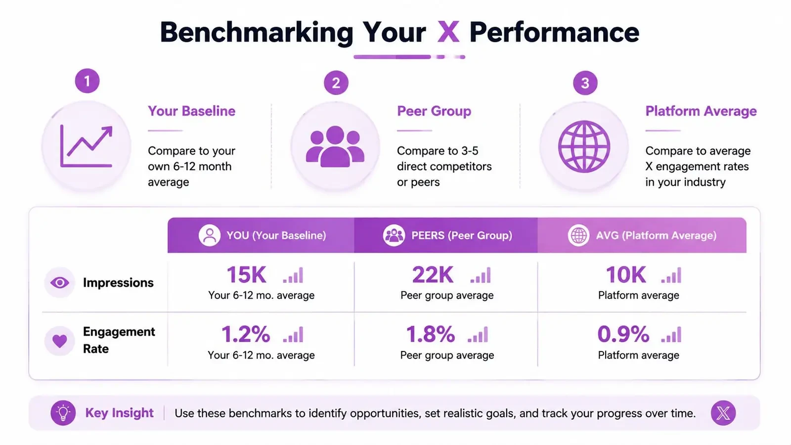
A metric by itself tells you almost nothing. A 1.2% engagement rate can be good or bad depending on what you compare it against, how you measure it, and whether the post was meant to create conversation or conversion. Benchmarking only works when the comparison set is honest.
Use three reference points. Compare against your own trailing 6 to 12 months to see whether the account is improving. Compare against a small group of direct competitors or peer accounts to understand your position in the niche. Then compare against broader industry averages so you do not mistake personal progress for category leadership. A benchmark guide recommends at least 30 posts for engagement-rate analysis and 90 days for trend analysis, which makes the read more useful (X engagement benchmark guide).
X needs extra caution because platform-wide averages can mislead badly. The benchmark context shows how wide the gap can be, with one cross-platform set placing X near the bottom on median engagement, while another view puts many accounts around 0.03% when engagement is measured per post by followers rather than impressions. Those figures use different denominators, which is exactly why they should not be mixed casually.
Compare the right things
- Use the same formula: Do not compare follower-based rates to impression-based rates.
- Use the same content type: A thread and a one-line post rarely belong in the same bucket.
- Use the same time window: A 7-day sample is too thin for most business decisions.
- Use the same peer set: Compare against direct competitors, not random accounts with different goals.
The most reliable benchmark process is to segment by content type, then review each segment quarterly. If text posts outperform image posts, that is useful. If replies outperform original posts, that is useful too. The mistake is turning a category average into a personal target and then blaming the account when the target was wrong from the start.
For a closer look at competitor sets, the guide on Twitter competitor analysis helps structure the comparison. The goal is not imitation. It is to see what your audience already responds to and where your account is lagging relative to the niche.
Interpreting Audience Data and Conversation Signals
Audience data on X is useful only when it changes what you choose to post and where you choose to show up. Raw demographics can tell you who follows you, but they don’t tell you which conversations are worth joining or which replies signal real interest. The better question is whether the audience and the conversation fit each other.
Native analytics can tell you when followers are active, which helps with timing, but the stronger signal is often what happens in the first 30 to 60 minutes after publishing. Early replies reveal whether the post landed with the right people, whether the hook invited the right kind of response, and whether the topic has enough momentum to keep going. A post that gets quick but low-quality reaction usually needs a different angle, not just more volume.
What to look for in conversations
- Topic momentum: Is the discussion growing, or is it already stale?
- Reply quality: Are the responses thoughtful, relevant, and on-niche?
- Audience fit: Are the people replying the people you want to attract?
- Geography and intent: Is this a market you care about, or just noise?
That’s where tools built for conversation discovery can help. If you don’t want to scroll endlessly, Xholic’s Engage feeds can surface conversations worth joining, while the Inspiration Library can help you study successful posts and formats without copying them. Its Context settings also hold your style guide, products, and rules, and replies learn from the edits you make, so suggestions get more relevant over time. For teams that want a broader listening framework, the internal guide on Twitter listening tools is a practical companion.
The best reply opportunity is usually not the loudest thread. It’s the one where your comment adds context that the original author and the audience both value.
Many business accounts go wrong here. They respond to the biggest posts instead of the right posts. In practice, the best conversations are often in smaller, higher-signal threads where the audience matches your niche and the reply section shows genuine intent. That’s especially true if your goal is demand, not just visibility.
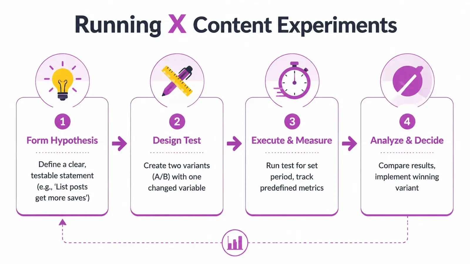
Running Experiments to Improve Content Performance
A founder once tested two hook styles across a batch of posts. The topic stayed the same, the format stayed the same, and only the opening line changed. The reply quality shifted enough to make the winner obvious.
That is the point of X experiments. Keep one variable fixed, or you will not know what moved the result. If the hook, format, timing, and topic all change together, the post is just a bundle of guesses.
A basic experiment loop
- Form a hypothesis. List-style posts may earn stronger replies than opinion-led posts in your niche.
- Design two variants. Change one element only, such as the opening line or structure.
- Run the test long enough. Do not stop after a handful of posts.
- Compare the median result. Then update your working benchmark and keep the stronger version.
The sample-size guidance from earlier still applies. Research consistently recommends at least 30 posts and a 90-day window before you draw a firm conclusion. That does not mean the test has to be perfect. It means the window has to be steady enough to separate signal from noise.
Document every test. Record the hypothesis, the exact change, the time window, and the metric used to judge success. That log becomes the team’s playbook, and it stops people from repeating the same weak test later because nobody remembers what was tried.
Connecting X Analytics to Pipeline and Business Results
This is the part most analytics coverage skips. A post can attract attention and still fail to contribute to revenue, and a thread can underperform on impressions while generating the right conversations in DM. If X is part of your demand system, the only honest question is whether it moves people farther into the funnel.
The cleanest way to do that is to connect post activity to downstream actions. Track profile visits to website clicks, DM conversations to meetings, and UTM-tagged links to landing-page performance so the platform isn’t reporting in isolation. X’s own analytics focus on audience response and what’s working, but business teams need to connect that to something a stakeholder can defend in a meeting.
You should also be realistic about attribution. On X, impressions can rise or fall without clear business impact, so the dashboard can’t be treated as proof of demand by itself. The broader market’s growth, including an estimate of USD 12.99 billion in 2025 rising to USD 43.25 billion by 2030 in one market view, shows that buyers want deeper measurement than post stats alone (social media analytics market). That doesn’t make attribution easy, but it does make the need obvious.
A practical reporting checklist
- Tag the links: Use UTM parameters on any URL you care about.
- Track the handoff: Note when an X conversation turns into a reply, DM, call, or signup.
- Review the path: Check whether high-profile-visit posts also create site visits.
- Report outcomes, not only activity: Tie X to qualified leads, meetings, or sales conversations where possible.
If you want to operationalize this over time, Xholic’s Context settings and Library can help keep the context behind posts, replies, and audience signals organized, so your team isn’t rebuilding the same judgment from scratch every week. The product is useful here as a human-in-the-loop workflow, not as an autopilot. It helps you keep track of what worked and which content patterns were worth repeating.
The next move is simple. Audit your current dashboard, remove any metric that doesn’t influence a decision, and rebuild around the smallest set of numbers that reflect business progress. Then wire those numbers to a weekly review so X stops being a guessing game and starts acting like a real growth channel.
If you want a more practical way to manage X growth decisions, Xholic AI helps you review conversations, study what works, and keep your context organized instead of starting over every day. It’s built to support the workflow behind better X analytics, from reply selection to content ideas to consistency. Visit Xholic AI to see how it fits into your process.