Want your X (formerly Twitter) profile to stand out without making it harder to read? A Twitter font generator can help you style a bio, display name, or short post with Unicode characters that look different, but the key is using it with restraint. These tools don’t change the installed font on X, they convert text into copy-paste Unicode variants, so the best choice is the one that stays readable, survives paste, and still feels on-brand.
That matters more now that the category has matured around Unicode styling, not true font rendering. Tools in this space range from clean, platform-safe generators to novelty-heavy options that can wreck legibility on mobile. X (formerly Twitter) also isn’t the place to decorate everything, a better approach is to style one part of your profile, then let your content do the rest.
1. YayText
YayText is the safest starting point if you want a Twitter font generator that feels practical instead of gimmicky. It focuses on styles people use, like bold, italic, monospace, and small caps, which makes it better for bios and short branded snippets than for flashy experiments. The page is also built around quick copy-paste behavior, so you can test a few versions and move on.
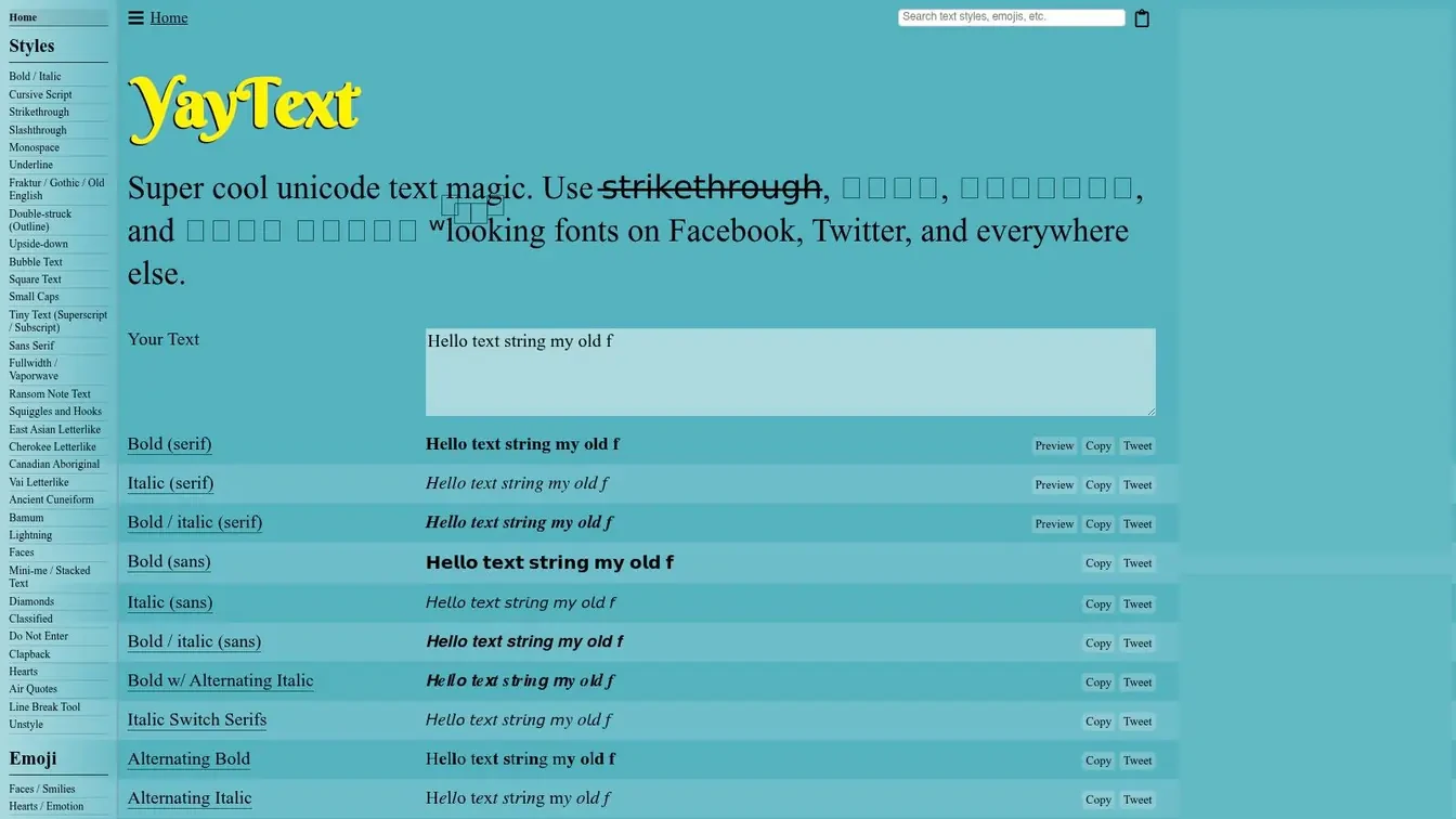
The biggest advantage is consistency. If you’re styling a display name or a bio line that needs to survive across X, mobile, and other social apps, this is the kind of tool that tends to hold up better than novelty-heavy generators. It also includes an Unstyle helper, which is useful when you pasted something too decorative and want to clean it up fast.
Practical rule: Use a generator like this for identity, not decoration. One strong style in a bio usually works better than multiple competing effects.
For X creators, that means pairing a readable Unicode style with a clear positioning statement. If your profile already does the heavy lifting, a small text treatment can make it feel more intentional without distracting from your offer. If you want a broader workflow around styling and profile setup, Xholic’s Twitter font generator sits in the same practical category.
The trade-off is simple. You won’t get the most experimental effects here, and you won’t find bulk export tools or image-generation extras. That’s fine for most serious X use cases, because the point is to make text usable, not to turn every word into a visual stunt. Visit the YayText website if you want clean, dependable Unicode styling.
2. LingoJam, Stylish Text Generator
LingoJam is the tool many people end up using first because it’s immediate. You type text, and the variants appear as you go, which makes it useful when you’re comparing how a name, hook, or short reply feels in different styles. For fast experimentation, that live preview is hard to beat.
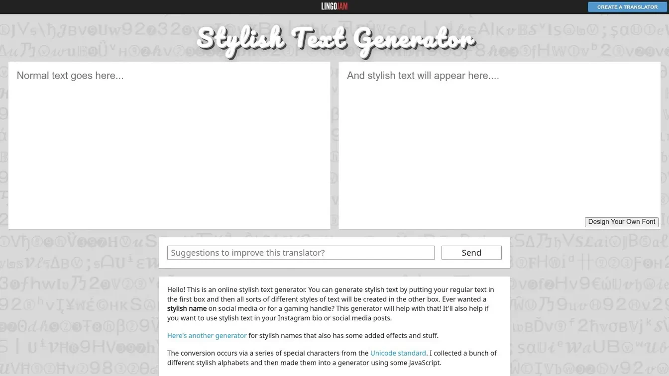
The strength here is breadth without friction. It covers a wide range of style families, so you can move from script to small caps to double-struck without signing in or digging through menus. That makes it practical for creators who want to test several visual tones before committing to one.
A tool like this works best when you already know what you’re trying to emphasize. A founder might use it to give a product line more presence in a display name, while a marketer might test a compact stylized hook in a quote post or pinned bio. The risk is that some styles lose clarity quickly on small screens, especially if you try to force them into long tweets.
The interface is basic, which is both a pro and a con. There’s less guidance, but also less clutter, so you can move quickly if you know your taste. If you want a deeper walkthrough of how to use styled text on X without overdoing it, this Xholic guide to Twitter fonts is a useful companion.
For sampling ideas, then backing off to the most readable option, LingoJam is best. Go to LingoJam’s Stylish Text Generator if you want speed and variety over polish.
3. CoolSymbol, Cool Fancy Text Generator
CoolSymbol is what you open when you want a Twitter font generator plus a symbol library in the same place. That combination matters for X bios, where spacing and small visual separators often do more work than the font effect itself. A name with tasteful symbols can feel more deliberate than a name overloaded with decorative Unicode.
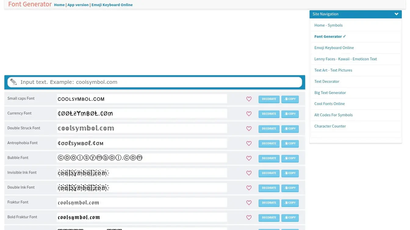
It offers a large set of style variants alongside symbol and emoji options, so the workflow is efficient if you like to build a profile line in one pass. You can copy the styled text, add a separator, and finish a bio without jumping between tools. That said, the page is heavier than a pure text converter, and the extra options make it easy to overdecorate.
Here’s the practical use case. If your brand is visual and you want a display name that feels distinct at a glance, this can help. If you’re a consultant, founder, or operator trying to look credible, the same features can backfire if you stack too many glyphs and symbols together.
Keep the symbols doing structural work, not emotional work. A separator can improve scanning, but too many icons make your profile feel noisy.
This is also where accessibility matters. Decorative text and symbols can look clever to you and cluttered to someone reading on a small screen or with assistive tools. If your aim is stronger profile branding, Xholic’s bio generator can help you think about the whole line, not just the styling.
Visit CoolSymbol’s Cool Fancy Text Generator if you want an all-in-one option, but use restraint.
4. CoolFancyText.com
CoolFancyText.com feels like a curated shelf of visual moods. Instead of making you hunt through endless generic variants, it groups styles by vibe, including bold, cursive, glitch, vaporwave, and tiny text. That makes it useful when you already know the tone you want and just need a fast way to get there.
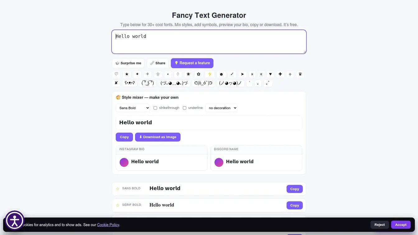
The social-use labels help too. When a generator clearly signals use for Twitter, Discord, or Instagram, it’s easier to judge whether the style fits the context you’re styling for. For X, that usually means checking whether the effect still reads cleanly in a bio, a display name, or a short reply.
The downside is predictable. Novelty styles are fun, but they can be fragile in long posts, and X posts reward scanning more than ornamental flair. If you want to use these effects in public content, keep them to short emphasis lines, not entire threads.
A good workflow here is to test one plain version and one stylized version side by side. If the styled version slows reading, it probably doesn’t belong in the post itself, even if it looks good in a preview. That’s especially true when you’re posting from a brand account and don’t want the text treatment to overshadow the message.
The site is a solid pick for quick vibe matching, not for deep customization. Go to CoolFancyText.com if you want a fast, visual picker with enough novelty to experiment responsibly.
5. Messletters (EN)
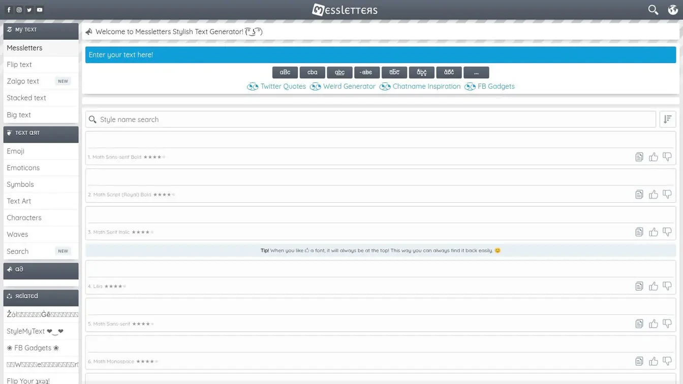
Messletters is the tool for people who like having lots of options on the page. It goes far beyond basic bold and italic variants, with niche sets such as gothic, calligraphy, and tiny text, plus symbols, kaomoji, and other decorations. If you’re testing display names or bios for a distinct look, that range can be useful.
This is also a good place to remember the wider market context. Web fonts are now effectively mainstream, with the 2025 HTTP Archive Web Almanac finding web fonts on roughly 88% of websites, up from about 87% in 2024, and almost nine out of ten sites now request web font files, while variable fonts were used on 39.4% of desktop websites and 41.3% of mobile websites in 2025, up from roughly 33% and 34% in 2024 (HTTP Archive Web Almanac). Even though Messletters is a Unicode tool, not a web-font platform, the broader typography ecosystem has normalized stylized text enough that users expect more than plain system text.
That said, variety doesn’t equal clarity. Messletters is easy to use when you want to test several profile-line options, but the long list can make the experience feel busy. Quality also varies across the catalog, so some styles will feel more polished than others.
Choose the shortest version that still says what you need. If the style competes with the words, the words lose.
If you need a deeper context layer for what to publish next on X, Xholic’s guide to Twitter font styles and Chirp pairs well with this tool. Visit Messletters (EN) when you want variety first and curation second.
6. FontGenerator.org
FontGenerator.org is useful when you want to scan many outputs quickly. It’s built around a simple input-and-scroll workflow, so you can paste a phrase once and review a long list of Unicode variants without much friction. For short testing sessions, that makes it efficient.
The page is especially helpful for A/B-style thinking around hooks and CTAs. If you’re trying to decide whether a stylized line feels stronger in a profile, a post opener, or a short promotional tweet, this kind of tool lets you compare looks fast. You’re not measuring performance here, just narrowing down the version that best matches your brand voice.
The limitation is guidance. It gives you options, but not much help choosing the ones that are easiest to read, especially on mobile. That’s where experienced creators should rely on judgment instead of novelty, because a visually loud style can make a post harder to scan even if it stands out in a preview.
Ads can also make the experience feel less clean than the minimalist tools above. That doesn’t make it unusable, but it does mean you’ll want to stay focused on the copy-paste action and ignore the distractions. For public-facing X content, speed matters, but readability matters more.
Use FontGenerator.org if you want broad selection in one screen and don’t need much hand-holding.
7. Font-Generator.com
Font-Generator.com stands out because it does two different jobs. It gives you Unicode styles for copy-paste text, and it also offers text-to-image rendering with thousands of display fonts, which makes it more flexible if you’re building mixed-media content for X. The copy-paste side is what you’d use for bios, names, and posts, while the image side is better for headers or carousel graphics.
That dual mode is the point. A founder can keep the public-facing text subtle while using more decorative typography in a visual asset, which is often a better split than forcing one effect to do everything. If you’re producing X content for launches, announcements, or profile branding, having both options in one place saves time.
The trade-off is density. The interface isn’t as lean as a pure Unicode converter, and the image outputs won’t work inside tweet text, so you need to know which output fits which job. That’s not a flaw, just a reminder that text styling and graphic design solve different problems.
For creators who care about presentation across multiple formats, this is a practical middle ground. You can keep your tweet text readable and still generate branded assets when the post needs a visual companion. Visit Font-Generator.com if you want one tool for both pasteable text and display-font graphics.
8. TextGenerators.org, Font Generator
TextGenerators.org is built for people who want a shortcut, not a gallery. Instead of making you browse endlessly, it offers presets for common tasks like Bio, Captions, and Stylish Name, which is useful if you already know the context where the styled text will live. That task-first design saves time.
This is the kind of tool I’d reach for when I’m working on a quick profile refresh. If the goal is to make a bio line or display name feel more polished, the preset labels help you think in terms of use case instead of style catalog. That’s useful for teams too, because it keeps edits aligned with a specific profile element.
The downside is that it doesn’t do much to teach judgment. There aren’t many accessibility cues, and some novelty styles can start to feel repetitive if you scroll long enough. For X, that means you still need to make the final call on whether the text is readable at a glance.
The copy-paste workflow is straightforward, which is what people want in this category. If you’re not trying to do anything fancy, it gets you from input to output quickly and without extra steps. Go to TextGenerators.org if you want a task-oriented generator with broad compatibility.
9. Textavia, Twitter Font Generator
Textavia is one of the cleaner X-specific options because it keeps the focus on Twitter-style use. It explains the basic idea clearly, these are Unicode characters you can paste into tweets, bios, and names, and then gets out of the way. That makes it a good fit if you want a dedicated Twitter font generator without extra clutter.
The style set is practical rather than excessive, which is usually what you want if the goal is readability. X creators often need a small amount of visual distinction, not a huge catalog of experimental effects. A simpler tool also makes it easier to keep your profile coherent across posts, replies, and pinned content.
That focus has a cost. You won’t get the same deep catalog you’d find in a generalist generator, and advanced extras are limited. For a lot of users, that’s fine, because more options often just mean more chances to pick a weaker one.
This is a strong choice for people who want direct instructions and don’t want to think about other platforms while styling for X. It’s also handy when you’re helping a team member or client make a quick update and don’t want to explain a complicated interface. Visit Textavia if you want the X-specific version of this workflow.
10. Textibox, Twitter Font Generator
Textibox is built around placement as much as style. It prompts you to think about a bio, a display name, or a short hook, which is helpful because the same Unicode treatment can feel right in one spot and wrong in another. That microcopy guidance makes it more practical than a generic styling page.
The best use case is quick previewing. If you want to know whether a styled snippet feels natural in a profile line, Textibox helps you see it in context before you copy it. That saves time and keeps you from forcing a style into a place where it doesn’t belong.
It also notes multi-platform compatibility, which is important for creators who reuse text across X, LinkedIn, or other social profiles. Even then, the smaller catalog means you’re choosing from a tighter set of options, not a full visual playground. That can be a benefit if you value speed over exploration.
For brand accounts, this kind of tool is often enough. You don’t need a dozen effects if your only goal is to make one line in the bio read cleaner or feel more intentional. Go to Textibox if you want a lightweight, X-focused generator with placement guidance.
Top 10 Twitter Font Generators, Quick Comparison
| Tool | ✨ Core features | ★ UX & reliability | 👥 Target audience | 💰 / 🏆 Value & standout |
|---|---|---|---|---|
| YayText | Readable, platform‑safe Unicode styles; “Unstyle” helper; compatibility notes | ★★★★ | 👥 Professionals, thread authors, marketers | 💰 Free; 🏆 Most dependable cross‑platform |
| LingoJam, Stylish Text Generator | Real‑time streaming previews; huge variety of scripts | ★★★★ | 👥 Experimenters, display‑name & short‑hook testers | 💰 Free; 🏆 Vast style coverage |
| CoolSymbol, Cool Fancy Text Generator | Font generator + large symbol/emoji library; one‑click copy | ★★★ | 👥 Bio builders, visual separators in profiles | 💰 Free; 🏆 All‑in‑one fonts + symbols |
| CoolFancyText.com | Curated style categories and social‑use labels; novelty effects | ★★★★ | 👥 Users picking a specific vibe quickly | 💰 Free; 🏆 Curated vibes & quick copy |
| Messletters (EN) | Thousands of niche variants (gothic, calligraphy, tiny); symbols & kaomoji | ★★★ | 👥 Users seeking unique, testable display names | 💰 Free; 🏆 Sheer variety for A/B testing |
| FontGenerator.org | Hundreds of outputs per input; quick copy buttons; usage guides | ★★★★ | 👥 Marketers, A/B testers, fast workflows | 💰 Free; 🏆 Fast multi‑style scanning |
| Font‑Generator.com | 100+ Unicode styles + 4,700+ text‑to‑image fonts; dual Unicode/graphic mode | ★★★★ | 👥 Mixed‑media creators, header/carousel designers | 💰 Free; 🏆 Unique Unicode + graphic blend |
| TextGenerators.org, Font Generator | Preset use‑cases (bio, captions, names); task shortcuts | ★★★★ | 👥 Users wanting task‑oriented outputs & speed | 💰 Free; 🏆 Workflow shortcuts for social tasks |
| Textavia, Twitter Font Generator | X‑focused guidance and examples; practical readable set | ★★★★ | 👥 X/Twitter‑first users & profile editors | 💰 Free; 🏆 Concise X‑specific instructions |
| Textibox, Twitter Font Generator | X/Twitter prompts for bio/display/hooks; microcopy guidance | ★★★★ | 👥 Users previewing styled snippets for X placements | 💰 Free; 🏆 Microcopy + placement suggestions |
Beyond Fonts: Building a Memorable Brand on X
Choosing a unique font is a small but creative part of your brand on X. The better approach is to use styled text sparingly for emphasis, not for entire posts. Always prioritize readability and accessibility, because decorative Unicode can look clever in a preview and awkward in a feed, especially on mobile.
That is why strong creators treat a Twitter font generator as a finishing tool, not a strategy. Use it to sharpen a display name, make a bio line cleaner, or add a subtle visual cue to a pinned post. If the style starts competing with the message, it is probably doing too much.
Brand control matters more than decoration. A readable profile, consistent voice, and clear positioning will always matter more than a fancy glyph. Tools like Xholic can help once you move past the styling stage, especially if you want to study what kinds of hooks, formats, and ideas work in your niche.
If you are building a profile that needs more than text decoration, Xholic’s Inspiration Library and Tweet X-Ray can help you understand why strong posts work. For a practical look at how niche positioning supports audience growth, this photographer audience-building guide is useful context. The best setup is simple, readable styling on the surface and disciplined content underneath.
The most useful generators for real work tend to be the ones that stay legible across devices. I would start with YayText for clean output, Textavia for X-specific clarity, and Textibox when placement matters. If the goal is broader content strategy, use the generator only after you have decided what your profile should say and who it should attract. For a practical walkthrough of choosing and using a twitter font generator guide, it helps to compare style with readability before you copy anything into your bio or display name.