If you’re checking X (Twitter) analytics and still making posting decisions by gut feel, you’re probably overvaluing impressions and undervaluing signals that drive growth. The useful way to read twitter analytics is simple: use engagement rate to judge resonance, use impressions to judge distribution, use link clicks to judge action, and use reply patterns to judge whether your account is building momentum or just collecting passive views. Once you read the data this way, analytics stops being a report and starts becoming a content operating system.
Understanding Core X Analytics Metrics
Many marketers look at twitter analytics backward. They start with the biggest number on the screen, then try to feel good about it. That’s how you end up chasing vanity metrics.
A better approach is to rank metrics by decision value. Engagement rate sits at the top because it tells you whether people cared enough to do something after seeing the post. That’s why Tweet Archivist’s glossary of X analytics terms describes engagement rate as the single most critical metric, while also noting that marketers track link clickthroughs, video views, impressions by time of day, top tweets, conversions, audience demographics, top mentions, like rate, hashtag performance, and follower growth.
The metrics that deserve your attention
| Metric | What It Is | What It Tells You |
|---|---|---|
| Impressions | The number of times a post was displayed | Whether X distributed the post broadly enough to test the idea |
| Engagements | Interactions such as likes, reposts, replies, link clicks, media views, hashtag clicks, and profile visits | Whether the post triggered action instead of a passive scroll |
| Engagement Rate | (Total Engagements / Impressions) × 100 | Whether the content resonated relative to the attention it received |
| Link Clicks | Clicks on the URL in your post | Whether your hook and CTA moved people off-platform |
The formula matters because it stops you from misreading raw engagement counts. A post with fewer total likes can still be stronger if it converted a larger share of impressions into action.
Practical rule: A post with strong impressions but weak engagement usually has a distribution win and a content problem. A post with weak impressions but strong engagement usually has a content win and a distribution problem.
A simple way to read the numbers together
Treat each metric as an answer to a different question:
- Impressions ask visibility. Did X give this enough reach to produce a useful test?
- Engagements ask reaction. Did people pause and interact?
- Engagement rate asks resonance. Did the idea land once people saw it?
- Link clicks ask intent. Did the post create enough curiosity or urgency to earn a next step?
This is also why impressions alone aren’t enough. If you need a deeper breakdown of what impression counts mean in practice, this guide on what impressions on Twitter really tell you is useful.
A quick example:
You publish a short founder post:
“We stopped writing feature announcements like changelogs. Now every launch starts with the user pain, not the release notes.”
If impressions are healthy but link clicks are flat, the topic probably earned attention but the CTA didn’t convert interest into action.
That’s the level where twitter analytics becomes useful. You’re not asking, “Did this post do well?” You’re asking, “What exactly failed or succeeded?”
How to Access Your Analytics Data
The hardest part of twitter analytics today isn’t interpretation. It’s access.

What you can access natively
If you have access to X’s native dashboard, start there. It’s still the cleanest place to review your own account-level and post-level performance. In practice, users generally use it for post analytics, top content review, engagement trends, and audience snapshots when available.
The trade-off is access. According to Hootsuite’s guide to Twitter analytics, full access now requires X Premium, and free users report 40-60% less visibility into follower demographics and optimal posting times. That limitation matters because those missing views are often the exact ones you need to improve scheduling and audience targeting.
For many creators, the workflow ends up looking like this:
- Check native post analytics first for immediate feedback on individual tweets.
- Track recurring patterns manually across top-performing posts.
- Use outside tools or public post signals when native reporting doesn’t show enough detail.
If you want more ideas for making sense of the data once you’ve collected it, Xholic’s archive of X analytics articles gives more platform-specific examples.
What to do when the dashboard is limited
Free-tier limitations change how you work. You can’t rely on one dashboard to answer every question, so you need a hybrid approach.
Use this decision framework:
- If you need post-level feedback, native analytics is enough to judge hooks, replies, and immediate response.
- If you need audience timing or demographic depth, you may need Premium access or a third-party workflow.
- If you need competitor insight, public post metrics and timeline observation become more useful than your own dashboard.
Here’s a practical split that works well for founders and indie hackers:
- Native analytics for your own posts
- Spreadsheet or notes for weekly pattern tracking
- Third-party discovery tools for trend and competitor analysis
- UTM tracking in your links for off-platform attribution
A short walkthrough helps if you haven’t been inside the dashboard recently:
The important trade-off is this. Native analytics tells you what happened on your posts. It often does a weaker job answering what you should do next unless you already have a process for comparing posts, spotting timing patterns, and mapping performance back to business goals.
From Data to Decisions Interpreting Metrics for Growth
You open X in the morning and see a post with strong impressions, decent likes, and almost no profile visits. Another post reached fewer people but pulled in replies, follows, and a few site clicks. The second post is usually the better growth asset.
That is the shift from reading numbers to making decisions. Raw reach matters, but growth comes from knowing what each metric says about audience intent, content fit, and next action.
Recent benchmark summaries from Rival IQ’s social media industry data support a simple point. Engagement rates vary widely by platform and post type, so post comparisons only make sense when the format and goal match. A short text opinion post, a video clip, and a link post should not be judged on one baseline.

How to judge whether a post is good
Start with two checks.
- Did the post get enough distribution to produce a fair read?
- Did the people who saw it do the thing you wanted them to do?
That second question filters out vanity metrics fast. A post can get likes and still fail if the goal was profile discovery, email clicks, qualified replies, or follower conversion. I usually review posts in that order: distribution first, then response quality, then business outcome.
Use this interpretation guide:
- High impressions, low engagement. The hook earned feed placement, but the body did not create enough curiosity, agreement, or tension to carry the post.
- Low impressions, high engagement. The idea likely has value. Packaging, timing, or early distribution held it back.
- High likes, weak replies and weak clicks. The post generated passive approval, not intent.
- Strong replies and profile visits. The topic created enough interest for people to continue the conversation and check credibility.
- High link clicks, low engagement. The CTA and audience fit may be strong even if the post never became broadly visible.
One metric rarely settles the question.
A practical review starts by separating packaging from payload. Packaging is the first line, visual, topic, and timing. Payload is whether the post delivers on the promise. Strong packaging with weak payload inflates impressions and depresses engagement. Strong payload with weak packaging produces the opposite pattern and usually deserves a second test.
If you want account growth, connect those patterns to the next move. A post with strong replies and profile visits can often be turned into a follow-up thread, a sharper profile headline, or a pinned post update. A post with clicks but weak conversation may be working as a conversion asset, even if it never looks impressive in the feed. For creators trying to improve account growth with better post choices, this guide on getting followers on Twitter through stronger content systems fits well with analytics review.
Four common analytics patterns and what they mean
Reading patterns beats staring at isolated numbers.
High impressions and low engagement rate
X gave the post a chance. People did not find enough value in the payoff.
Common causes:
- The opening promised too much
- The body stayed vague
- The idea was familiar without a new angle
- The CTA asked for too much commitment
Example:
“10 lessons from building a startup”
That line can win distribution. If the thread repeats generic advice, engagement drops because the post created curiosity but did not reward it.
Low impressions and high engagement rate
This pattern deserves more attention than many teams give it. The audience who saw the post responded well, which means the idea may be stronger than the result looks.
Practical fixes:
- Rewrite the first line with more specificity
- Shorten the post to remove setup
- Turn it into a plain text post if media distracted from the point
- Repost in a better time block
- Use it as a reply starter under a larger account in the same niche
This is also where a simple momentum score helps. Track early replies, reposts, bookmarks if available, profile visits, and clicks in the first 60 to 120 minutes. If a post shows strong response quality despite modest reach, queue a variant while the topic is still fresh. That gives you a workaround when X Premium data is limited or inconsistent.
High likes and weak replies or clicks
This is approval without movement.
You will see it on motivational one-liners, broad founder takes, and low-friction opinions. These posts can support reach, but they often do little for trust, lead flow, or follower growth because they do not create enough tension or specificity for people to act.
Strong replies and profile visits
This is one of the clearest signals that content is pulling the right kind of attention. People did not just consume the post. They wanted to test your thinking, agree publicly, or inspect your profile before deciding whether to follow.
A post that often creates that pattern looks like this:
“Most founders don’t need more content ideas. They need a repeatable angle library: objections, mistakes, failed assumptions, customer language, and process breakdowns.”
It gives people something concrete to react to. It also creates a useful split in the audience. The right readers reply, save it, or visit the profile. That is a stronger growth signal than likes alone.
The goal is not to find your top post. The goal is to find the patterns worth repeating, the weak points worth fixing, and the posts that move people one step closer to following, clicking, or buying.
Advanced Analytics Workflows for Faster Growth
A post from a larger account in your niche starts picking up real replies at 9:12 a.m. By 9:40, the thread has not gone viral, but the response quality is rising, smart quote posts are appearing, and the conversation is still open. That is the window advanced analytics should help you spot.
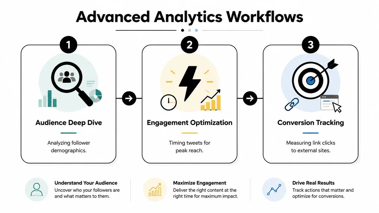
Momentum scoring before a conversation peaks
Basic reporting shows what already worked. Momentum scoring helps you decide where to act while reach is still building.
According to Digital Applied’s 2026 X data points, X gives outsized weight to engagement-quality signals such as bookmarks and longer replies. The same analysis says early engagement velocity in the first few hours can materially affect downstream visibility. For operators, the takeaway is simple. Track acceleration, not just totals.
A useful momentum score usually combines a few early signals:
- Reply quality, especially specific responses, disagreement, or follow-up questions
- Save intent, using bookmarks when available or quote-post behavior as a proxy
- Velocity, measured by how quickly replies and interactions stack up over short intervals
- Relevance, based on whether the topic matches your audience, offer, or positioning
- Action potential, meaning the thread gives you room to add a clear point of view
I use a practical rule here. If a thread is attracting thoughtful replies and still has room for a better answer, it is worth entering. If it already has hundreds of low-signal reactions and no real discussion, the opportunity is usually gone.
That matters even more because X Premium data is inconsistent across accounts and views. When bookmark counts or richer analytics are missing, use visible proxies. Count meaningful replies, note quote-post activity, watch whether the author is replying back, and check how fast the thread is compounding over 15 to 30 minute intervals.
A simple workflow:
- Build a monitored list of accounts in your niche
- Check recent posts, not only top posts from the last day
- Score each candidate thread for reply quality, velocity, and relevance
- Reply only where you can add a distinct example, counterpoint, or framework
- Log which replies later lead to profile visits, followers, or site clicks
If you need software support for this process, this list of twitter analysis tools for engagement and better tweets is a solid starting point.
Audience network analysis that changes who you reply to
Reply strategy gets better once you stop treating every visible account as equally useful.
The accounts around your best conversations usually matter more than the biggest names in your feed. Some creators generate passive likes. Others attract the exact people who follow, click, buy, or refer. Audience network analysis helps you separate those groups.
Socialinsider’s Twitter analytics benchmarks found that reply-driven interaction remains one of the clearer signs of active audience engagement on X. That fits what I see in growth audits. Threads with real back-and-forth often produce better downstream outcomes than posts with lightweight approval signals.
Start by reviewing the accounts that repeatedly show up around strong conversations:
- People who bring your target audience into the thread
- Accounts whose posts attract detailed discussion instead of one-word reactions
- Peers who create overlap between adjacent niches
- Users who repeatedly trigger profile visits or qualified traffic after you reply
Then tighten your behavior.
Reply less often to large accounts with broad, low-intent audiences. Spend more time where the audience already cares about the problem you solve. For a founder, that often means operators, customers, and niche experts. For a marketer, it often means threads where budget, attribution, or channel performance is being debated in public.
The reply itself has to earn attention. Generic agreement rarely travels. A stronger response usually does one of three things. It adds a concrete example, sharpens the original claim, or introduces a useful objection.
This workflow takes more effort than chasing visible threads. It also produces cleaner learning. You start seeing which conversations create follower growth, which audiences convert, and which creators are worth building around over time.
Creating Your Analytics Reporting System
Monday morning, the dashboard looks busy. A few posts spiked, one thread brought in followers, and another got plenty of impressions but no clicks. Without a reporting system, that week turns into guesswork fast.
A useful analytics process creates the same outcome every time. It helps you spot what deserves more distribution, what should be retired, and what is attracting attention from the wrong audience. Keep it light enough to maintain, but structured enough to connect X activity to traffic, leads, and revenue.
A practical daily weekly monthly cadence
Daily checks are for triage. Spend a few minutes identifying what needs action while the post is still alive.
Focus on:
- Posts gaining traction early
- Replies worth continuing because they attract the right people
- Spikes in profile visits, link clicks, or follows
- Posts worth reposting, turning into a thread, or adapting into another format
Weekly reviews are for pattern recognition. During these reviews, vanity metrics start losing their grip. Pull your strongest and weakest posts side by side, then compare them by topic, format, hook, audience intent, and CTA.
Review questions:
- Which posts earned strong engagement relative to impressions?
- Which posts brought in replies from prospects, peers, or customers instead of passive reactions?
- Which hooks won distribution but failed to drive clicks, follows, or conversation?
- Which themes keep producing qualified attention across multiple posts?
- Which posts showed momentum early, then died because the CTA or angle was weak?
If you already track momentum scoring, include it here. A simple version works well. Score posts based on early impressions, engagement rate, reply quality, profile visits, and click intent within the first day. That makes it easier to separate posts that are merely visible from posts that create business value.
Monthly reviews are for attribution. Native X analytics can show reach and interaction, but they are thin when you need to tie content to conversions, especially if you are working around X Premium limits. Use UTM-tagged links, then compare post performance inside X with session quality and conversion data in your web analytics platform. Google’s Campaign URL Builder is a simple way to keep UTM naming consistent across posts.
That is the difference between “this content got attention” and “this content drove qualified traffic and signups.”
Attention without downstream action is not a growth signal. Treat it as a creative signal unless it consistently leads to clicks, follows, leads, or sales conversations.
A simple reporting template you can keep up with
Use a sheet or doc with five columns:
| Timeframe | What to review | What to record | What decision to make |
|---|---|---|---|
| Daily | New post performance and active conversations | Standout post, weak post, reply opportunities, early momentum score | Reply, repost, expand, or ignore |
| Weekly | Post patterns by topic, format, hook, and CTA | Best hooks, strongest formats, weak conversion paths, repeat audience signals | Adjust next week’s content plan |
| Monthly | Trend lines and attribution | Follower movement, click quality, UTM traffic, conversion outcomes | Increase focus, cut low-value themes, refine positioning |
For a founder, the system might look like this:
- Daily. Check whether product, customer, or operator posts are attracting replies from buyers, partners, or relevant peers.
- Weekly. Compare company-building posts against customer pain point posts and opinion-led threads.
- Monthly. Match UTM-tagged X traffic to demos, signups, or sales-qualified actions.
Teams usually need one more layer before reporting. They need a review process before publishing. A free quote tweet generator for planning and approvals is useful for reviewing positioning, visuals, and tone before a post goes live. Use mockups responsibly for planning, education, product previews, and presentations, not to mislead people.
The reporting system should answer one practical question every week. What should the team do more of, do less of, or test next based on observed results.
Frequently Asked Questions About Twitter Analytics
What is a good engagement rate on X
A founder posts a sharp hook, gets solid reach, and then celebrates a number that did nothing for pipeline, signups, or audience quality. That is the wrong standard.
A good engagement rate depends on format, audience size, and goal. Text posts, videos, link posts, and reply-led posts behave differently. Use your own recent median by format as the baseline, then judge each post against the action you wanted. If the goal was conversation, look at reply quality. If the goal was traffic, check clicks and downstream sessions. If the goal was audience growth, measure follows per 1,000 impressions.
How can I see analytics for other accounts
You cannot see another account’s private native analytics.
You can still do useful competitive analysis with public signals. Track posting cadence, topic mix, visible engagement, reply depth, repost velocity, and whether strong posts keep earning interaction after the first few hours. For serious monitoring, build a simple spreadsheet that logs those signals over time. That gives you a workable momentum view even if X Premium limits what you can export or compare directly.
How often should I check my X analytics
Check early signals daily if you post often. Interpret patterns weekly. Review business impact monthly.
That cadence prevents two common mistakes. The first is overreacting to one post. The second is waiting so long that you miss repeatable wins. I usually check within the first hour, again after 24 hours, then compare groups of posts at the end of the week.
What metric matters most in twitter analytics
No single metric deserves that title in every case.
If you need one starting point, use engagement rate to compare content quality across posts with different reach. Then pair it with a second metric that reflects the job of the post. Use profile visits or follows for audience building. Use link clicks and tagged traffic for acquisition. Use qualified replies for relationship building. Teams that want a faster read can also create a simple momentum score using early impressions, reposts, replies, and profile visits in the first few hours to spot posts worth amplifying.
Why do some posts get high impressions but low results
High impressions with weak results usually mean distribution outperformed conversion. The hook earned attention, but the rest of the post did not create enough curiosity, trust, or urgency to get the next action.
The fix depends on the gap. If people stop after the first line, tighten the body. If they engage but do not click, improve the offer or CTA. If they click but do not convert, the problem sits on the landing page, not in X analytics. Separate those stages and the diagnosis gets much easier.
If you want a faster way to turn these ideas into execution, try Xholic AI. It’s built for creators, founders, indie hackers, marketers, and X power users who want to find high-momentum conversations early, generate better replies, remix proven tweet structures, organize research, use a Chrome extension inside the X workflow, and keep posting consistently with Smart Scheduling.