You post on X (Twitter), check a few likes, maybe glance at impressions, and still do not know what to do next. This is the core problem. Many users are not short on content ideas. They are short on feedback they can trust.
A twitter analytics dashboard fixes that when you use it as a decision tool instead of a scoreboard. It shows which posts earn attention, which ones create real engagement, and which topics push people to visit your profile or click deeper. Used well, it stops random posting and turns your account into a repeatable growth system.
Stop Guessing and Start Growing
Teams often waste time in one of two ways. They either post blindly and hope something hits, or they stare at numbers without changing anything. Neither approach helps.
A twitter analytics dashboard gives you the missing layer between publishing and improving. It shows what people saw, how they reacted, and whether your content created enough curiosity to move them toward your profile, your links, or your next post. That is the difference between activity and progress.
The native dashboard on X is especially useful when you are trying to answer practical questions: Which hook format gets attention? Which topic earns replies? Which post style attracts the right followers instead of empty reach?
Practical rule: If a metric does not change your next post, it is not insight yet.
If you are also trying to connect analytics to audience growth, this guide on getting more Twitter followers with a clearer strategy is a good companion read.
Accessing and Navigating Your Analytics Dashboard
The first thing to know is simple. Full dashboard access is not universal anymore.
Access has changed over time. X rolled out an improved analytics page for Premium subscribers in June 2024, and free accounts may see a more limited view depending on account, surface, and feature availability (Social Media Today on X’s Premium analytics rollout).
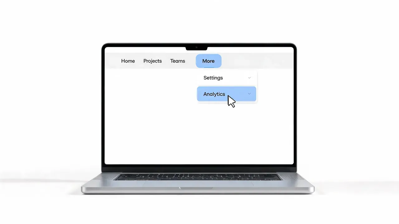
How to open the dashboard
On desktop, go into X and open the left-side menu. From there, the usual path is More, then Creator Studio, then Analytics. If you already know where you are going, you can also head straight to the account analytics area from your logged-in account.
Once you are inside, do not click around randomly. Start with the overview page and treat it like a control panel.
What you should look at first
The most useful areas for a quick read are usually these:
- 28-day summary: This is your broad health check. It gives you a fast view of recent account movement without forcing you to judge performance from one post.
- Performance graph: Use this to spot spikes, dips, and timing patterns. If something jumps, ask what you posted that day.
- Top Tweet area: This helps you identify the post that outperformed the rest. That post deserves analysis, not celebration alone.
- Date range controls: Change the time window when you need to compare a launch week, a campaign period, or a posting experiment.
A good habit is to review one short window and one broader window. The short view helps with recent decisions. The broader one stops you from overreacting.
Your dashboard is not there to impress you. It is there to help you repeat what works and stop repeating what does not.
Decoding Core Metrics: What to Actually Track
One often opens analytics and gets distracted by whatever number is biggest. That usually leads to bad decisions. The dashboard matters because it helps you compare reach, resonance, and intent separately.
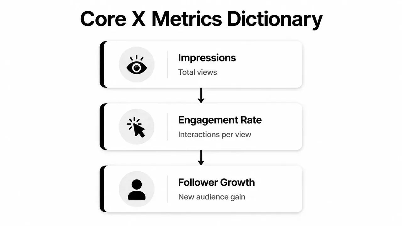
Impressions tell you reach
Impressions tell you how many times people saw a post. That is your visibility metric.
If impressions rise, something in your timing, topic, hook, or network distribution worked. But impressions alone do not tell you whether the post was good. They only tell you the post got seen.
A practical way to think about impressions is this: they answer “Did the market notice this?” They do not answer “Did the post land?”
For a deeper breakdown, this guide on what impressions on Twitter actually mean for engagement is useful.
Engagements show activity, not quality
Engagements combine interactions such as likes, replies, reposts, and clicks. This is the total activity around a post.
That sounds useful, and it is, but it can still mislead you. A post with more reach can pile up more engagements while being less effective on a per-view basis. That is why engagement count is a supporting metric, not your lead metric.
Use engagements to answer: What kind of reaction did this post generate? Then go one step further and ask whether that reaction was efficient.
Engagement rate is the decision metric
Engagement rate is the metric that deserves the most attention. It measures total interactions divided by impressions.
Engagement rate is useful because it can reveal content quality even when two posts have very different reach. A post with a 5% engagement rate is usually a stronger resonance signal than one with a 1% engagement rate, even if the lower-rate post had more impressions (Tweet Archivist guide to the Twitter analytics dashboard).
That is the metric that tells you whether your content connected.
Stop asking, “How many people saw it?” Start asking, “Of the people who saw it, how many cared enough to act?”
Profile visits and link clicks show intent
Profile visits matter because they show curiosity. Someone read the post and wanted to know who you are. That is often the bridge between a good tweet and a new follower.
Link clicks matter when your goal goes beyond engagement. If you want traffic, signups, product interest, or newsletter visits, clicks tell you whether the post created enough interest to move people off the timeline.
Here is the easiest way to classify the core metrics:
| Metric | What it tells you | Best next question |
|---|---|---|
| Impressions | How far the post traveled | Why did this hook earn distribution? |
| Engagements | How much activity happened | Which interaction type dominated? |
| Engagement rate | How strong the post was per view | What made people react instead of scroll? |
| Profile visits | Whether curiosity increased | Did the post position the account clearly? |
| Link clicks | Whether people took the next step | Was the CTA strong and relevant? |
When you read metrics this way, the dashboard becomes much easier to use. Each number answers a different question.
From Metrics to Momentum: Interpreting Data for Growth
Reading metrics is easy. Turning them into decisions is where most accounts stall.
What matters is the pattern, not the isolated number. A strong twitter analytics dashboard workflow is basically a set of playbooks. You look at a signal, match it to the likely cause, then make one specific change.
Playbook for common metric patterns
Here are the patterns that show up most often and what to do with them.
- High impressions, low engagement rate: Your hook did its job, but the body did not deliver. Tighten the payoff. Cut filler. Move the strongest insight higher in the post.
- Low impressions, high engagement rate: The content resonates with the people who saw it. Your next move is broader packaging. Test a stronger opening line, a more timely angle, or a better posting slot.
- High profile visits, low follows: The post created interest, but your profile did not close the sale. Check your bio, pinned post, recent content quality, and whether your profile makes a clear promise.
- Strong likes, weak replies: People agree, but they do not feel invited into a conversation. End with a sharper question, a stronger opinion, or a more discussable claim.
- Good engagement, weak clicks: The tweet works as content but not as a bridge. Rework the CTA, make the next step clearer, or give the reader a stronger reason to leave the feed.
That is the fundamental operating model. Do not just label posts as good or bad. Diagnose them.
A simple post review workflow
After a post has had enough time to gather signal, review it in this order:
-
Check the hook through impressions
If reach is weak, the opening probably did not earn enough attention. -
Check content fit through engagement rate
If people saw it but did not interact, the message likely lacked clarity, novelty, tension, or payoff. -
Check intent through profile visits or clicks
If interaction happened but no one went deeper, the post may have been entertaining without being directional. -
Check audience quality through replies and mentions
Look at who engaged, not just how many. The right audience matters more than broad approval.
A quick example:
“Most founders do not need more features. They need a clearer promise.”
If that post earns strong impressions but weak engagement, the statement probably caught attention but felt too broad. The fix is to add proof, a sharper angle, or a concrete example.
If it earns strong engagement and profile visits, that is a different signal. The idea resonated, and people wanted context. That tells you to create a follow-up post, a thread, or a pinned explanation on the same theme.
This is also where consistent comparison matters. If a few high-performing posts all share the same structure, do not treat that as coincidence. Treat it as a repeatable format.
A practical benchmark for your own process is to compare posts in groups:
- Topic clusters: product posts, personal observations, educational tips
- Format clusters: one-liners, short lists, threads, replies
- Intent clusters: awareness posts, authority posts, traffic posts
When a format repeatedly produces better signals, standardize it. Build a small posting system around it.
Here is a useful walkthrough before you do your own reviews:
If you want more tactical ideas for connecting analytics to actual audience growth, this guide on how to get followers on Twitter with repeatable actions pairs well with the playbooks above.
Common Mistakes When Reading X Analytics
Most analytics mistakes are not technical. They are judgment mistakes. People look at the right dashboard and ask the wrong question.
Mistake one: chasing reach without resonance
The easiest trap is obsessing over impressions while ignoring whether the post connected. A post can travel far and still teach you very little if the engagement quality is weak.
Fix: Treat visibility as a headline and engagement as the article. If the reach is high but reactions are soft, study the gap between the promise in the hook and the value in the body.
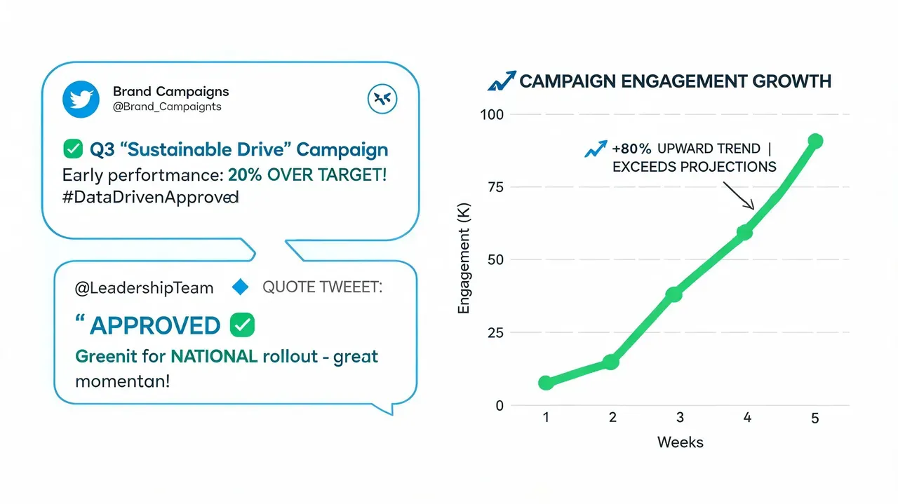
A useful content habit is to rewrite weak performers before posting again. You can mock up revised versions in a planning workflow with tools like a fake tweet generator for drafts, reviews, and presentation mockups. Mockups are useful for planning and approvals, and they should not be used to mislead people.
Mistake two: overreacting to single posts
One post underperforming does not automatically mean the topic is bad. Timing, audience mood, unclear phrasing, and competition on the timeline can all distort a single result.
Fix: Read trends over a broader window. The dashboard’s rolling summary exists for a reason. Look for repeat patterns across multiple posts before changing your whole strategy.
A single post is feedback. A pattern is evidence.
This matters even more for experiments. If you test a new style, judge the set, not the first attempt.
Mistake three: ignoring context around mentions
Mentions can bring reach, credibility, and conversation quality, but only if you investigate them. Teams often notice the volume and skip the source.
Fix: Review who mentioned you, what post triggered it, and whether the mention opened a useful network. Some mentions come from people your target audience already trusts. Others generate noise without relevance.
Use this quick review lens:
| Mistake | What people do | Better move |
|---|---|---|
| Vanity reading | Celebrate big impressions | Check whether people interacted |
| Post panic | Rewrite strategy after one miss | Compare across several similar posts |
| Surface mention review | Count tags only | Study who mentioned you and why |
The broader principle is simple. Read analytics with context, not emotion.
Beyond Native Analytics: Building a Growth Workflow
Native analytics tell you what happened. They do not give you a full operating system for what to do next.
That becomes a problem as soon as you identify a winner. If a post format works, you need a way to save it, study it, remix it, schedule the next variation, and keep the insight from disappearing into the timeline.
Turn winners into repeatable formats
The strongest workflow looks like this:
- Save the post pattern: Do not just save the tweet. Save why it worked. Was it the hook, the contrarian angle, the compact structure, or the CTA?
- Group wins by format: Put educational posts together. Put story-led posts together. Put authority one-liners together. Pattern recognition gets easier when similar posts live side by side.
- Create variations on purpose: Rewrite the same underlying structure for a different pain point, audience segment, or timely event.
- Schedule while the insight is fresh: Good ideas decay fast when they stay in drafts with no publishing plan.
This is why many teams outgrow native-only reporting. They need one workflow for discovery, writing, organizing, and scheduling.
Use native analytics for answers and a workflow for action
A practical setup is to use the dashboard for diagnosis, then use a growth workflow to act on what you found. If a topic repeatedly drives profile visits, build a short series around it. If a concise opinion format earns strong engagement, turn it into a weekly template. If reply-led activity brings the best audience, make reply writing part of the calendar instead of treating it as extra work.
For teams that want help operationalizing that process, this guide on free Twitter analytics options and what they miss is worth reviewing.
The bigger point is simple. Analytics alone will not create consistency. You need a system that turns insight into the next draft, the next reply, and the next scheduled post.
Frequently Asked Questions About X Analytics
Can I use X Analytics without Premium?
You may still see limited post-level metrics for your own posts, but broader desktop dashboard access and deeper account-level reporting can depend on your account, subscription tier, and the analytics surface X makes available at the time.
Why do mobile numbers feel different from the desktop dashboard?
Mobile often focuses on per-post snapshots. The desktop dashboard is better for broader account-level context and historical views when your account has access to them, so it is usually stronger for trend analysis.
Can I see another account’s analytics directly?
No. You can only see direct analytics for your own account. For other accounts, you have to infer performance from visible post activity, reply quality, reposts, topic patterns, and timing.
How often should I check analytics?
Check individual posts after they have had time to gather signal, then review account trends on a regular schedule. Daily obsession usually creates noise. Weekly review works well for most creators and teams.
What metric should I focus on first?
Start with engagement rate if your goal is to judge content quality. Use impressions, profile visits, and clicks to understand the rest of the story.
What should I do after finding a top post?
Break down the hook, structure, topic, and CTA. Then create a new version built on the same underlying pattern instead of copying it directly.
Conclusion: Turn Insights into Action
A good twitter analytics dashboard does not just report performance. It shows you where your content strategy is strong, where it leaks attention, and where your next gains are likely to come from. The value is not in checking numbers. It is in changing your behavior based on what those numbers mean.
Teams that grow on X do not guess better. They review better, interpret better, and publish with tighter feedback loops.
If you want help turning analytics into a real posting system, try Xholic AI. It is an AI-powered X growth toolkit for finding high-momentum tweets, generating replies, remixing proven posts, organizing saved ideas, tracking consistency, using an in-feed Chrome extension workflow, and scheduling posts with Smart Scheduling.