Twitter/X’s current font is Chirp, a custom typeface introduced in January 2021. But if you’re a creator trying to make graphics, screenshots, carousels, or promo images feel native on X, knowing the name alone doesn’t help much because Chirp is proprietary, and you can’t just grab it and drop it into Canva.
That’s usually the frustrating part. You make a clean visual, the colors are right, the copy is sharp, and it still looks slightly off once it lands in the feed. The reason is often typography. X has a very specific text feel: compact but not cramped, friendly but not soft, clear without looking generic. If your graphic uses the wrong font, people may not notice consciously, but they can still feel the mismatch.
This guide answers the obvious question, what is twitter font, and then goes one step further. You’ll learn what Chirp is, why X moved to it, what qualities make it feel native, and how to mimic that aesthetic with free fonts you can use in Figma, Canva, or any design tool.
Why Your Content Might Not Feel Right on X
A lot of creators run into the same problem. Their content looks polished in isolation, but inside the X feed it feels imported from somewhere else. The layout might be fine. The copy might even be strong. But the text styling gives away that it wasn’t designed with the platform’s visual language in mind.
Chirp is a big part of that visual language. X uses it across the interface, so users repeatedly absorb its shapes, spacing, and tone. When your graphic uses a very different font, the mismatch can make your post feel more like an ad, a repost from another platform, or a generic template.
Why typography affects trust
People don’t read social posts like they read a brochure. They scan fast. They decide in a split second whether something feels native, credible, and worth attention. Typography influences that judgment before anyone processes your argument.
Three things usually create the “off” feeling:
- Mismatch in tone: A slick geometric font can feel too corporate for X.
- Mismatch in spacing: Loose letter spacing often looks alien in a feed built for dense reading.
- Mismatch in hierarchy: Oversized headlines and tiny body copy can feel more like a Pinterest graphic than an X-native post.
Practical rule: If your graphic looks like it belongs in a startup pitch deck, it probably won’t feel native on X without typographic adjustments.
Creators who care about fit usually spend time on analytics, hooks, and reply strategy too. If you want to sharpen that side as well, this guide to top Twitter analysis tools for better engagement is a useful companion.
What creators usually get wrong
The most common mistake is searching “what is twitter font,” finding the answer, and stopping there. The essential question isn’t just “What font does X use?” It’s “What visual traits make X text feel like X text?”
That shift matters because you’re rarely designing inside X itself. You’re building thumbnails, teaser graphics, quote cards, product screenshots, and fake UI mockups. In those formats, the goal isn’t literal duplication. It’s capturing the same feel.
The Evolution of Twitter’s Typography
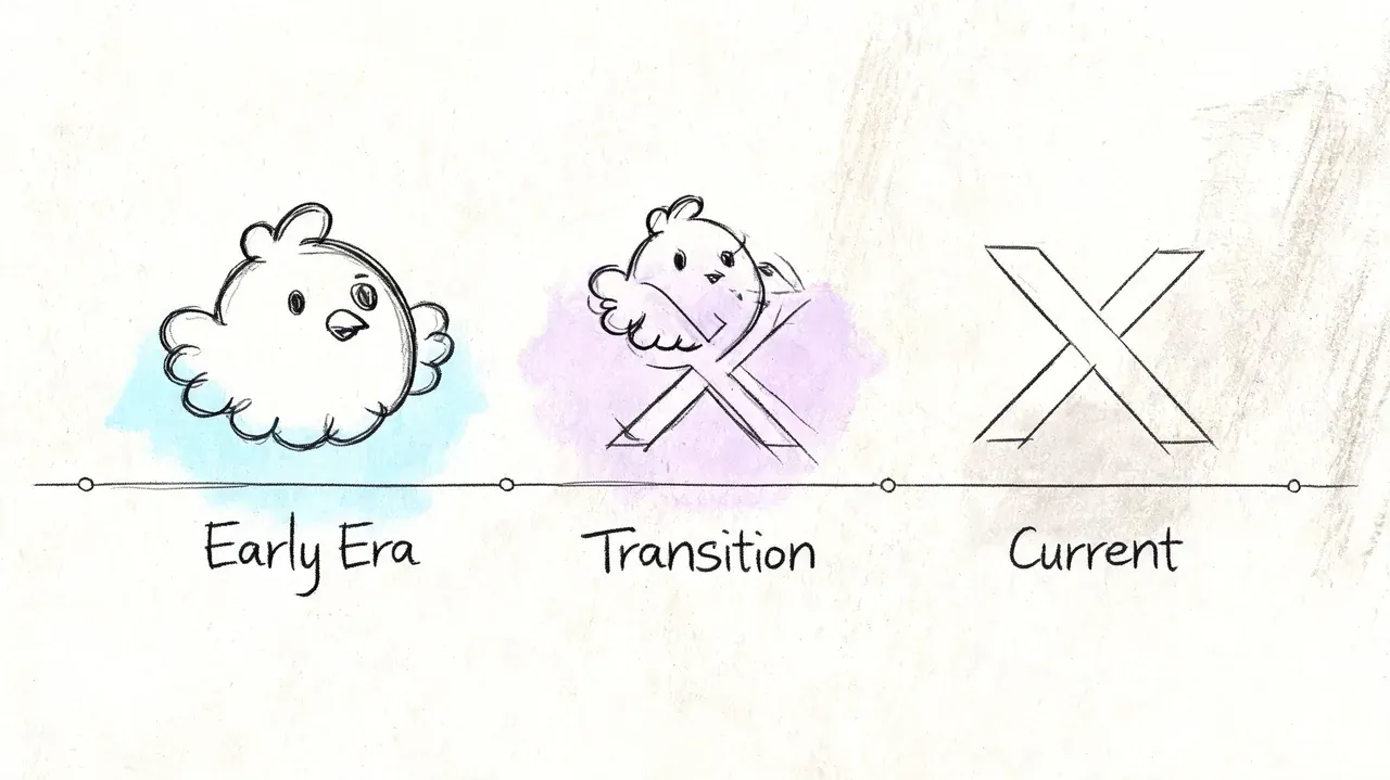
You open an old screenshot of Twitter from the late 2000s, then compare it with X today. They barely feel like the same product. The shift is not only about the bird disappearing or the name changing. It is also a typography story.
Twitter’s earliest visual identity was soft and playful. The original wordmark used a custom bubbled style created by Linda Gavin for the platform’s 2006 launch, and that rounded lettering helped frame Twitter as friendly, lightweight, and conversational, according to DesignBro’s history of the Twitter logo.
From playful branding to symbol-first branding
That early wordmark worked like a handwritten sign on a small neighborhood shop. It gave the product warmth before the platform had earned instant recognition on its own.
By 2012, Twitter had grown strong enough to rely on the bird symbol without the wordmark, as noted earlier. That changed the job typography had to do across the product. Once the logo stopped carrying so much personality, the interface text had to carry more of it.
This matters if you create graphics for X today. A lot of creators copy the logo era they remember, then wonder why their mockups feel dated. The rounded, bubbly aesthetic belongs to an earlier version of the brand. Modern X visuals need a sharper, more editorial reading texture.
The in-between years felt inconsistent
For years, Twitter depended on system fonts such as Helvetica Neue and Arial instead of a single custom typeface. That choice was practical, but it also meant the product could look slightly different across devices and operating systems.
For casual users, that variation was easy to miss. For designers and creators building screenshots, promo cards, or interface-inspired graphics, it created a problem. If the platform’s own text changed from screen to screen, there was no single visual standard to imitate.
A custom font solved that. It gave Twitter one reading voice across the product, the same way a consistent color palette gives a brand a recognizable tone. That historical shift is the part many “what is twitter font” articles skip, and it is the part that helps creators most. If you understand why the typography changed, you can make better choices in Canva or Figma. You stop chasing exact duplication and start matching the platform’s current feel.
A Deep Dive into Chirp The Font That Defines X
You see the difference fastest when you build a promo graphic in Canva, drop in a random sans serif, and the result looks clean but somehow not native to X. The color might be right. The layout might be close. The type is usually the part that gives it away.
That feeling points back to Chirp, the custom typeface Twitter introduced in 2021 to give the product a more recognizable reading voice. Earlier in the article, we covered why that shift mattered. Here, the useful question for creators is different: what does Chirp do on screen, and what should you copy if you want your own visuals to feel at home on X?
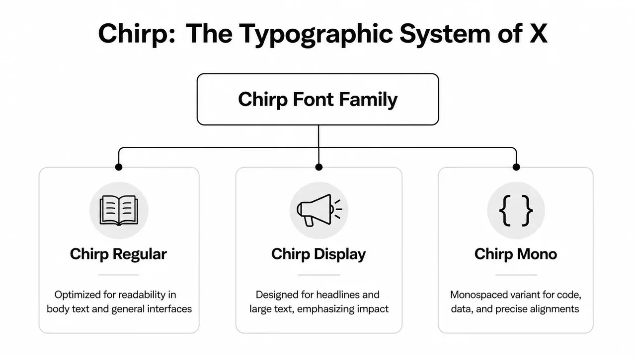
Chirp is a type system, not a single one-size-fits-all font choice. It was built to handle interface labels, posts, dense text, and stronger headline moments inside one visual language. For creators, that matters because the X look comes from repeated habits, not from dropping in one magical font file.
Why Chirp feels distinct
Chirp was developed with Grilli Type, and its design mixes geometric structure with the more restrained tone of grotesque sans serifs, as described in Gridfiti’s analysis of the Chirp design approach. In practice, that gives X a voice that feels editorial, compact, and human at the same time.
A simple way to read it is this. Chirp has enough structure to stay sharp in a busy feed, but enough irregularity to avoid feeling sterile. That is why many substitutes miss the mark. They copy the category, “sans serif,” but miss the texture.
What to study if you want the same aesthetic
You do not need to analyze every character. Focus on the traits that show up in actual content:
- Tight, readable text color: Posts and UI text feel efficient on screen, not airy or luxurious.
- Firm weight choices: Headlines have confidence without looking like poster typography.
- Subtle personality in the shapes: The font feels designed, but it does not beg for attention.
- Range across sizes: It holds up in both short labels and denser blocks of text.
A good analogy is product design. Two apps can use the same neutral color palette and still feel completely different because of spacing, corners, and motion. X typography works the same way. The overall impression comes from small, repeated decisions.
What that means for your own graphics
If you make quote cards, fake tweet layouts, launch graphics, or screenshot-style promos, your goal is not exact duplication. Your goal is visual compatibility.
That changes the design brief. Instead of asking, “How do I get Chirp?” ask, “What font and settings will make this feel like it belongs next to real X content?”
Usually that means:
- Use a sans serif with structure, not a playful rounded face.
- Keep line spacing controlled so the text feels feed-friendly.
- Choose medium to bold weights carefully for emphasis instead of jumping to extra-heavy styles.
- Avoid overly geometric branding fonts that feel more like startup landing pages than social conversation.
If you are building tweet-style visuals for campaigns, product launches, or social proof, a fake tweet maker for realistic X mockups can help you study that native text rhythm before you recreate it in Figma or Canva.
The practical takeaway for creators
Chirp helps X content feel immediate and platform-specific. It reads quickly, carries personality without becoming decorative, and supports hierarchy without making the interface feel loud.
That is the part worth copying. Once you understand that balance, you make better font choices even without access to Chirp itself. Your graphics stop looking like generic social media templates and start looking built for X.
Using the Twitter Font Legally and Effectively
You open Canva to make a quote card for X, type the copy, and something feels off. The words are readable, but they do not feel native to the platform. That usually sends creators hunting for the exact font file.
In practice, that is the wrong target.
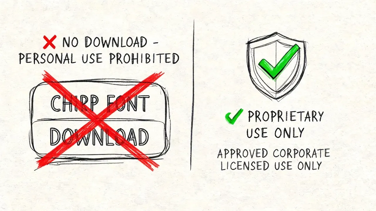
For creator work, the useful question is simpler: can you legally use Chirp in your own graphics, and if not, how do you recreate the same feel without crossing a licensing line? Chirp is a proprietary type system tied to the platform, so the safe move is to treat it like a house font in a branded app. You can study its behavior. You should not assume you can download it and use it freely in marketing assets, client work, or templates.
What legal use means for creators
A custom platform font works like a signature ingredient in a restaurant recipe. You can taste what makes it distinctive and cook something with a similar balance at home. You do not get the restaurant’s exact formula just because you like the dish.
That distinction matters if you build launch graphics, tweet-style screenshots, ad creative, or social proof visuals. Copying the interface too closely can create licensing risk and also make your work look forced. Content usually performs better when it feels native without pretending to be an actual post from the platform.
Where creators get tripped up
Chirp often appears inside the X product experience, but what you see on screen is also shaped by device rendering, font fallback behavior, weight choices, spacing, and layout. So even if someone handed you the exact font file, your graphic could still look wrong if the text settings are off.
That is why effective use starts with system thinking. Treat the font as one part of a larger visual recipe.
A safer workflow that still looks native
If your goal is an X-style graphic in Figma or Canva, use a legal substitute and match the platform’s reading rhythm.
Focus on these settings:
- Pick a clean sans serif with some personality. It should feel modern and structured, not bubbly, decorative, or aggressively geometric.
- Use restrained weights. Medium, semibold, and bold usually feel closer to X than thin or extra-black styles.
- Tighten spacing carefully. Loose line spacing makes a design feel like a presentation slide instead of a post in a fast-moving feed.
- Keep styling plain. Skip heavy shadows, outlines, gradients, and effects that compete with the text.
- Build one reusable text style. Save your font, size, weight, and line-height settings so every graphic feels consistent.
If you create mock posts for product demos, education, or campaign concepts, study realistic structure before designing from scratch. A fake tweet maker for realistic X mockups without misleading anyone can help you see the spacing, hierarchy, and text balance that make a layout feel believable.
The practical rule
Use the look. Do not use the asset unless you have clear rights to it.
For creators, that usually leads to a better result anyway. A good substitute with smart spacing and strong hierarchy will look more at home on X than the wrong use of the exact font.
Free Alternatives That Mimic the Twitter Font
This is the part most articles skip. They answer what is twitter font, say “Chirp,” and leave you stranded. But creators need a workable substitute.
One source covering this search query points out that a major gap is practical replication, especially with free options such as Inter and Montserrat that can approximate Chirp’s blend of American Gothic and European Grotesque influences, as noted by FontsArena’s discussion of Chirp alternatives for creators.
The best free options for a Chirp-like feel
No free font is Chirp. That’s not the goal. The goal is finding the right tradeoff for your specific use case.
Here’s a quick comparison.
| Font | Best For | Similarity to Chirp | Available Weights |
|---|---|---|---|
| Inter | UI mockups, threads turned into carousels, product screenshots | High for readability and neutral structure | Broad range |
| Montserrat | Bold headlines, quote cards, promo graphics | Moderate for geometric strength, less subtle in body text | Broad range |
| Manrope | Clean creator visuals, minimalist overlays | Moderate to high for modern clarity | Multiple weights |
How to choose the right one
Inter for the safest default
If you want one answer, start with Inter. It’s clean, highly readable, and doesn’t impose too much personality. That makes it ideal for tweet-style graphics, app screenshots, and text-heavy visuals where the font should support the message instead of performing.
Inter also behaves well at smaller sizes, which matters when you’re creating visuals that mimic feed density.
Montserrat for bolder promo graphics
Montserrat is useful when you need more punch in large text. It gives you that firm, upright, platform-friendly structure for headers and short statements.
Its weakness is body text. If you use it for long blocks, it can feel more branded than native. I’d use Montserrat for the top line of a graphic, then pair it carefully or keep the copy short.
Manrope for a cleaner modern edge
Manrope sits in an interesting middle ground. It’s tidy and modern, but it still has enough warmth to avoid feeling cold. If your own brand already leans slightly technical or product-focused, Manrope can fit nicely while still nodding toward X’s interface feel.
Don’t ask “Which font is closest?” Ask “Which font makes this post feel like it belongs on X?”
A practical setup for Canva and Figma
If you want a repeatable system, try this:
- For tweet-style screenshots: Use Inter in regular or medium.
- For bold cover text: Try Montserrat in semibold or bold.
- For clean product-led visuals: Use Manrope with compact spacing.
- For consistency: Build one text style set and reuse it across every asset.
A lot of creators sabotage themselves by changing fonts every week. Native feel comes from repetition. Pick one substitute and make it part of your system.
Aligning Your Content With X’s Visual Identity
You post a graphic on X, the message is strong, and the design is clean. It still feels slightly off in the feed. That usually is not a content problem. It is a fit problem.
X has a very specific visual rhythm. The text feels compact, readable, and calm, even when the conversation around it is fast and noisy. Chirp helps create that feeling, and X has kept that general typographic personality through the platform’s rebrand, as noted earlier. For creators, that matters less as trivia and more as a design cue. If your graphics match that rhythm, they tend to look more native beside real posts, screenshots, and UI elements.
The goal is not to copy the interface pixel for pixel. The goal is to make your content feel like it belongs in the same environment.
A good way to approach this is to treat X like a room with its own lighting. If your font choice, spacing, and text weight clash with that lighting, your post stands out for the wrong reason. If they match it, the content feels familiar before anyone reads a word.
What this means for creators
If you are building quote cards, launch graphics, carousels, or tweet-style visuals in Canva or Figma, keep these principles in mind:
- Prioritize readability over decoration
- Choose a sans serif with a little character, but not a loud personality
- Keep layouts compact so they feel feed-native
- Reuse the same text styles so your posts feel consistent
That last point gets overlooked. Native-looking content usually comes from repeated design decisions, not one perfect font pick. A stable system beats constant experimentation.
If you want a starting point, build from simple blank Twitter post templates for 2026 and swap in your preferred Chirp-like alternative. Then adjust line spacing, font weight, and margins until the result feels closer to a real post than a polished ad.
The short answer to “what is twitter font” is useful. The practical answer is better. Once you understand the feel Chirp creates, you can recreate that aesthetic legally with free alternatives and make your marketing graphics look more at home on X.